Plotting
We use the standard convention for referencing the matplotlib API:
In [1]: import matplotlib.pyplot as plt
The plots in this document are made using matplotlib’s ggplot style (new in version 1.4):
import matplotlib
matplotlib.style.use('ggplot')
If your version of matplotlib is 1.3 or lower, you can set display.mpl_style to 'default' with pd.options.display.mpl_style = 'default' to produce more appealing plots. When set, matplotlib’s rcParams are changed (globally!) to nicer-looking settings.
We provide the basics in pandas to easily create decent looking plots. See the ecosystem section for visualization libraries that go beyond the basics documented here.
Note
All calls to np.random are seeded with 123456.
Basic Plotting: plot
See the cookbook for some advanced strategies
The plot method on Series and DataFrame is just a simple wrapper around plt.plot():
In [2]: ts = pd.Series(np.random.randn(1000), index=pd.date_range('1/1/2000', periods=1000))
In [3]: ts = ts.cumsum()
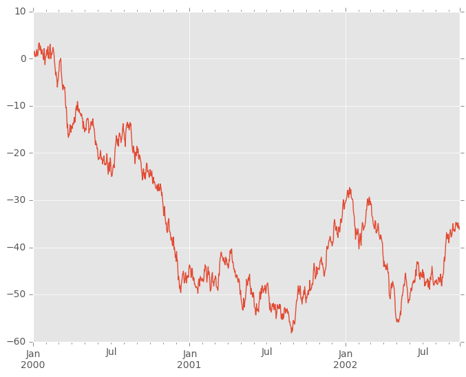
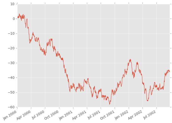
In [4]: ts.plot()
Out[4]: <matplotlib.axes._subplots.AxesSubplot at 0x9e433bec>
If the index consists of dates, it calls gcf().autofmt_xdate() to try to format the x-axis nicely as per above.
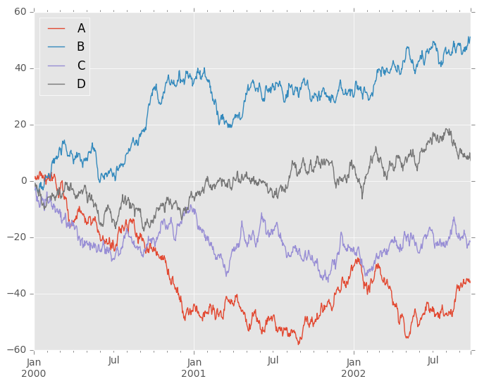
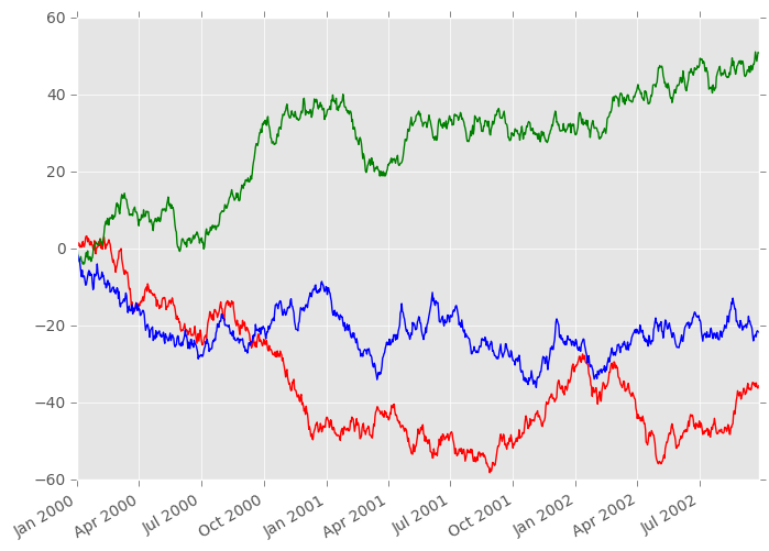
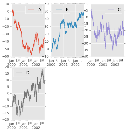
On DataFrame, plot() is a convenience to plot all of the columns with labels:
In [5]: df = pd.DataFrame(np.random.randn(1000, 4), index=ts.index, columns=list('ABCD'))

In [6]: df = df.cumsum()

In [7]: plt.figure(); df.plot();
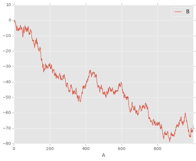
You can plot one column versus another using the x and y keywords in plot():
In [8]: df3 = pd.DataFrame(np.random.randn(1000, 2), columns=['B', 'C']).cumsum()

In [9]: df3['A'] = pd.Series(list(range(len(df))))

In [10]: df3.plot(x='A', y='B')
Out[10]: <matplotlib.axes._subplots.AxesSubplot at 0x9e1aeb6c>
Note
For more formatting and sytling options, see below.
Other Plots
Plotting methods allow for a handful of plot styles other than the default Line plot. These methods can be provided as the kind keyword argument to plot(). These include:
- ‘bar’ or ‘barh’ for bar plots
- ‘hist’ for histogram
- ‘box’ for boxplot
- ‘kde’ or 'density' for density plots
- ‘area’ for area plots
- ‘scatter’ for scatter plots
- ‘hexbin’ for hexagonal bin plots
- ‘pie’ for pie plots
New in version 0.17.
You can also create these other plots using the methods DataFrame.plot.<kind> instead of providing the kind keyword argument. This makes it easier to discover plot methods and the specific arguments they use:
In [11]: df = pd.DataFrame()

In [12]: df.plot.<TAB>
df.plot.area     df.plot.barh     df.plot.density  df.plot.hist     df.plot.line     df.plot.scatter
df.plot.bar      df.plot.box      df.plot.hexbin   df.plot.kde      df.plot.pie
In addition to these kind s, there are the DataFrame.hist(), and DataFrame.boxplot() methods, which use a separate interface.
Finally, there are several plotting functions in pandas.tools.plotting that take a Series or DataFrame as an argument. These include
- Scatter Matrix
- Andrews Curves
- Parallel Coordinates
- Lag Plot
- Autocorrelation Plot
- Bootstrap Plot
- RadViz
Plots may also be adorned with errorbars or tables.
Bar plots
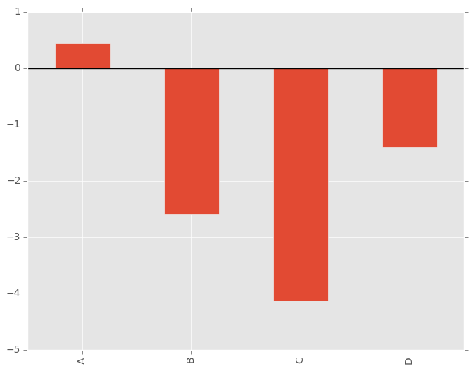
For labeled, non-time series data, you may wish to produce a bar plot:
In [13]: plt.figure();

In [14]: df.ix[5].plot(kind='bar'); plt.axhline(0, color='k')
Out[14]: <matplotlib.lines.Line2D at 0x9ed176ec>
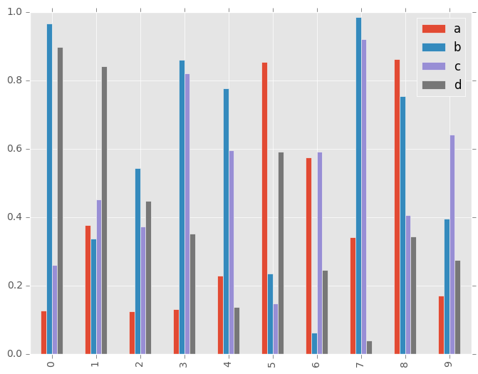
Calling a DataFrame’s plot() method with kind='bar' produces a multiple bar plot:
In [15]: df2 = pd.DataFrame(np.random.rand(10, 4), columns=['a', 'b', 'c', 'd'])

In [16]: df2.plot(kind='bar');
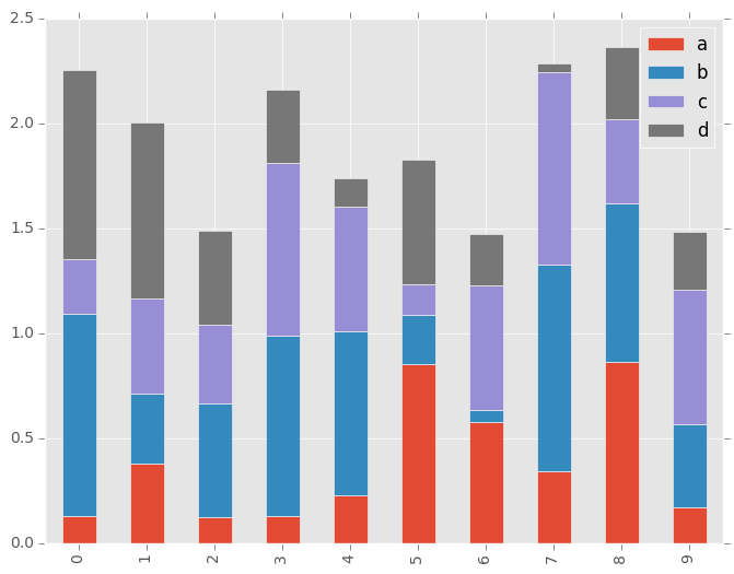
To produce a stacked bar plot, pass stacked=True:
In [17]: df2.plot(kind='bar', stacked=True);
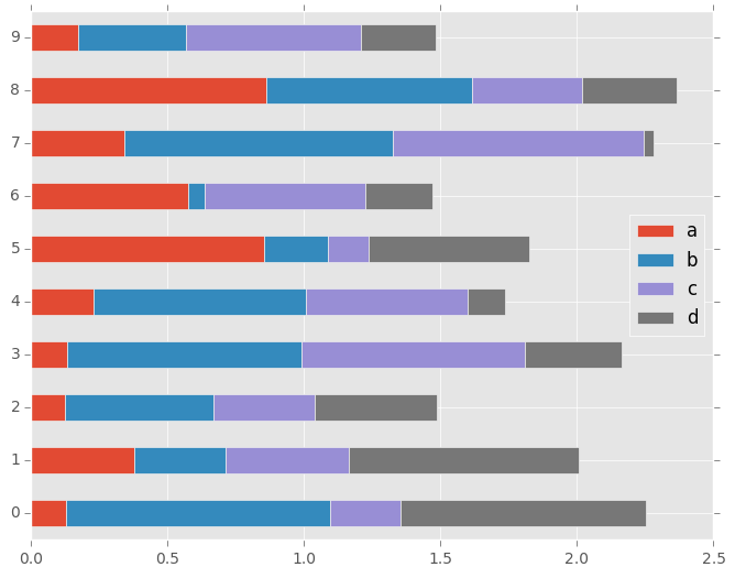
To get horizontal bar plots, pass kind='barh':
In [18]: df2.plot(kind='barh', stacked=True);
Histograms
New in version 0.15.0.
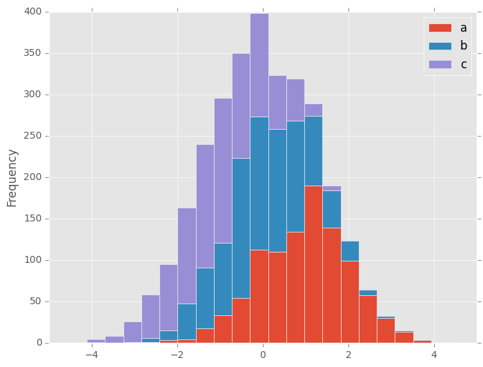
Histogram can be drawn specifying kind='hist'.
In [19]: df4 = pd.DataFrame({'a': np.random.randn(1000) + 1, 'b': np.random.randn(1000),
   ....:                     'c': np.random.randn(1000) - 1}, columns=['a', 'b', 'c'])
   ....:

In [20]: plt.figure();

In [21]: df4.plot(kind='hist', alpha=0.5)
Out[21]: <matplotlib.axes._subplots.AxesSubplot at 0x9f0ec46c>
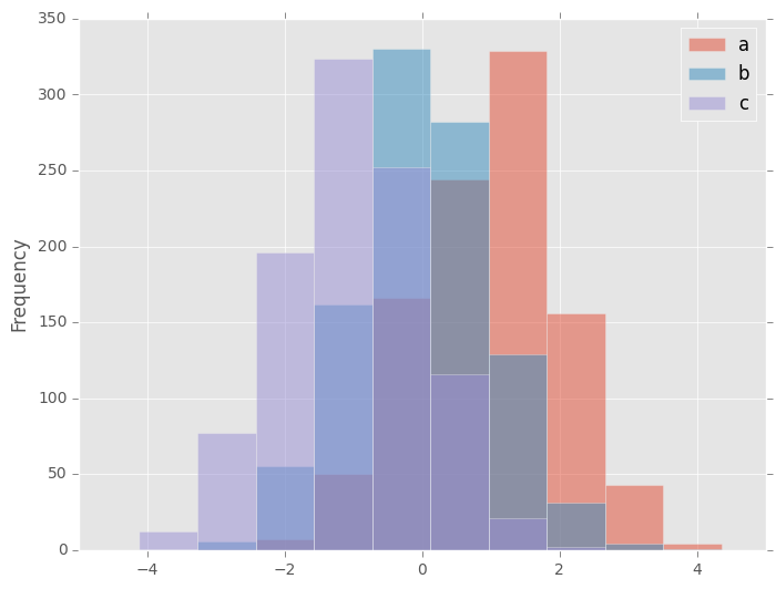
Histogram can be stacked by stacked=True. Bin size can be changed by bins keyword.
In [22]: plt.figure();

In [23]: df4.plot(kind='hist', stacked=True, bins=20)
Out[23]: <matplotlib.axes._subplots.AxesSubplot at 0x9f3132cc>
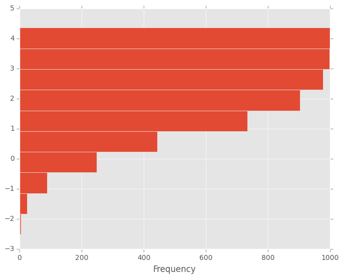
You can pass other keywords supported by matplotlib hist. For example, horizontal and cumulative histgram can be drawn by orientation='horizontal' and cumulative='True'.
In [24]: plt.figure();

In [25]: df4['a'].plot(kind='hist', orientation='horizontal', cumulative=True)
Out[25]: <matplotlib.axes._subplots.AxesSubplot at 0xa45ed04c>
See the hist method and the matplotlib hist documentation for more.
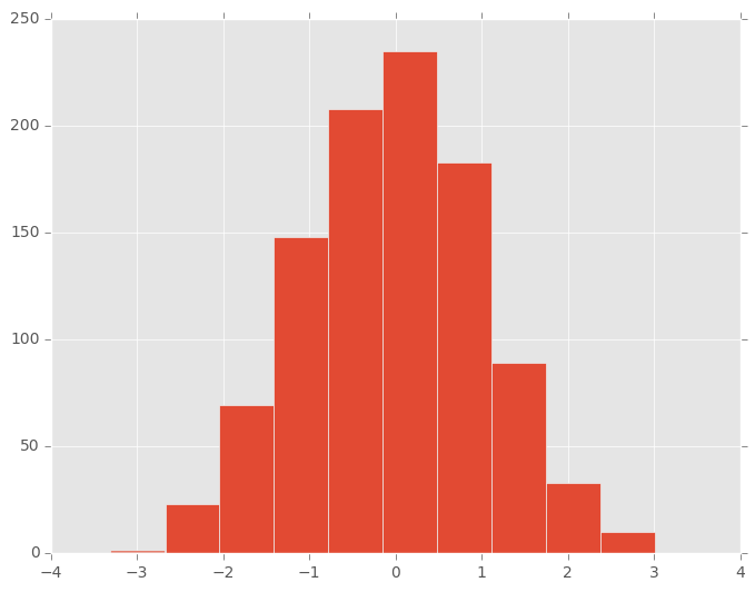
The existing interface DataFrame.hist to plot histogram still can be used.
In [26]: plt.figure();

In [27]: df['A'].diff().hist()
Out[27]: <matplotlib.axes._subplots.AxesSubplot at 0x9ee5856c>
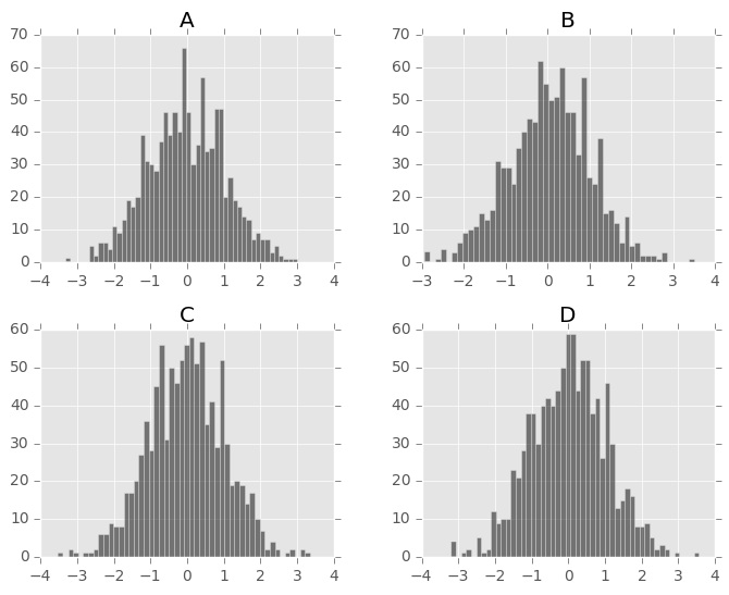
DataFrame.hist() plots the histograms of the columns on multiple subplots:
In [28]: plt.figure()
Out[28]: <matplotlib.figure.Figure at 0xb0706f2c>

In [29]: df.diff().hist(color='k', alpha=0.5, bins=50)
Out[29]:
array([[<matplotlib.axes._subplots.AxesSubplot object at 0x9f2071cc>,
        <matplotlib.axes._subplots.AxesSubplot object at 0x9dba50ec>],
       [<matplotlib.axes._subplots.AxesSubplot object at 0x9ee34b4c>,
        <matplotlib.axes._subplots.AxesSubplot object at 0x9e8c922c>]], dtype=object)
New in version 0.10.0.
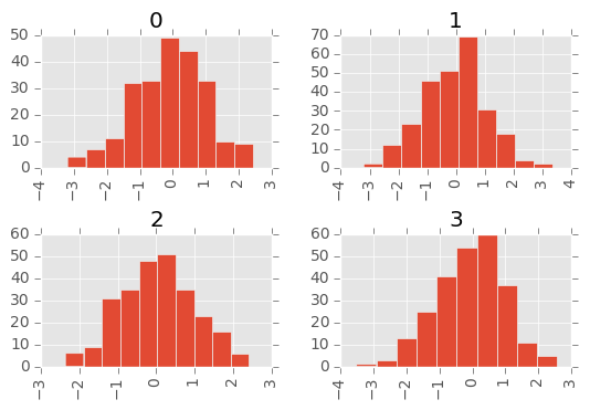
The by keyword can be specified to plot grouped histograms:
In [30]: data = pd.Series(np.random.randn(1000))

In [31]: data.hist(by=np.random.randint(0, 4, 1000), figsize=(6, 4))
Out[31]:
array([[<matplotlib.axes._subplots.AxesSubplot object at 0x9db440ec>,
        <matplotlib.axes._subplots.AxesSubplot object at 0x9de009ac>],
       [<matplotlib.axes._subplots.AxesSubplot object at 0x9e450b4c>,
        <matplotlib.axes._subplots.AxesSubplot object at 0x9e4e684c>]], dtype=object)
Box Plots
Boxplot can be drawn calling a Series and DataFrame.plot with kind='box', or DataFrame.boxplot to visualize the distribution of values within each column.
New in version 0.15.0.
plot method now supports kind='box' to draw boxplot.
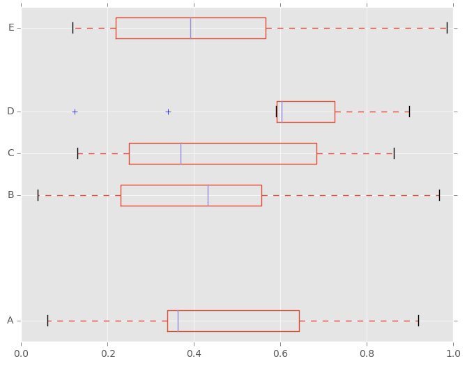
For instance, here is a boxplot representing five trials of 10 observations of a uniform random variable on [0,1).
In [32]: df = pd.DataFrame(np.random.rand(10, 5), columns=['A', 'B', 'C', 'D', 'E'])

In [33]: df.plot(kind='box')
Out[33]: <matplotlib.axes._subplots.AxesSubplot at 0x9dd0802c>
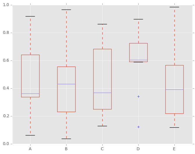
Boxplot can be colorized by passing color keyword. You can pass a dict whose keys are boxes, whiskers, medians and caps. If some keys are missing in the dict, default colors are used for the corresponding artists. Also, boxplot has sym keyword to specify fliers style.
When you pass other type of arguments via color keyword, it will be directly passed to matplotlib for all the boxes, whiskers, medians and caps colorization.
The colors are applied to every boxes to be drawn. If you want more complicated colorization, you can get each drawn artists by passing return_type.
In [34]: color = dict(boxes='DarkGreen', whiskers='DarkOrange',
   ....:              medians='DarkBlue', caps='Gray')
   ....:

In [35]: df.plot(kind='box', color=color, sym='r+')
Out[35]: <matplotlib.axes._subplots.AxesSubplot at 0x9dfad5cc>
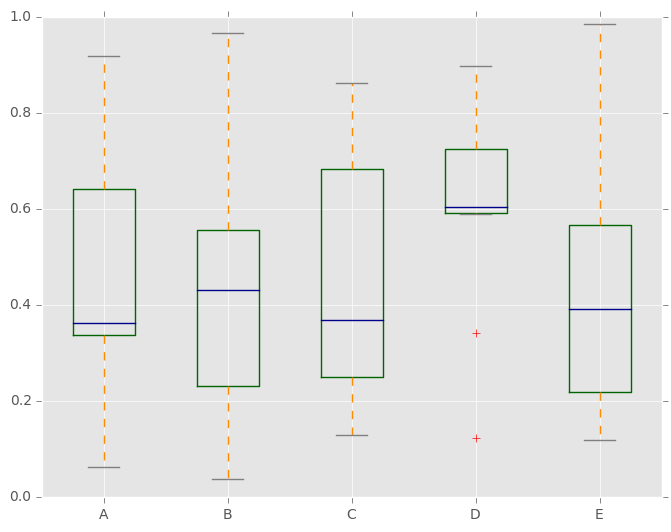
Also, you can pass other keywords supported by matplotlib boxplot. For example, horizontal and custom-positioned boxplot can be drawn by vert=False and positions keywords.
In [36]: df.plot(kind='box', vert=False, positions=[1, 4, 5, 6, 8])
Out[36]: <matplotlib.axes._subplots.AxesSubplot at 0x9d742c4c>
See the boxplot method and the matplotlib boxplot documentation for more.
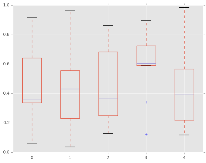
The existing interface DataFrame.boxplot to plot boxplot still can be used.
In [37]: df = pd.DataFrame(np.random.rand(10,5))

In [38]: plt.figure();

In [39]: bp = df.boxplot()
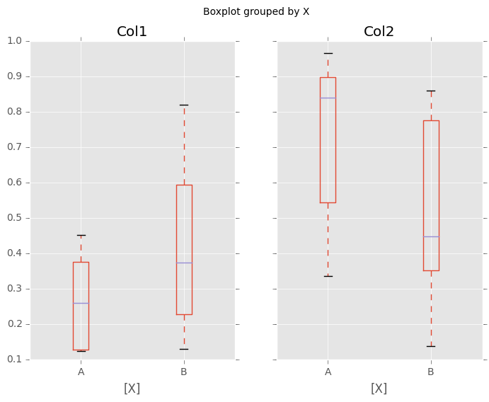
You can create a stratified boxplot using the by keyword argument to create groupings. For instance,
In [40]: df = pd.DataFrame(np.random.rand(10,2), columns=['Col1', 'Col2'] )

In [41]: df['X'] = pd.Series(['A','A','A','A','A','B','B','B','B','B'])

In [42]: plt.figure();

In [43]: bp = df.boxplot(by='X')
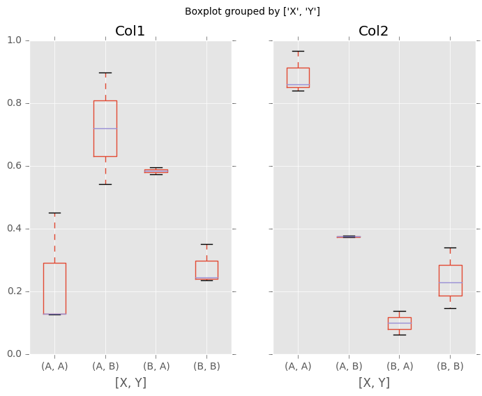
You can also pass a subset of columns to plot, as well as group by multiple columns:
In [44]: df = pd.DataFrame(np.random.rand(10,3), columns=['Col1', 'Col2', 'Col3'])

In [45]: df['X'] = pd.Series(['A','A','A','A','A','B','B','B','B','B'])

In [46]: df['Y'] = pd.Series(['A','B','A','B','A','B','A','B','A','B'])

In [47]: plt.figure();

In [48]: bp = df.boxplot(column=['Col1','Col2'], by=['X','Y'])
Basically, plot functions return matplotlib Axes as a return value. In boxplot, the return type can be changed by argument return_type, and whether the subplots is enabled (subplots=True in plot or by is specified in boxplot).
When subplots=False / by is None:
- if return_type is 'dict', a dictionary containing the matplotlib Lines is returned. The keys are “boxes”, “caps”, “fliers”, “medians”, and “whiskers”.
This is the default of boxplot in historical reason. Note that plot(kind='box') returns Axes as default as the same as other plots.
if return_type is 'axes', a matplotlib Axes containing the boxplot is returned.
- if return_type is 'both' a namedtuple containging the matplotlib Axes
and matplotlib Lines is returned
When subplots=True / by is some column of the DataFrame:
- A dict of return_type is returned, where the keys are the columns of the DataFrame. The plot has a facet for each column of the DataFrame, with a separate box for each value of by.
Finally, when calling boxplot on a Groupby object, a dict of return_type is returned, where the keys are the same as the Groupby object. The plot has a facet for each key, with each facet containing a box for each column of the DataFrame.
In [49]: np.random.seed(1234)

In [50]: df_box = pd.DataFrame(np.random.randn(50, 2))

In [51]: df_box['g'] = np.random.choice(['A', 'B'], size=50)

In [52]: df_box.loc[df_box['g'] == 'B', 1] += 3

In [53]: bp = df_box.boxplot(by='g')
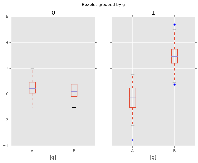
Compare to:
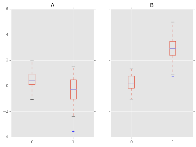
In [54]: bp = df_box.groupby('g').boxplot()
Area Plot
New in version 0.14.
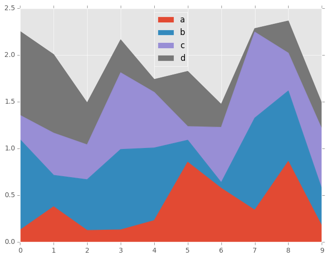
You can create area plots with Series.plot and DataFrame.plot by passing kind='area'. Area plots are stacked by default. To produce stacked area plot, each column must be either all positive or all negative values.
When input data contains NaN, it will be automatically filled by 0. If you want to drop or fill by different values, use dataframe.dropna() or dataframe.fillna() before calling plot.
In [55]: df = pd.DataFrame(np.random.rand(10, 4), columns=['a', 'b', 'c', 'd'])

In [56]: df.plot(kind='area');
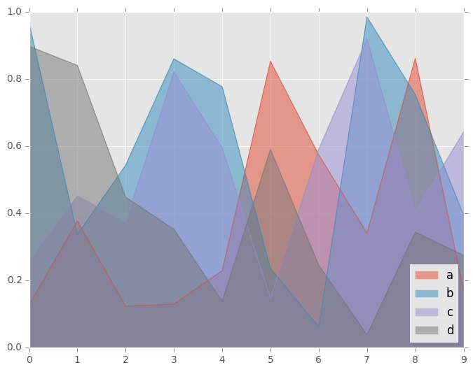
To produce an unstacked plot, pass stacked=False. Alpha value is set to 0.5 unless otherwise specified:
In [57]: df.plot(kind='area', stacked=False);
Scatter Plot
New in version 0.13.
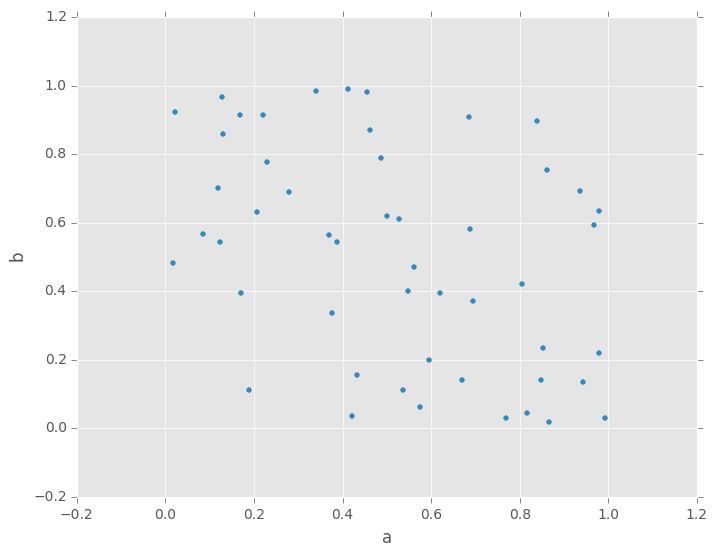
You can create scatter plots with DataFrame.plot by passing kind='scatter'. Scatter plot requires numeric columns for x and y axis. These can be specified by x and y keywords each.
In [58]: df = pd.DataFrame(np.random.rand(50, 4), columns=['a', 'b', 'c', 'd'])

In [59]: df.plot(kind='scatter', x='a', y='b');
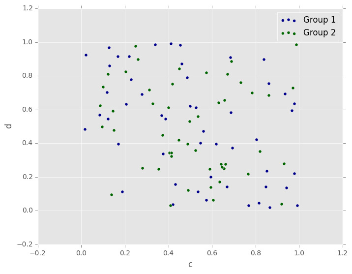
To plot multiple column groups in a single axes, repeat plot method specifying target ax. It is recommended to specify color and label keywords to distinguish each groups.
In [60]: ax = df.plot(kind='scatter', x='a', y='b',
   ....:              color='DarkBlue', label='Group 1');
   ....:

In [61]: df.plot(kind='scatter', x='c', y='d',
   ....:         color='DarkGreen', label='Group 2', ax=ax);
   ....:
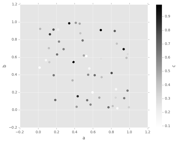
The keyword c may be given as the name of a column to provide colors for each point:
In [62]: df.plot(kind='scatter', x='a', y='b', c='c', s=50);
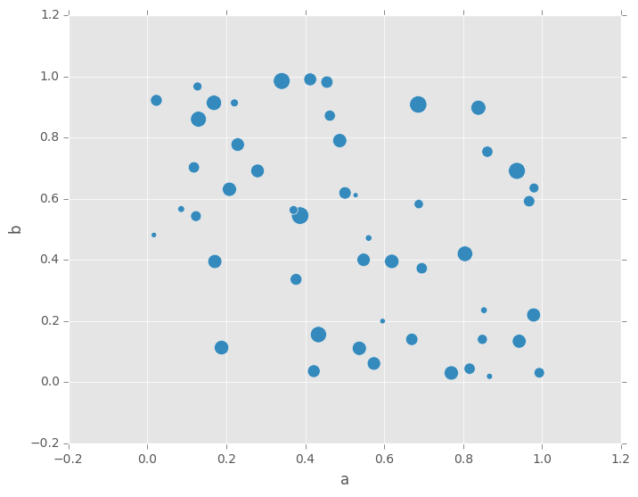
You can pass other keywords supported by matplotlib scatter. Below example shows a bubble chart using a dataframe column values as bubble size.
In [63]: df.plot(kind='scatter', x='a', y='b', s=df['c']*200);
See the scatter method and the matplotlib scatter documentation for more.
Hexagonal Bin Plot
New in version 0.14.
You can create hexagonal bin plots with DataFrame.plot() and kind='hexbin'. Hexbin plots can be a useful alternative to scatter plots if your data are too dense to plot each point individually.
In [64]: df = pd.DataFrame(np.random.randn(1000, 2), columns=['a', 'b'])

In [65]: df['b'] = df['b'] + np.arange(1000)

In [66]: df.plot(kind='hexbin', x='a', y='b', gridsize=25)
Out[66]: <matplotlib.axes._subplots.AxesSubplot at 0x9c6e2fcc>
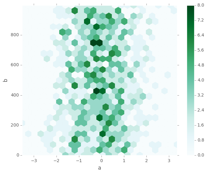
A useful keyword argument is gridsize; it controls the number of hexagons in the x-direction, and defaults to 100. A larger gridsize means more, smaller bins.
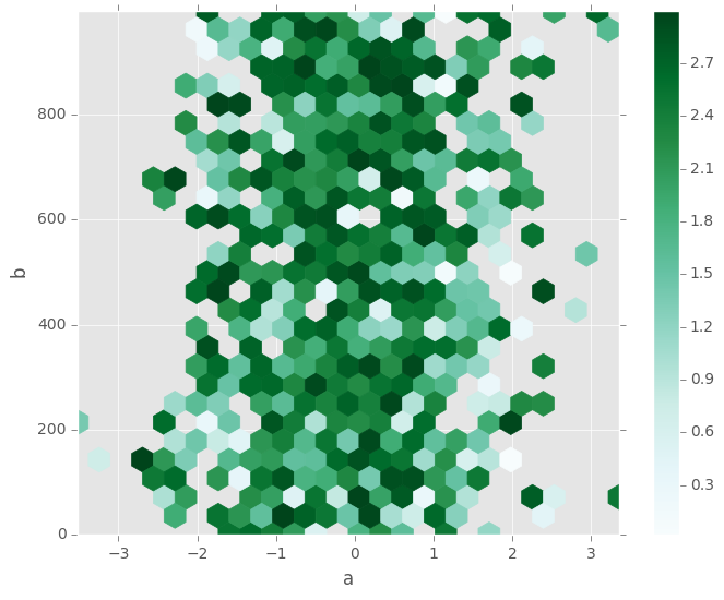
By default, a histogram of the counts around each (x, y) point is computed. You can specify alternative aggregations by passing values to the C and reduce_C_function arguments. C specifies the value at each (x, y) point and reduce_C_function is a function of one argument that reduces all the values in a bin to a single number (e.g. mean, max, sum, std). In this example the positions are given by columns a and b, while the value is given by column z. The bins are aggregated with numpy’s max function.
In [67]: df = pd.DataFrame(np.random.randn(1000, 2), columns=['a', 'b'])

In [68]: df['b'] = df['b'] = df['b'] + np.arange(1000)

In [69]: df['z'] = np.random.uniform(0, 3, 1000)

In [70]: df.plot(kind='hexbin', x='a', y='b', C='z', reduce_C_function=np.max,
   ....:         gridsize=25)
   ....:
Out[70]: <matplotlib.axes._subplots.AxesSubplot at 0x9cbedccc>
See the hexbin method and the matplotlib hexbin documentation for more.
Pie plot
New in version 0.14.
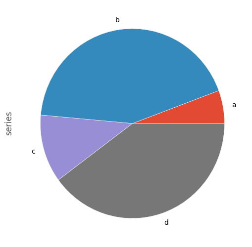
You can create a pie plot with DataFrame.plot() or Series.plot() with kind='pie'. If your data includes any NaN, they will be automatically filled with 0. A ValueError will be raised if there are any negative values in your data.
In [71]: series = pd.Series(3 * np.random.rand(4), index=['a', 'b', 'c', 'd'], name='series')

In [72]: series.plot(kind='pie', figsize=(6, 6))
Out[72]: <matplotlib.axes._subplots.AxesSubplot at 0x9cd248cc>
For pie plots it’s best to use square figures, one’s with an equal aspect ratio. You can create the figure with equal width and height, or force the aspect ratio to be equal after plotting by calling ax.set_aspect('equal') on the returned axes object.
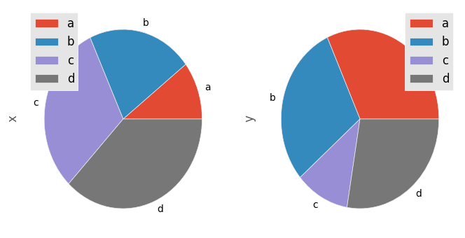
Note that pie plot with DataFrame requires that you either specify a target column by the y argument or subplots=True. When y is specified, pie plot of selected column will be drawn. If subplots=True is specified, pie plots for each column are drawn as subplots. A legend will be drawn in each pie plots by default; specify legend=False to hide it.
In [73]: df = pd.DataFrame(3 * np.random.rand(4, 2), index=['a', 'b', 'c', 'd'], columns=['x', 'y'])

In [74]: df.plot(kind='pie', subplots=True, figsize=(8, 4))
Out[74]:
array([<matplotlib.axes._subplots.AxesSubplot object at 0x9cd0c4cc>,
       <matplotlib.axes._subplots.AxesSubplot object at 0x9d67412c>], dtype=object)
You can use the labels and colors keywords to specify the labels and colors of each wedge.
Warning
Most pandas plots use the the label and color arguments (note the lack of “s” on those). To be consistent with matplotlib.pyplot.pie() you must use labels and colors.
If you want to hide wedge labels, specify labels=None. If fontsize is specified, the value will be applied to wedge labels. Also, other keywords supported by matplotlib.pyplot.pie() can be used.
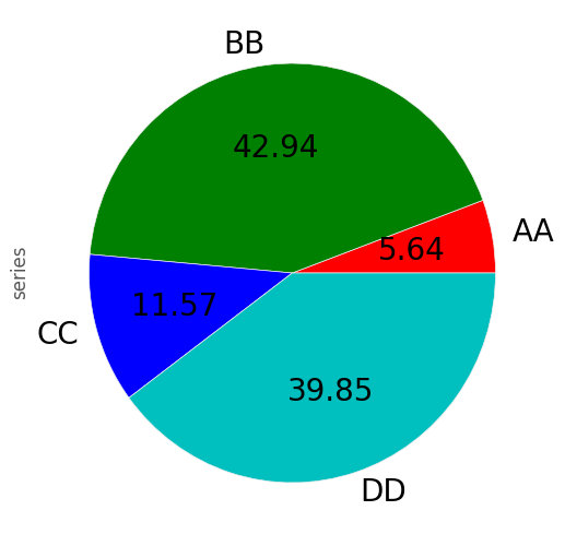
In [75]: series.plot(kind='pie', labels=['AA', 'BB', 'CC', 'DD'], colors=['r', 'g', 'b', 'c'],
   ....:             autopct='%.2f', fontsize=20, figsize=(6, 6))
   ....:
Out[75]: <matplotlib.axes._subplots.AxesSubplot at 0x9d27f80c>
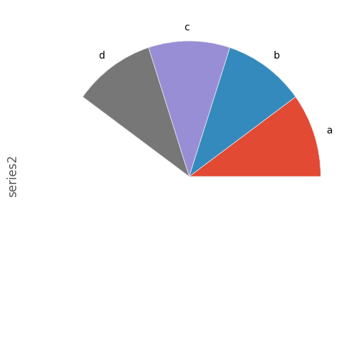
If you pass values whose sum total is less than 1.0, matplotlib draws a semicircle.
In [76]: series = pd.Series([0.1] * 4, index=['a', 'b', 'c', 'd'], name='series2')

In [77]: series.plot(kind='pie', figsize=(6, 6))
Out[77]: <matplotlib.axes._subplots.AxesSubplot at 0x9d1ca44c>
See the matplotlib pie documentation for more.
Plotting with Missing Data
Pandas tries to be pragmatic about plotting DataFrames or Series that contain missing data. Missing values are dropped, left out, or filled depending on the plot type.
| Plot Type | NaN Handling |
|---|---|
| Line | Leave gaps at NaNs |
| Line (stacked) | Fill 0’s |
| Bar | Fill 0’s |
| Scatter | Drop NaNs |
| Histogram | Drop NaNs (column-wise) |
| Box | Drop NaNs (column-wise) |
| Area | Fill 0’s |
| KDE | Drop NaNs (column-wise) |
| Hexbin | Drop NaNs |
| Pie | Fill 0’s |
If any of these defaults are not what you want, or if you want to be explicit about how missing values are handled, consider using fillna() or dropna() before plotting.
Plotting Tools
These functions can be imported from pandas.tools.plotting and take a Series or DataFrame as an argument.
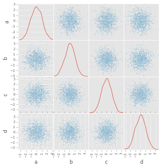
Scatter Matrix Plot
New in version 0.7.3.
You can create a scatter plot matrix using the scatter_matrix method in pandas.tools.plotting:
In [78]: from pandas.tools.plotting import scatter_matrix

In [79]: df = pd.DataFrame(np.random.randn(1000, 4), columns=['a', 'b', 'c', 'd'])

In [80]: scatter_matrix(df, alpha=0.2, figsize=(6, 6), diagonal='kde')
Out[80]:
array([[<matplotlib.axes._subplots.AxesSubplot object at 0x9d4f276c>,
        <matplotlib.axes._subplots.AxesSubplot object at 0x9d229cec>,
        <matplotlib.axes._subplots.AxesSubplot object at 0x9d39f2ac>,
        <matplotlib.axes._subplots.AxesSubplot object at 0x9cf9b78c>],
       [<matplotlib.axes._subplots.AxesSubplot object at 0x9ce526ec>,
        <matplotlib.axes._subplots.AxesSubplot object at 0x9d5332cc>,
        <matplotlib.axes._subplots.AxesSubplot object at 0x9d5f750c>,
        <matplotlib.axes._subplots.AxesSubplot object at 0x9d009fcc>],
       [<matplotlib.axes._subplots.AxesSubplot object at 0x9ce1628c>,
        <matplotlib.axes._subplots.AxesSubplot object at 0x9ce0c88c>,
        <matplotlib.axes._subplots.AxesSubplot object at 0x9e0d68cc>,
        <matplotlib.axes._subplots.AxesSubplot object at 0x9df71eac>],
       [<matplotlib.axes._subplots.AxesSubplot object at 0x9cd5a8cc>,
        <matplotlib.axes._subplots.AxesSubplot object at 0x9e7cfb0c>,
        <matplotlib.axes._subplots.AxesSubplot object at 0x9c584b0c>,
        <matplotlib.axes._subplots.AxesSubplot object at 0x9c5fd14c>]], dtype=object)
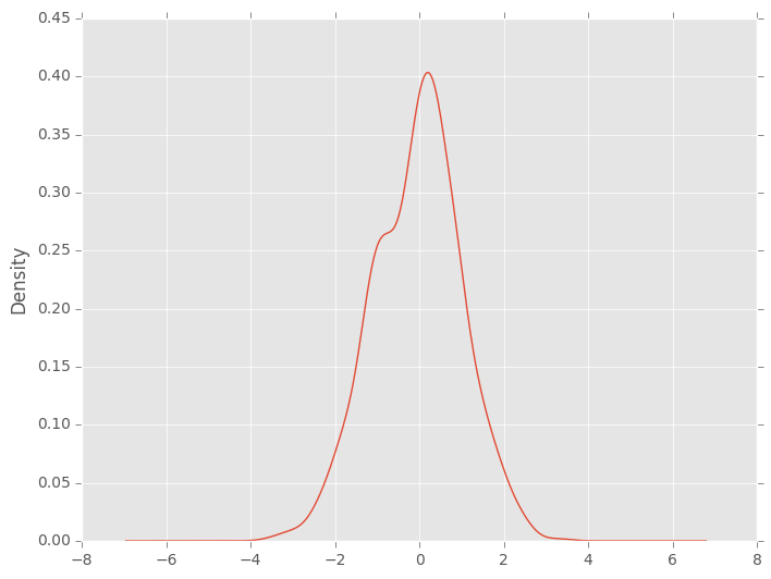
Density Plot
New in version 0.8.0.
You can create density plots using the Series/DataFrame.plot and setting kind='kde':
In [81]: ser = pd.Series(np.random.randn(1000))

In [82]: ser.plot(kind='kde')
Out[82]: <matplotlib.axes._subplots.AxesSubplot at 0x9dfbbdac>
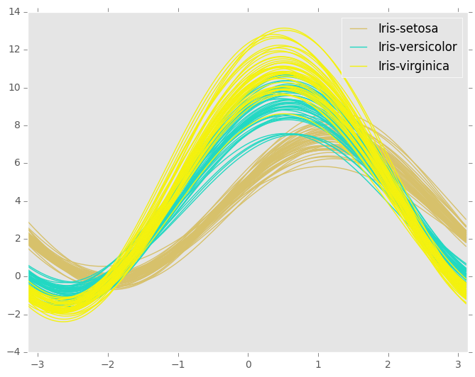
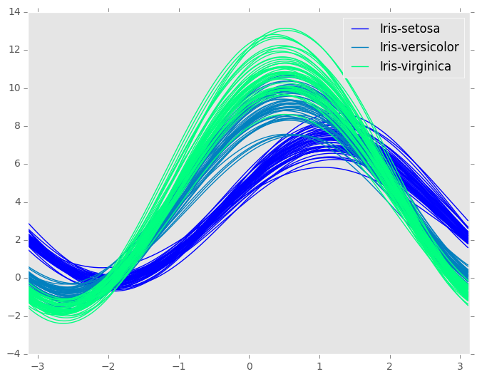
Andrews Curves
Andrews curves allow one to plot multivariate data as a large number of curves that are created using the attributes of samples as coefficients for Fourier series. By coloring these curves differently for each class it is possible to visualize data clustering. Curves belonging to samples of the same class will usually be closer together and form larger structures.
Note: The “Iris” dataset is available here.
In [83]: from pandas.tools.plotting import andrews_curves

In [84]: data = pd.read_csv('data/iris.data')

In [85]: plt.figure()
Out[85]: <matplotlib.figure.Figure at 0x9e633acc>

In [86]: andrews_curves(data, 'Name')
Out[86]: <matplotlib.axes._subplots.AxesSubplot at 0x9ea8890c>
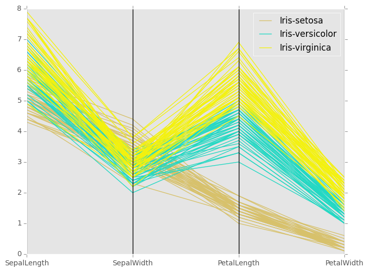
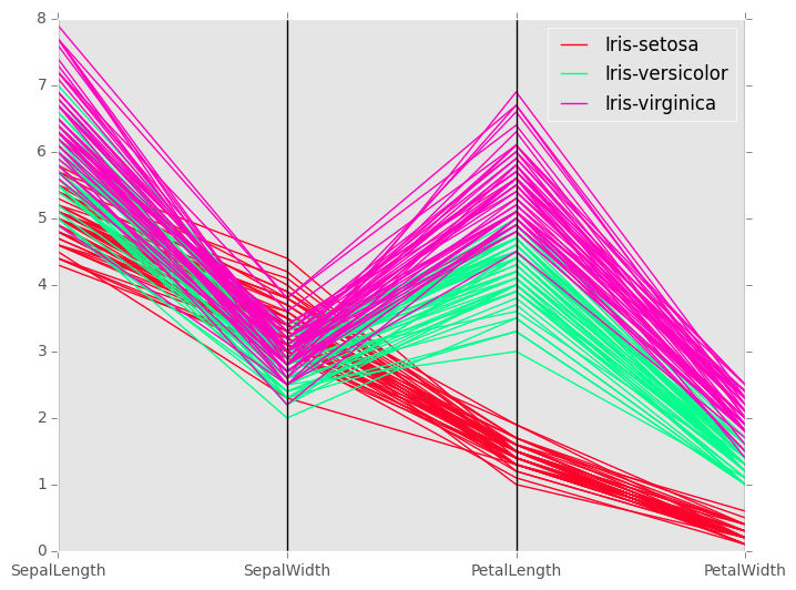
Parallel Coordinates
Parallel coordinates is a plotting technique for plotting multivariate data. It allows one to see clusters in data and to estimate other statistics visually. Using parallel coordinates points are represented as connected line segments. Each vertical line represents one attribute. One set of connected line segments represents one data point. Points that tend to cluster will appear closer together.
In [87]: from pandas.tools.plotting import parallel_coordinates

In [88]: data = pd.read_csv('data/iris.data')

In [89]: plt.figure()
Out[89]: <matplotlib.figure.Figure at 0x9e07b96c>

In [90]: parallel_coordinates(data, 'Name')
Out[90]: <matplotlib.axes._subplots.AxesSubplot at 0x9e416fac>
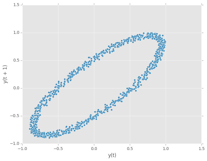
Lag Plot
Lag plots are used to check if a data set or time series is random. Random data should not exhibit any structure in the lag plot. Non-random structure implies that the underlying data are not random.
In [91]: from pandas.tools.plotting import lag_plot

In [92]: plt.figure()
Out[92]: <matplotlib.figure.Figure at 0xb083614c>

In [93]: data = pd.Series(0.1 * np.random.rand(1000) +
   ....:     0.9 * np.sin(np.linspace(-99 * np.pi, 99 * np.pi, num=1000)))
   ....:

In [94]: lag_plot(data)
Out[94]: <matplotlib.axes._subplots.AxesSubplot at 0xb08b1d2c>
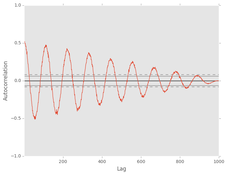
Autocorrelation Plot
Autocorrelation plots are often used for checking randomness in time series. This is done by computing autocorrelations for data values at varying time lags. If time series is random, such autocorrelations should be near zero for any and all time-lag separations. If time series is non-random then one or more of the autocorrelations will be significantly non-zero. The horizontal lines displayed in the plot correspond to 95% and 99% confidence bands. The dashed line is 99% confidence band.
In [95]: from pandas.tools.plotting import autocorrelation_plot

In [96]: plt.figure()
Out[96]: <matplotlib.figure.Figure at 0xb08c0f8c>

In [97]: data = pd.Series(0.7 * np.random.rand(1000) +
   ....:    0.3 * np.sin(np.linspace(-9 * np.pi, 9 * np.pi, num=1000)))
   ....:

In [98]: autocorrelation_plot(data)
Out[98]: <matplotlib.axes._subplots.AxesSubplot at 0xb098778c>
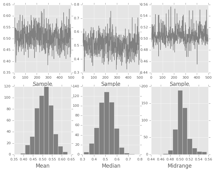
Bootstrap Plot
Bootstrap plots are used to visually assess the uncertainty of a statistic, such as mean, median, midrange, etc. A random subset of a specified size is selected from a data set, the statistic in question is computed for this subset and the process is repeated a specified number of times. Resulting plots and histograms are what constitutes the bootstrap plot.
In [99]: from pandas.tools.plotting import bootstrap_plot

In [100]: data = pd.Series(np.random.rand(1000))

In [101]: bootstrap_plot(data, size=50, samples=500, color='grey')
Out[101]: <matplotlib.figure.Figure at 0xb0897c8c>
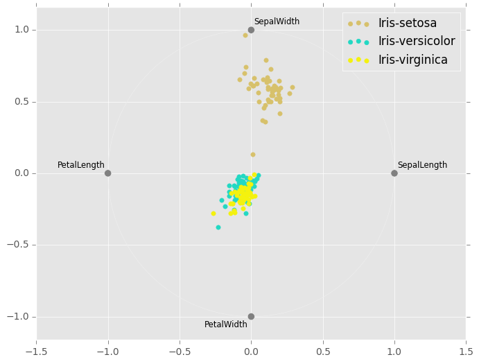
RadViz
RadViz is a way of visualizing multi-variate data. It is based on a simple spring tension minimization algorithm. Basically you set up a bunch of points in a plane. In our case they are equally spaced on a unit circle. Each point represents a single attribute. You then pretend that each sample in the data set is attached to each of these points by a spring, the stiffness of which is proportional to the numerical value of that attribute (they are normalized to unit interval). The point in the plane, where our sample settles to (where the forces acting on our sample are at an equilibrium) is where a dot representing our sample will be drawn. Depending on which class that sample belongs it will be colored differently.
Note: The “Iris” dataset is available here.
In [102]: from pandas.tools.plotting import radviz

In [103]: data = pd.read_csv('data/iris.data')

In [104]: plt.figure()
Out[104]: <matplotlib.figure.Figure at 0x9ce79e8c>

In [105]: radviz(data, 'Name')
Out[105]: <matplotlib.axes._subplots.AxesSubplot at 0x9ce6ec2c>
Plot Formatting
Most plotting methods have a set of keyword arguments that control the layout and formatting of the returned plot:
In [106]: plt.figure(); ts.plot(style='k--', label='Series');
For each kind of plot (e.g. line, bar, scatter) any additional arguments keywords are passed along to the corresponding matplotlib function (ax.plot(), ax.bar(), ax.scatter()). These can be used to control additional styling, beyond what pandas provides.
Controlling the Legend
You may set the legend argument to False to hide the legend, which is shown by default.
In [107]: df = pd.DataFrame(np.random.randn(1000, 4), index=ts.index, columns=list('ABCD'))

In [108]: df = df.cumsum()

In [109]: df.plot(legend=False)
Out[109]: <matplotlib.axes._subplots.AxesSubplot at 0xb083620c>
Scales
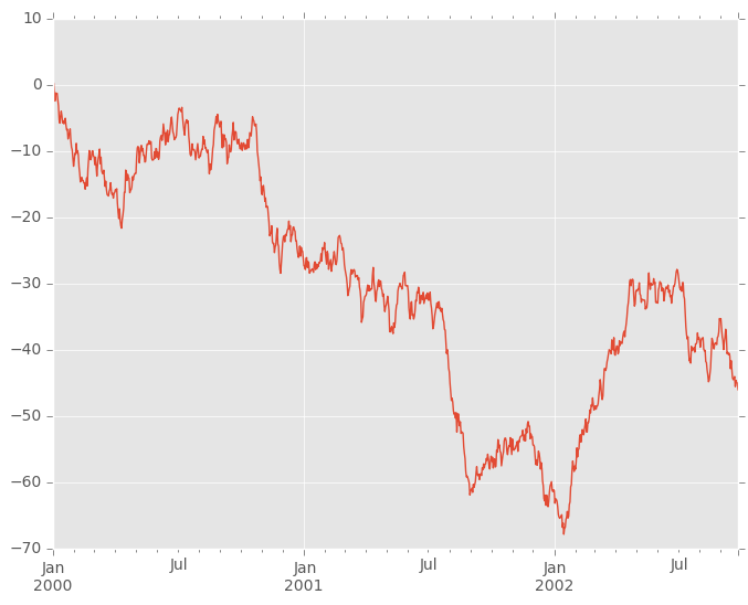
You may pass logy to get a log-scale Y axis.
In [110]: ts = pd.Series(np.random.randn(1000), index=pd.date_range('1/1/2000', periods=1000))

In [111]: ts = np.exp(ts.cumsum())

In [112]: ts.plot(logy=True)
Out[112]: <matplotlib.axes._subplots.AxesSubplot at 0x9e4871ac>
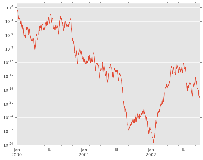
See also the logx and loglog keyword arguments.
Plotting on a Secondary Y-axis
To plot data on a secondary y-axis, use the secondary_y keyword:
In [113]: df.A.plot()
Out[113]: <matplotlib.axes._subplots.AxesSubplot at 0x9e40918c>

In [114]: df.B.plot(secondary_y=True, style='g')
Out[114]: <matplotlib.axes._subplots.AxesSubplot at 0x9d4d5aac>
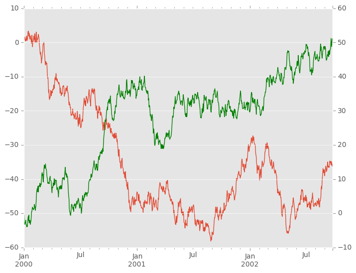
To plot some columns in a DataFrame, give the column names to the secondary_y keyword:
In [115]: plt.figure()
Out[115]: <matplotlib.figure.Figure at 0x9e95e40c>

In [116]: ax = df.plot(secondary_y=['A', 'B'])

In [117]: ax.set_ylabel('CD scale')
Out[117]: <matplotlib.text.Text at 0x9f09e1cc>

In [118]: ax.right_ax.set_ylabel('AB scale')
Out[118]: <matplotlib.text.Text at 0x9ed2f2cc>
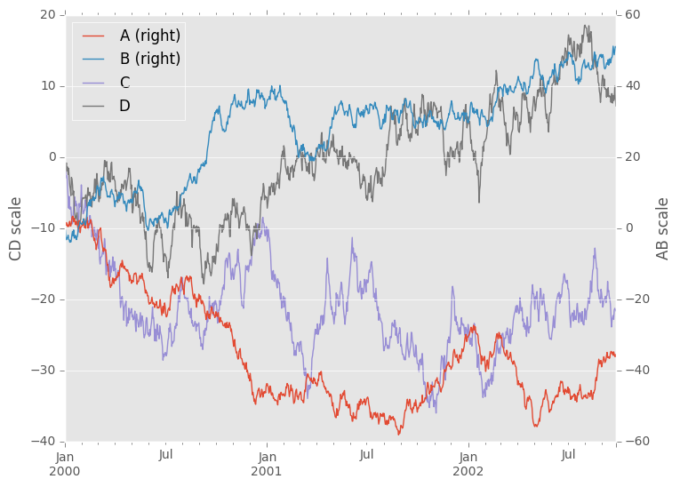
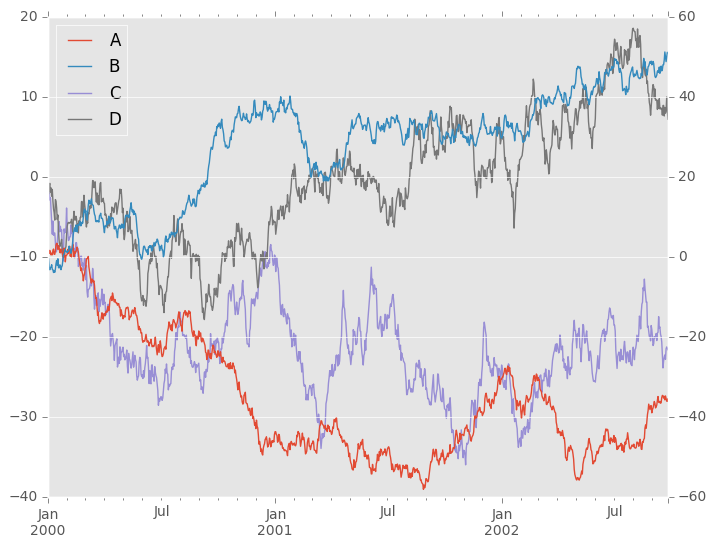
Note that the columns plotted on the secondary y-axis is automatically marked with “(right)” in the legend. To turn off the automatic marking, use the mark_right=False keyword:
In [119]: plt.figure()
Out[119]: <matplotlib.figure.Figure at 0x9cda83cc>

In [120]: df.plot(secondary_y=['A', 'B'], mark_right=False)
Out[120]: <matplotlib.axes._subplots.AxesSubplot at 0x9cd82a0c>
Suppressing Tick Resolution Adjustment
pandas includes automatic tick resolution adjustment for regular frequency time-series data. For limited cases where pandas cannot infer the frequency information (e.g., in an externally created twinx), you can choose to suppress this behavior for alignment purposes.
Here is the default behavior, notice how the x-axis tick labelling is performed:
In [121]: plt.figure()
Out[121]: <matplotlib.figure.Figure at 0x9e95e8ac>

In [122]: df.A.plot()
Out[122]: <matplotlib.axes._subplots.AxesSubplot at 0x9f04a32c>
Using the x_compat parameter, you can suppress this behavior:
In [123]: plt.figure()
Out[123]: <matplotlib.figure.Figure at 0x9f205d8c>

In [124]: df.A.plot(x_compat=True)
Out[124]: <matplotlib.axes._subplots.AxesSubplot at 0x9f20556c>
If you have more than one plot that needs to be suppressed, the use method in pandas.plot_params can be used in a with statement:
In [125]: plt.figure()
Out[125]: <matplotlib.figure.Figure at 0x9da6ceac>

In [126]: with pd.plot_params.use('x_compat', True):
   .....:     df.A.plot(color='r')
   .....:     df.B.plot(color='g')
   .....:     df.C.plot(color='b')
   .....:
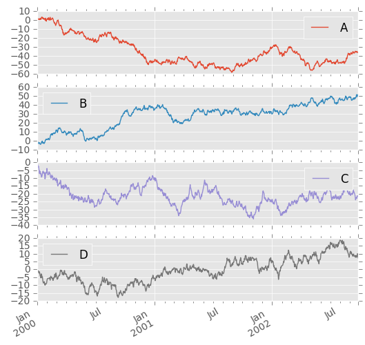
Subplots
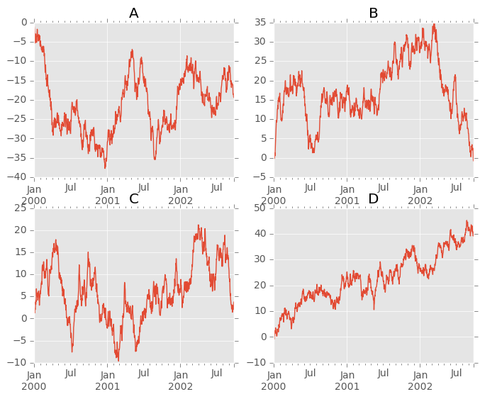
Each Series in a DataFrame can be plotted on a different axis with the subplots keyword:
In [127]: df.plot(subplots=True, figsize=(6, 6));
Using Layout and Targetting Multiple Axes
The layout of subplots can be specified by layout keyword. It can accept (rows, columns). The layout keyword can be used in hist and boxplot also. If input is invalid, ValueError will be raised.
The number of axes which can be contained by rows x columns specified by layout must be larger than the number of required subplots. If layout can contain more axes than required, blank axes are not drawn. Similar to a numpy array’s reshape method, you can use -1 for one dimension to automatically calculate the number of rows or columns needed, given the other.
In [128]: df.plot(subplots=True, layout=(2, 3), figsize=(6, 6), sharex=False);
The above example is identical to using
In [129]: df.plot(subplots=True, layout=(2, -1), figsize=(6, 6), sharex=False);
The required number of columns (3) is inferred from the number of series to plot and the given number of rows (2).
Also, you can pass multiple axes created beforehand as list-like via ax keyword. This allows to use more complicated layout. The passed axes must be the same number as the subplots being drawn.
When multiple axes are passed via ax keyword, layout, sharex and sharey keywords don’t affect to the output. You should explicitly pass sharex=False and sharey=False, otherwise you will see a warning.
In [130]: fig, axes = plt.subplots(4, 4, figsize=(6, 6));

In [131]: plt.subplots_adjust(wspace=0.5, hspace=0.5);

In [132]: target1 = [axes[0][0], axes[1][1], axes[2][2], axes[3][3]]

In [133]: target2 = [axes[3][0], axes[2][1], axes[1][2], axes[0][3]]

In [134]: df.plot(subplots=True, ax=target1, legend=False, sharex=False, sharey=False);

In [135]: (-df).plot(subplots=True, ax=target2, legend=False, sharex=False, sharey=False);
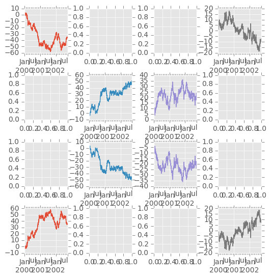
Another option is passing an ax argument to Series.plot() to plot on a particular axis:
In [136]: fig, axes = plt.subplots(nrows=2, ncols=2)

In [137]: df['A'].plot(ax=axes[0,0]); axes[0,0].set_title('A');

In [138]: df['B'].plot(ax=axes[0,1]); axes[0,1].set_title('B');

In [139]: df['C'].plot(ax=axes[1,0]); axes[1,0].set_title('C');

In [140]: df['D'].plot(ax=axes[1,1]); axes[1,1].set_title('D');
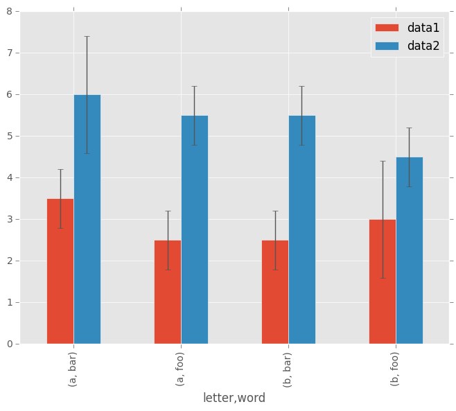
Plotting With Error Bars
New in version 0.14.
Plotting with error bars is now supported in the DataFrame.plot() and Series.plot()
Horizontal and vertical errorbars can be supplied to the xerr and yerr keyword arguments to plot(). The error values can be specified using a variety of formats.
- As a DataFrame or dict of errors with column names matching the columns attribute of the plotting DataFrame or matching the name attribute of the Series
- As a str indicating which of the columns of plotting DataFrame contain the error values
- As raw values (list, tuple, or np.ndarray). Must be the same length as the plotting DataFrame/Series
Asymmetrical error bars are also supported, however raw error values must be provided in this case. For a M length Series, a Mx2 array should be provided indicating lower and upper (or left and right) errors. For a MxN DataFrame, asymmetrical errors should be in a Mx2xN array.
Here is an example of one way to easily plot group means with standard deviations from the raw data.
# Generate the data
In [141]: ix3 = pd.MultiIndex.from_arrays([['a', 'a', 'a', 'a', 'b', 'b', 'b', 'b'], ['foo', 'foo', 'bar', 'bar', 'foo', 'foo', 'bar', 'bar']], names=['letter', 'word'])

In [142]: df3 = pd.DataFrame({'data1': [3, 2, 4, 3, 2, 4, 3, 2], 'data2': [6, 5, 7, 5, 4, 5, 6, 5]}, index=ix3)

# Group by index labels and take the means and standard deviations for each group
In [143]: gp3 = df3.groupby(level=('letter', 'word'))

In [144]: means = gp3.mean()

In [145]: errors = gp3.std()

In [146]: means
Out[146]:
             data1  data2
letter word
a      bar     3.5    6.0
       foo     2.5    5.5
b      bar     2.5    5.5
       foo     3.0    4.5

In [147]: errors
Out[147]:
                data1     data2
letter word
a      bar   0.707107  1.414214
       foo   0.707107  0.707107
b      bar   0.707107  0.707107
       foo   1.414214  0.707107

# Plot
In [148]: fig, ax = plt.subplots()

In [149]: means.plot(yerr=errors, ax=ax, kind='bar')
Out[149]: <matplotlib.axes._subplots.AxesSubplot at 0x9ad6050c>
Plotting Tables
New in version 0.14.
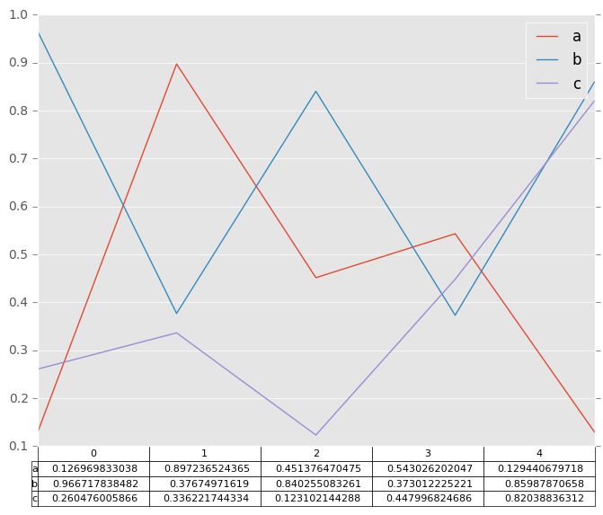
Plotting with matplotlib table is now supported in DataFrame.plot() and Series.plot() with a table keyword. The table keyword can accept bool, DataFrame or Series. The simple way to draw a table is to specify table=True. Data will be transposed to meet matplotlib’s default layout.
In [150]: fig, ax = plt.subplots(1, 1)

In [151]: df = pd.DataFrame(np.random.rand(5, 3), columns=['a', 'b', 'c'])

In [152]: ax.get_xaxis().set_visible(False)   # Hide Ticks

In [153]: df.plot(table=True, ax=ax)
Out[153]: <matplotlib.axes._subplots.AxesSubplot at 0x9959708c>
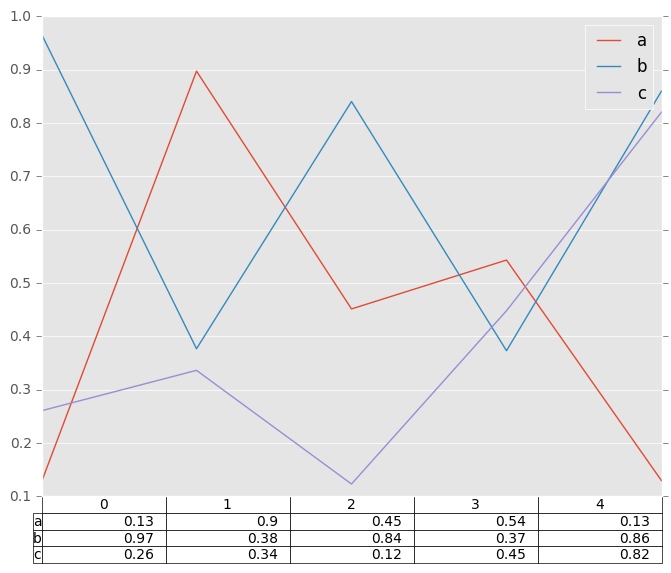
Also, you can pass different DataFrame or Series for table keyword. The data will be drawn as displayed in print method (not transposed automatically). If required, it should be transposed manually as below example.
In [154]: fig, ax = plt.subplots(1, 1)

In [155]: ax.get_xaxis().set_visible(False)   # Hide Ticks

In [156]: df.plot(table=np.round(df.T, 2), ax=ax)
Out[156]: <matplotlib.axes._subplots.AxesSubplot at 0x9aec176c>
Finally, there is a helper function pandas.tools.plotting.table to create a table from DataFrame and Series, and add it to an matplotlib.Axes. This function can accept keywords which matplotlib table has.
In [157]: from pandas.tools.plotting import table

In [158]: fig, ax = plt.subplots(1, 1)

In [159]: table(ax, np.round(df.describe(), 2),
   .....:       loc='upper right', colWidths=[0.2, 0.2, 0.2])
   .....:
Out[159]: <matplotlib.table.Table at 0x968bda6c>

In [160]: df.plot(ax=ax, ylim=(0, 2), legend=None)
Out[160]: <matplotlib.axes._subplots.AxesSubplot at 0x9d7ef38c>
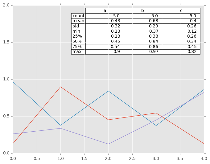
Note: You can get table instances on the axes using axes.tables property for further decorations. See the matplotlib table documentation for more.
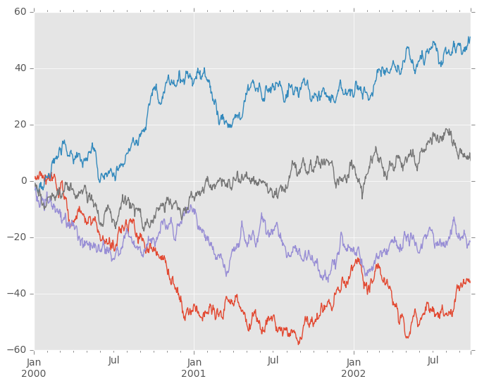
Colormaps
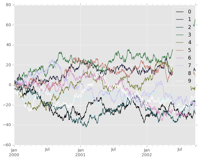
A potential issue when plotting a large number of columns is that it can be difficult to distinguish some series due to repetition in the default colors. To remedy this, DataFrame plotting supports the use of the colormap= argument, which accepts either a Matplotlib colormap or a string that is a name of a colormap registered with Matplotlib. A visualization of the default matplotlib colormaps is available here.
As matplotlib does not directly support colormaps for line-based plots, the colors are selected based on an even spacing determined by the number of columns in the DataFrame. There is no consideration made for background color, so some colormaps will produce lines that are not easily visible.
To use the cubehelix colormap, we can simply pass 'cubehelix' to colormap=
In [161]: df = pd.DataFrame(np.random.randn(1000, 10), index=ts.index)

In [162]: df = df.cumsum()

In [163]: plt.figure()
Out[163]: <matplotlib.figure.Figure at 0x9689b7ec>

In [164]: df.plot(colormap='cubehelix')
Out[164]: <matplotlib.axes._subplots.AxesSubplot at 0x9689f62c>
or we can pass the colormap itself
In [165]: from matplotlib import cm

In [166]: plt.figure()
Out[166]: <matplotlib.figure.Figure at 0x967a2c8c>

In [167]: df.plot(colormap=cm.cubehelix)
Out[167]: <matplotlib.axes._subplots.AxesSubplot at 0x9679758c>

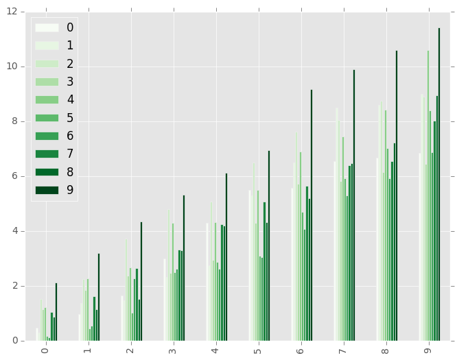
Colormaps can also be used other plot types, like bar charts:
In [168]: dd = pd.DataFrame(np.random.randn(10, 10)).applymap(abs)

In [169]: dd = dd.cumsum()

In [170]: plt.figure()
Out[170]: <matplotlib.figure.Figure at 0x96507f4c>

In [171]: dd.plot(kind='bar', colormap='Greens')
Out[171]: <matplotlib.axes._subplots.AxesSubplot at 0x964eeccc>
Parallel coordinates charts:
In [172]: plt.figure()
Out[172]: <matplotlib.figure.Figure at 0x963f104c>

In [173]: parallel_coordinates(data, 'Name', colormap='gist_rainbow')
Out[173]: <matplotlib.axes._subplots.AxesSubplot at 0x9607eecc>
Andrews curves charts:
In [174]: plt.figure()
Out[174]: <matplotlib.figure.Figure at 0x95c94e6c>

In [175]: andrews_curves(data, 'Name', colormap='winter')
Out[175]: <matplotlib.axes._subplots.AxesSubplot at 0x95c9474c>
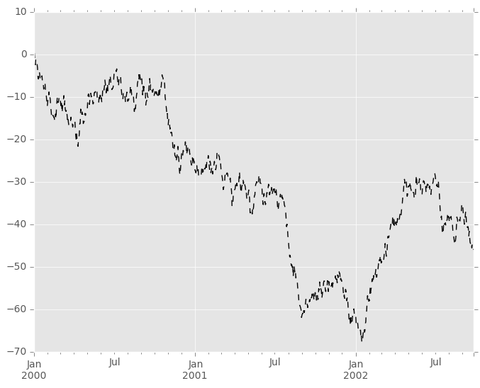
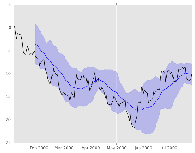
Plotting directly with matplotlib
In some situations it may still be preferable or necessary to prepare plots directly with matplotlib, for instance when a certain type of plot or customization is not (yet) supported by pandas. Series and DataFrame objects behave like arrays and can therefore be passed directly to matplotlib functions without explicit casts.
pandas also automatically registers formatters and locators that recognize date indices, thereby extending date and time support to practically all plot types available in matplotlib. Although this formatting does not provide the same level of refinement you would get when plotting via pandas, it can be faster when plotting a large number of points.
Note
The speed up for large data sets only applies to pandas 0.14.0 and later.
In [176]: price = pd.Series(np.random.randn(150).cumsum(),
   .....:                   index=pd.date_range('2000-1-1', periods=150, freq='B'))
   .....:

In [177]: ma = pd.rolling_mean(price, 20)

In [178]: mstd = pd.rolling_std(price, 20)

In [179]: plt.figure()
Out[179]: <matplotlib.figure.Figure at 0x9591d54c>

In [180]: plt.plot(price.index, price, 'k')
Out[180]: [<matplotlib.lines.Line2D at 0x95938cac>]

In [181]: plt.plot(ma.index, ma, 'b')
Out[181]: [<matplotlib.lines.Line2D at 0x958dbaac>]

In [182]: plt.fill_between(mstd.index, ma-2*mstd, ma+2*mstd, color='b', alpha=0.2)
Out[182]: <matplotlib.collections.PolyCollection at 0x958e21cc>
Trellis plotting interface
Warning
The rplot trellis plotting interface is deprecated and will be removed in a future version. We refer to external packages like seaborn for similar but more refined functionality.
The docs below include some example on how to convert your existing code to seaborn.
Note
The tips data set can be downloaded here. Once you download it execute
tips_data = pd.read_csv('tips.csv')
from the directory where you downloaded the file.
We import the rplot API:
In [183]: import pandas.tools.rplot as rplot
Examples
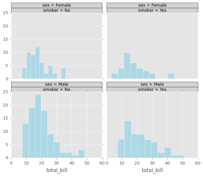
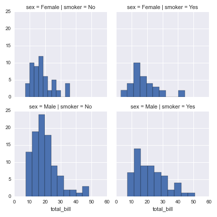
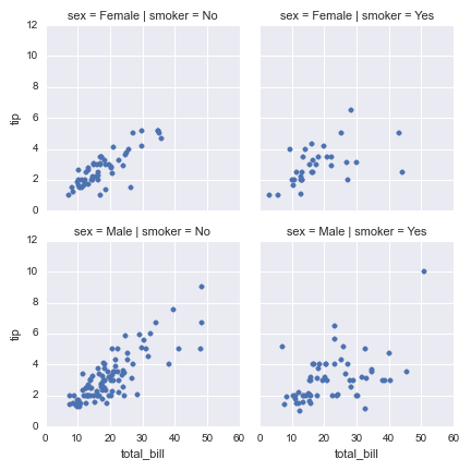
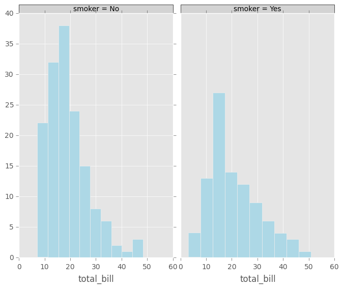
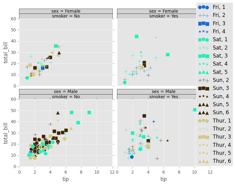
RPlot was an API for producing Trellis plots. These plots allow you toµ arrange data in a rectangular grid by values of certain attributes. In the example below, data from the tips data set is arranged by the attributes ‘sex’ and ‘smoker’. Since both of those attributes can take on one of two values, the resulting grid has two columns and two rows. A histogram is displayed for each cell of the grid.
In [184]: plt.figure()
Out[184]: <matplotlib.figure.Figure at 0x9590982c>

In [185]: plot = rplot.RPlot(tips_data, x='total_bill', y='tip')

In [186]: plot.add(rplot.TrellisGrid(['sex', 'smoker']))

In [187]: plot.add(rplot.GeomHistogram())

In [188]: plot.render(plt.gcf())
Out[188]: <matplotlib.figure.Figure at 0x9590982c>
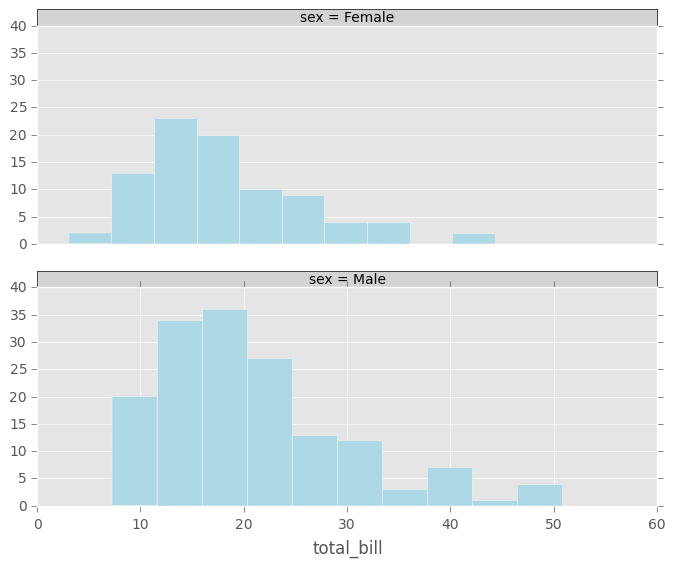
A similar plot can be made with seaborn using the FacetGrid object, resulting in the following image:
import seaborn as sns
g = sns.FacetGrid(tips_data, row="sex", col="smoker")
g.map(plt.hist, "total_bill")
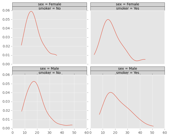
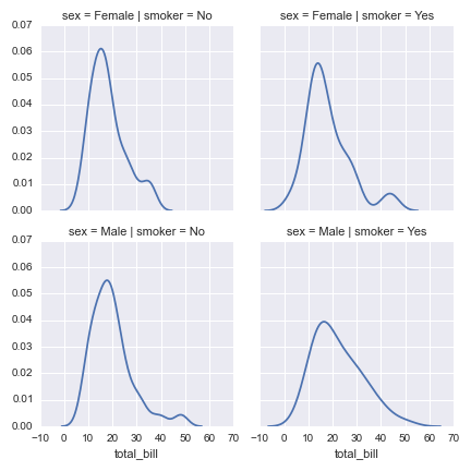
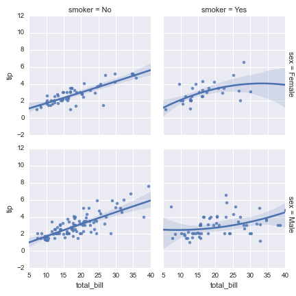
Example below is the same as previous except the plot is set to kernel density estimation. A seaborn example is included beneath.
In [189]: plt.figure()
Out[189]: <matplotlib.figure.Figure at 0x955cf62c>

In [190]: plot = rplot.RPlot(tips_data, x='total_bill', y='tip')

In [191]: plot.add(rplot.TrellisGrid(['sex', 'smoker']))

In [192]: plot.add(rplot.GeomDensity())

In [193]: plot.render(plt.gcf())
Out[193]: <matplotlib.figure.Figure at 0x955cf62c>
g = sns.FacetGrid(tips_data, row="sex", col="smoker")
g.map(sns.kdeplot, "total_bill")
The plot below shows that it is possible to have two or more plots for the same data displayed on the same Trellis grid cell.
In [194]: plt.figure()
Out[194]: <matplotlib.figure.Figure at 0x952166ac>

In [195]: plot = rplot.RPlot(tips_data, x='total_bill', y='tip')

In [196]: plot.add(rplot.TrellisGrid(['sex', 'smoker']))

In [197]: plot.add(rplot.GeomScatter())

In [198]: plot.add(rplot.GeomPolyFit(degree=2))

In [199]: plot.render(plt.gcf())
Out[199]: <matplotlib.figure.Figure at 0x952166ac>
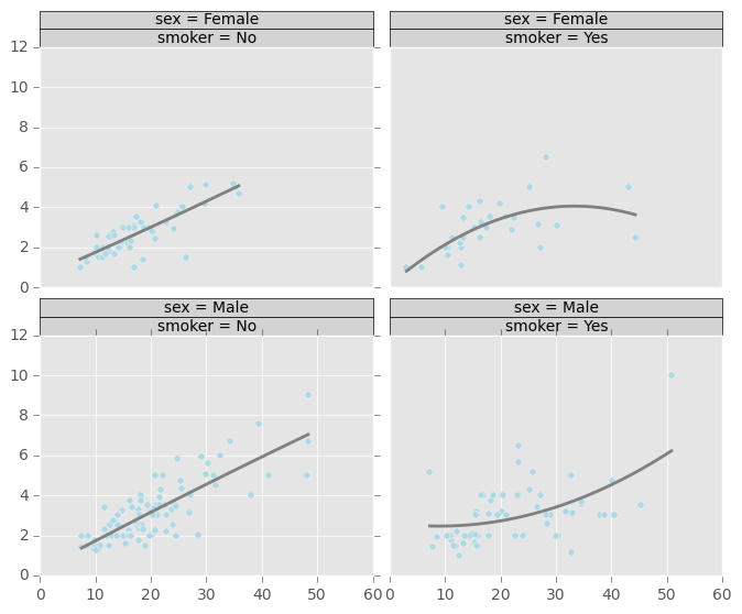
A seaborn equivalent for a simple scatter plot:
g = sns.FacetGrid(tips_data, row="sex", col="smoker")
g.map(plt.scatter, "total_bill", "tip")
and with a regression line, using the dedicated seaborn regplot function:
g = sns.FacetGrid(tips_data, row="sex", col="smoker", margin_titles=True)
g.map(sns.regplot, "total_bill", "tip", order=2)
Below is a similar plot but with 2D kernel density estimation plot superimposed, followed by a seaborn equivalent:
In [200]: plt.figure()
Out[200]: <matplotlib.figure.Figure at 0x94ebebec>

In [201]: plot = rplot.RPlot(tips_data, x='total_bill', y='tip')

In [202]: plot.add(rplot.TrellisGrid(['sex', 'smoker']))

In [203]: plot.add(rplot.GeomScatter())

In [204]: plot.add(rplot.GeomDensity2D())

In [205]: plot.render(plt.gcf())
Out[205]: <matplotlib.figure.Figure at 0x94ebebec>
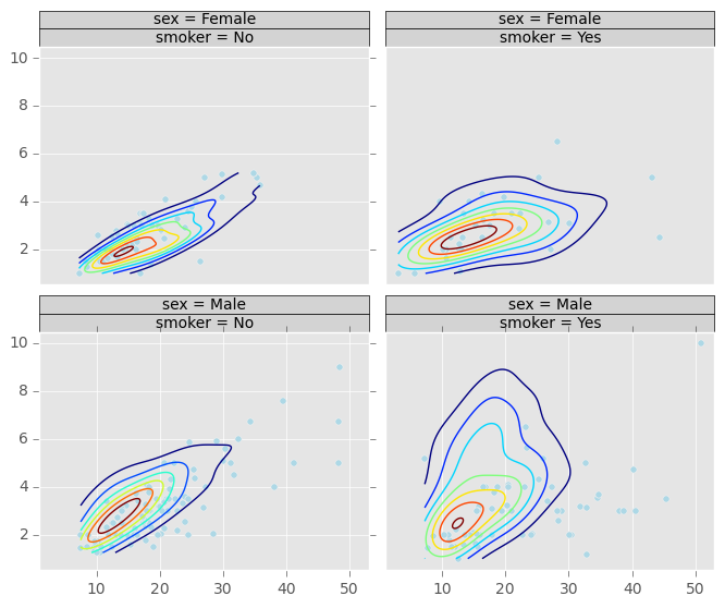
g = sns.FacetGrid(tips_data, row="sex", col="smoker")
g.map(plt.scatter, "total_bill", "tip")
g.map(sns.kdeplot, "total_bill", "tip")
It is possible to only use one attribute for grouping data. The example above only uses ‘sex’ attribute. If the second grouping attribute is not specified, the plots will be arranged in a column.
In [206]: plt.figure()
Out[206]: <matplotlib.figure.Figure at 0x94b528ac>

In [207]: plot = rplot.RPlot(tips_data, x='total_bill', y='tip')

In [208]: plot.add(rplot.TrellisGrid(['sex', '.']))

In [209]: plot.add(rplot.GeomHistogram())

In [210]: plot.render(plt.gcf())
Out[210]: <matplotlib.figure.Figure at 0x94b528ac>
If the first grouping attribute is not specified the plots will be arranged in a row.
In [211]: plt.figure()
Out[211]: <matplotlib.figure.Figure at 0x94b9ddac>

In [212]: plot = rplot.RPlot(tips_data, x='total_bill', y='tip')

In [213]: plot.add(rplot.TrellisGrid(['.', 'smoker']))

In [214]: plot.add(rplot.GeomHistogram())

In [215]: plot.render(plt.gcf())
Out[215]: <matplotlib.figure.Figure at 0x94b9ddac>
In seaborn, this can also be done by only specifying one of the row and col arguments.
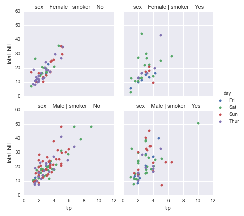
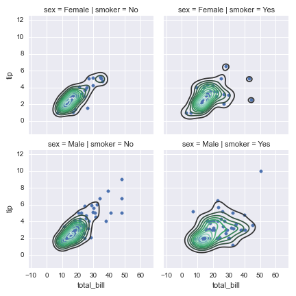
In the example below the colour and shape of the scatter plot graphical objects is mapped to ‘day’ and ‘size’ attributes respectively. You use scale objects to specify these mappings. The list of scale classes is given below with initialization arguments for quick reference.
In [216]: plt.figure()
Out[216]: <matplotlib.figure.Figure at 0x94ee56ac>

In [217]: plot = rplot.RPlot(tips_data, x='tip', y='total_bill')

In [218]: plot.add(rplot.TrellisGrid(['sex', 'smoker']))

In [219]: plot.add(rplot.GeomPoint(size=80.0, colour=rplot.ScaleRandomColour('day'), shape=rplot.ScaleShape('size'), alpha=1.0))

In [220]: plot.render(plt.gcf())
Out[220]: <matplotlib.figure.Figure at 0x94ee56ac>
This can also be done in seaborn, at least for 3 variables:
g = sns.FacetGrid(tips_data, row="sex", col="smoker", hue="day")
g.map(plt.scatter, "tip", "total_bill")
g.add_legend()