Plotting with matplotlib
Note
We intend to build more plotting integration with matplotlib as time goes on.
We use the standard convention for referencing the matplotlib API:
In [888]: import matplotlib.pyplot as plt
Basic plotting: plot
The plot method on Series and DataFrame is just a simple wrapper around plt.plot:
In [889]: ts = Series(randn(1000), index=DateRange('1/1/2000', periods=1000))

In [890]: ts = ts.cumsum()

In [891]: ts.plot()
Out[891]: <matplotlib.axes.AxesSubplot at 0x115ba4410>
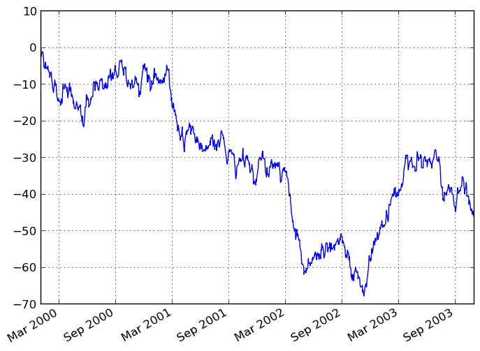
If the index consists of dates, it calls gca().autofmt_xdate() to try to format the x-axis nicely as per above. The method takes a number of arguments for controlling the look of the plot:
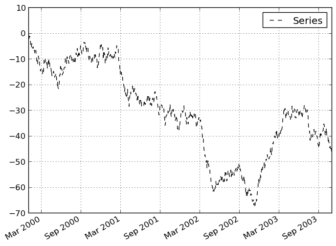
In [892]: plt.figure(); ts.plot(style='k--', label='Series'); plt.legend()
Out[892]: <matplotlib.legend.Legend at 0x115c07650>
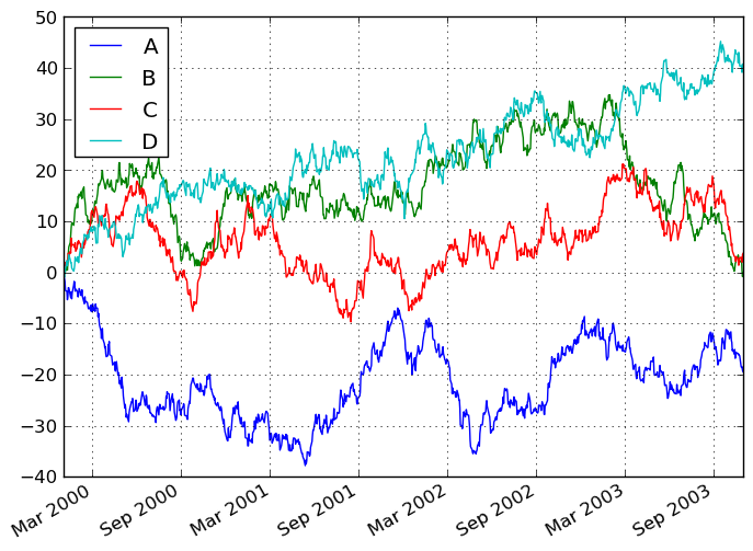
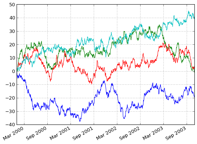
On DataFrame, plot is a convenience to plot all of the columns with labels:
In [893]: df = DataFrame(randn(1000, 4), index=ts.index,
   .....:                columns=['A', 'B', 'C', 'D'])

In [894]: df = df.cumsum()

In [895]: plt.figure(); df.plot(); plt.legend(loc='best')
Out[895]: <matplotlib.legend.Legend at 0x115aab890>
You may set the legend argument to False to hide the legend, which is shown by default.
In [896]: df.plot(legend=False)
Out[896]: <matplotlib.axes.AxesSubplot at 0x115a69a90>
Some other options are available, like plotting each Series on a different axis:
In [897]: df.plot(subplots=True, figsize=(8, 8)); plt.legend(loc='best')
Out[897]: <matplotlib.legend.Legend at 0x115acd110>
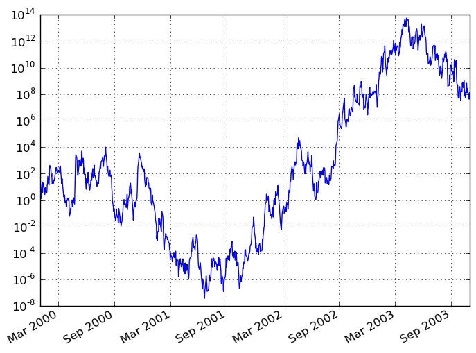
You may pass logy to get a log-scale Y axis.
In [898]: plt.figure();
In [898]: ts = Series(randn(1000), index=DateRange('1/1/2000', periods=1000))

In [899]: ts = np.exp(ts.cumsum())

In [900]: ts.plot(logy=True)
Out[900]: <matplotlib.axes.AxesSubplot at 0x11970f990>
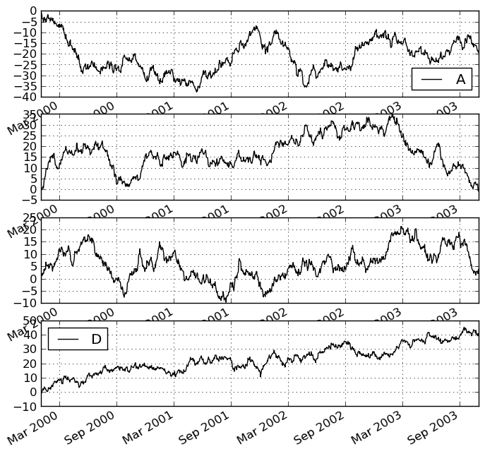
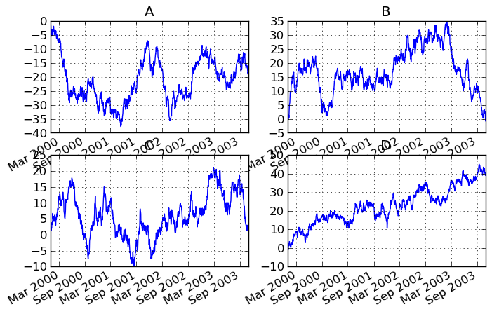
Targeting different subplots
You can pass an ax argument to Series.plot to plot on a particular axis:
In [901]: fig, axes = plt.subplots(nrows=2, ncols=2, figsize=(8, 5))

In [902]: df['A'].plot(ax=axes[0,0]); axes[0,0].set_title('A')
Out[902]: <matplotlib.text.Text at 0x11ae83a10>

In [903]: df['B'].plot(ax=axes[0,1]); axes[0,1].set_title('B')
Out[903]: <matplotlib.text.Text at 0x11babee50>

In [904]: df['C'].plot(ax=axes[1,0]); axes[1,0].set_title('C')
Out[904]: <matplotlib.text.Text at 0x11bad6e90>

In [905]: df['D'].plot(ax=axes[1,1]); axes[1,1].set_title('D')
Out[905]: <matplotlib.text.Text at 0x11bad8350>
Other plotting features
Bar plots
For labeled, non-time series data, you may wish to produce a bar plot:
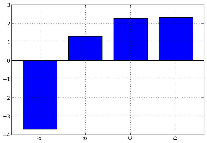
In [906]: plt.figure();
In [906]: df.ix[5].plot(kind='bar'); plt.axhline(0, color='k')
Out[906]: <matplotlib.lines.Line2D at 0x1197d3710>
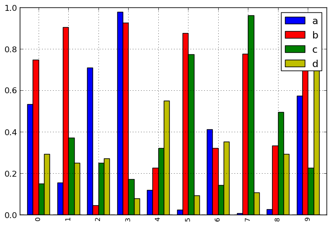
Calling a DataFrame’s plot method with kind='bar' produces a multiple bar plot:
In [907]: df2 = DataFrame(np.random.rand(10, 4), columns=['a', 'b', 'c', 'd'])

In [908]: df2.plot(kind='bar');
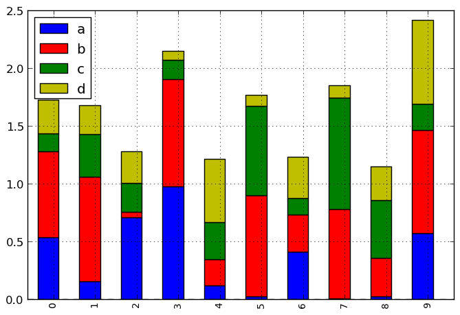
To produce a stacked bar plot, pass stacked=True:
In [908]: df2.plot(kind='bar', stacked=True);
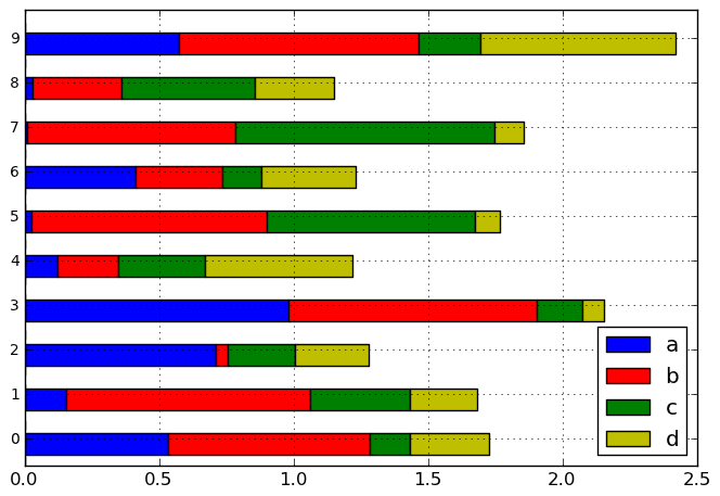
To get horizontal bar plots, pass kind='barh':
In [908]: df2.plot(kind='barh', stacked=True);
Histograms
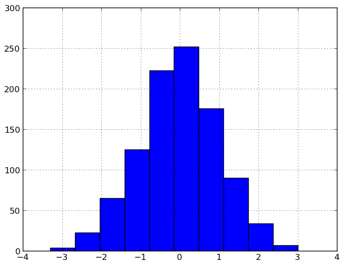
In [908]: plt.figure();
In [908]: df['A'].diff().hist()
Out[908]: <matplotlib.axes.AxesSubplot at 0x11ba46910>
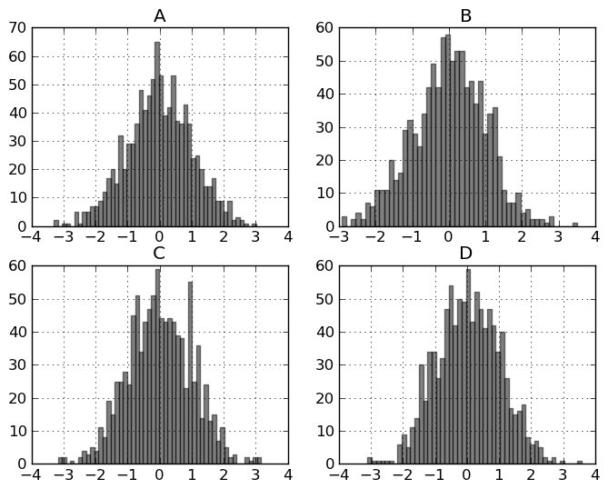
For a DataFrame, hist plots the histograms of the columns on multiple subplots:
In [909]: plt.figure()
Out[909]: <matplotlib.figure.Figure at 0x11c05bb50>

In [910]: df.diff().hist(color='k', alpha=0.5, bins=50)
Out[910]:
array([[Axes(0.125,0.536364;0.352273x0.363636),
        Axes(0.547727,0.536364;0.352273x0.363636)],
       [Axes(0.125,0.1;0.352273x0.363636),
        Axes(0.547727,0.1;0.352273x0.363636)]], dtype=object)
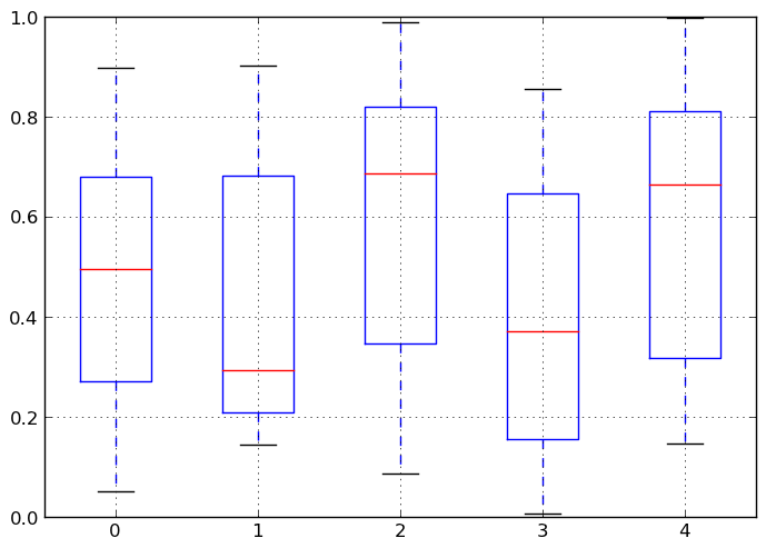
Box-Plotting
DataFrame has a boxplot method which allows you to visualize the distribution of values within each column.
For instance, here is a boxplot representing five trials of 10 observations of a uniform random variable on [0,1).
In [911]: df = DataFrame(np.random.rand(10,5))

In [912]: plt.figure();
In [912]: bp = df.boxplot()
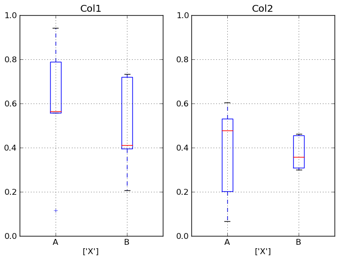
You can create a stratified boxplot using the by keyword argument to create groupings. For instance,
In [913]: df = DataFrame(np.random.rand(10,2), columns=['Col1', 'Col2'] )

In [914]: df['X'] = Series(['A','A','A','A','A','B','B','B','B','B'])

In [915]: plt.figure();
In [915]: bp = df.boxplot(by='X')
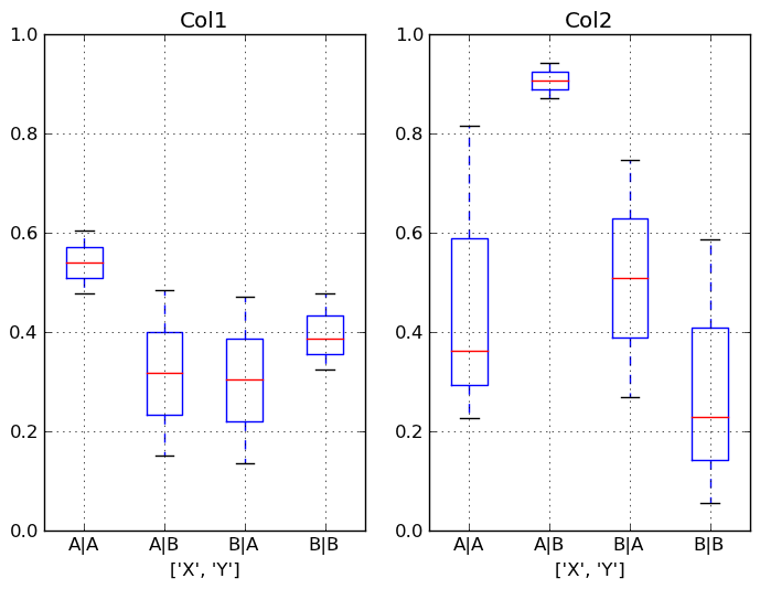
You can also pass a subset of columns to plot, as well as group by multiple columns:
In [916]: df = DataFrame(np.random.rand(10,3), columns=['Col1', 'Col2', 'Col3'])

In [917]: df['X'] = Series(['A','A','A','A','A','B','B','B','B','B'])

In [918]: df['Y'] = Series(['A','B','A','B','A','B','A','B','A','B'])

In [919]: plt.figure();
In [919]: bp = df.boxplot(column=['Col1','Col2'], by=['X','Y'])
Scatter plot matrix
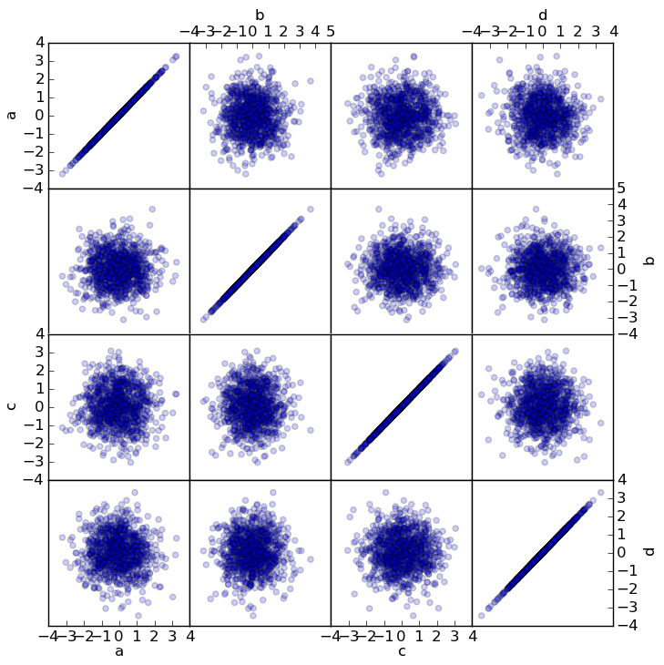
- New in 0.7.3. You can create a scatter plot matrix using the
- scatter_matrix method in pandas.tools.plotting:
In [920]: from pandas.tools.plotting import scatter_matrix

In [921]: df = DataFrame(np.random.randn(1000, 4), columns=['a', 'b', 'c', 'd'])

In [922]: scatter_matrix(df, alpha=0.2, figsize=(8, 8))
Out[922]:
array([[Axes(0.125,0.7;0.19375x0.2), Axes(0.31875,0.7;0.19375x0.2),
        Axes(0.5125,0.7;0.19375x0.2), Axes(0.70625,0.7;0.19375x0.2)],
       [Axes(0.125,0.5;0.19375x0.2), Axes(0.31875,0.5;0.19375x0.2),
        Axes(0.5125,0.5;0.19375x0.2), Axes(0.70625,0.5;0.19375x0.2)],
       [Axes(0.125,0.3;0.19375x0.2), Axes(0.31875,0.3;0.19375x0.2),
        Axes(0.5125,0.3;0.19375x0.2), Axes(0.70625,0.3;0.19375x0.2)],
       [Axes(0.125,0.1;0.19375x0.2), Axes(0.31875,0.1;0.19375x0.2),
        Axes(0.5125,0.1;0.19375x0.2), Axes(0.70625,0.1;0.19375x0.2)]], dtype=object)