pandas.plotting.autocorrelation_plot#
- pandas.plotting.autocorrelation_plot(series, ax=None, **kwargs)[source]#
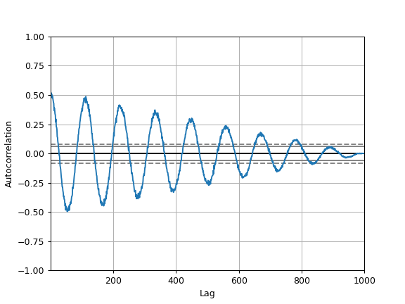
Autocorrelation plot for time series.
This method generates an autocorrelation plot for a given time series, which helps to identify any periodic structure or correlation within the data across various lags. It shows the correlation of a time series with a delayed copy of itself as a function of delay. Autocorrelation plots are useful for checking randomness in a data set. If the data are random, the autocorrelations should be near zero for any and all time-lag separations. If the data are not random, then one or more of the autocorrelations will be significantly non-zero.
- Parameters:
- seriesSeries
The time series to visualize.
- axMatplotlib axis object, optional
The matplotlib axis object to use.
- **kwargs
Options to pass to matplotlib plotting method.
- Returns:
- matplotlib.axes.Axes
The matplotlib axes containing the autocorrelation plot.
See also
Series.autocorrCompute the lag-N autocorrelation for a Series.
plotting.lag_plotLag plot for time series.
Examples
The horizontal lines in the plot correspond to 95% and 99% confidence bands.
The dashed line is 99% confidence band.
>>> spacing = np.linspace(-9 * np.pi, 9 * np.pi, num=1000)
>>> s = pd.Series(0.7 * np.random.rand(1000) + 0.3 * np.sin(spacing))
>>> pd.plotting.autocorrelation_plot(s)