Plotting with matplotlib
Note
We intend to build more plotting integration with matplotlib as time goes on.
We use the standard convention for referencing the matplotlib API:
In [1]: import matplotlib.pyplot as plt
Basic plotting: plot
See the cookbook for some advanced strategies
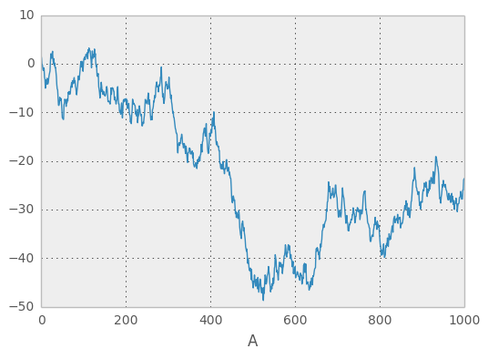
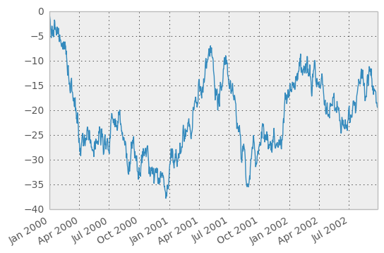
The plot method on Series and DataFrame is just a simple wrapper around plt.plot:
In [2]: ts = Series(randn(1000), index=date_range('1/1/2000', periods=1000))

In [3]: ts = ts.cumsum()

In [4]: ts.plot()
<matplotlib.axes.AxesSubplot at 0x927d490>
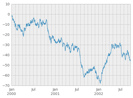
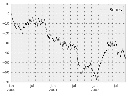
If the index consists of dates, it calls gcf().autofmt_xdate() to try to format the x-axis nicely as per above. The method takes a number of arguments for controlling the look of the plot:
In [5]: plt.figure(); ts.plot(style='k--', label='Series'); plt.legend()
<matplotlib.legend.Legend at 0x6832bd0>
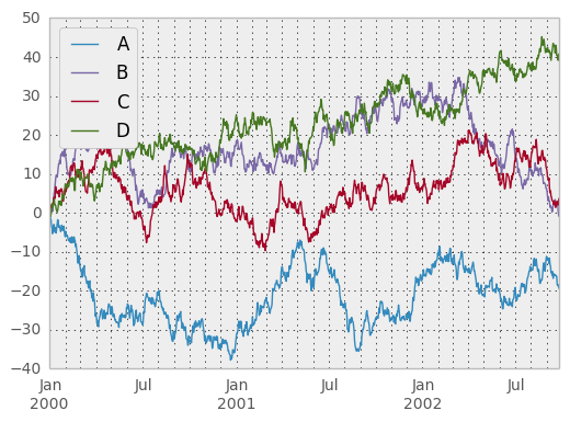
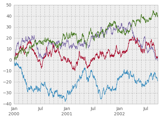
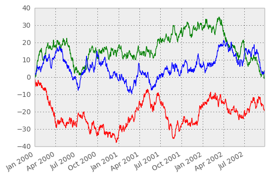
On DataFrame, plot is a convenience to plot all of the columns with labels:
In [6]: df = DataFrame(randn(1000, 4), index=ts.index, columns=list('ABCD'))

In [7]: df = df.cumsum()

In [8]: plt.figure(); df.plot(); plt.legend(loc='best')
<matplotlib.legend.Legend at 0x78d8b10>
You may set the legend argument to False to hide the legend, which is shown by default.
In [9]: df.plot(legend=False)
<matplotlib.axes.AxesSubplot at 0x78eca90>
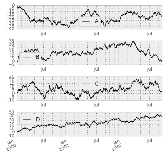
Some other options are available, like plotting each Series on a different axis:
In [10]: df.plot(subplots=True, figsize=(6, 6)); plt.legend(loc='best')
<matplotlib.legend.Legend at 0xaa1a810>
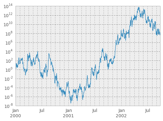
You may pass logy to get a log-scale Y axis.
In [11]: plt.figure();
In [11]: ts = Series(randn(1000), index=date_range('1/1/2000', periods=1000))

In [12]: ts = np.exp(ts.cumsum())

In [13]: ts.plot(logy=True)
<matplotlib.axes.AxesSubplot at 0x907da10>
You can plot one column versus another using the x and y keywords in DataFrame.plot:
In [14]: plt.figure()
<matplotlib.figure.Figure at 0x8de3450>

In [15]: df3 = DataFrame(randn(1000, 2), columns=['B', 'C']).cumsum()

In [16]: df3['A'] = Series(range(len(df)))

In [17]: df3.plot(x='A', y='B')
<matplotlib.axes.AxesSubplot at 0x879d850>
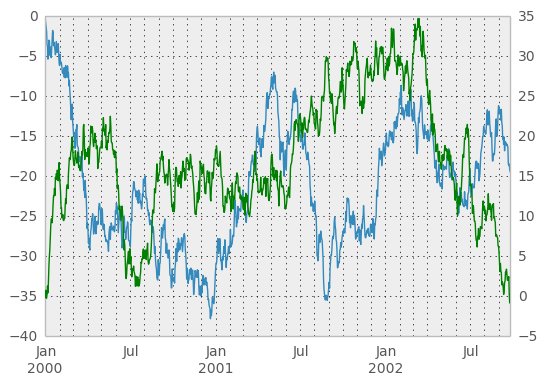
Plotting on a Secondary Y-axis
To plot data on a secondary y-axis, use the secondary_y keyword:
In [18]: plt.figure()
<matplotlib.figure.Figure at 0x75ea810>

In [19]: df.A.plot()
<matplotlib.axes.AxesSubplot at 0x7611190>

In [20]: df.B.plot(secondary_y=True, style='g')
<matplotlib.axes.AxesSubplot at 0x9c86510>
Selective Plotting on Secondary Y-axis
To plot some columns in a DataFrame, give the column names to the secondary_y keyword:
In [21]: plt.figure()
<matplotlib.figure.Figure at 0x907c950>

In [22]: ax = df.plot(secondary_y=['A', 'B'])

In [23]: ax.set_ylabel('CD scale')
<matplotlib.text.Text at 0x9c67290>

In [24]: ax.right_ax.set_ylabel('AB scale')
<matplotlib.text.Text at 0x9f449d0>
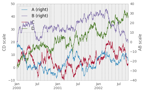
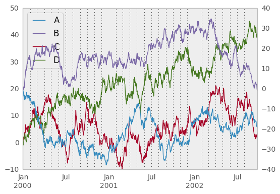
Note that the columns plotted on the secondary y-axis is automatically marked with “(right)” in the legend. To turn off the automatic marking, use the mark_right=False keyword:
In [25]: plt.figure()
<matplotlib.figure.Figure at 0x9c55290>

In [26]: df.plot(secondary_y=['A', 'B'], mark_right=False)
<matplotlib.axes.AxesSubplot at 0x961c790>
Suppressing tick resolution adjustment
Pandas includes automatically tick resolution adjustment for regular frequency time-series data. For limited cases where pandas cannot infer the frequency information (e.g., in an externally created twinx), you can choose to suppress this behavior for alignment purposes.
Here is the default behavior, notice how the x-axis tick labelling is performed:
In [27]: plt.figure()
<matplotlib.figure.Figure at 0x9617ad0>

In [28]: df.A.plot()
<matplotlib.axes.AxesSubplot at 0x961e210>
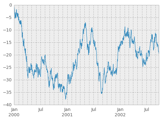
Using the x_compat parameter, you can suppress this behavior:
In [29]: plt.figure()
<matplotlib.figure.Figure at 0x9765ed0>

In [30]: df.A.plot(x_compat=True)
<matplotlib.axes.AxesSubplot at 0x9755f10>
If you have more than one plot that needs to be suppressed, the use method in pandas.plot_params can be used in a with statement:
In [31]: import pandas as pd

In [32]: plt.figure()
<matplotlib.figure.Figure at 0x8170ad0>

In [33]: with pd.plot_params.use('x_compat', True):
   ....:     df.A.plot(color='r')
   ....:     df.B.plot(color='g')
   ....:     df.C.plot(color='b')
   ....:
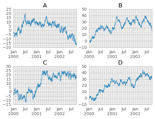
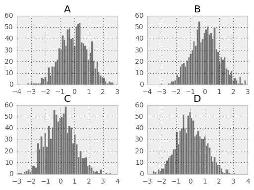
Targeting different subplots
You can pass an ax argument to Series.plot to plot on a particular axis:
In [34]: fig, axes = plt.subplots(nrows=2, ncols=2)

In [35]: df['A'].plot(ax=axes[0,0]); axes[0,0].set_title('A')
<matplotlib.text.Text at 0x987ac90>

In [36]: df['B'].plot(ax=axes[0,1]); axes[0,1].set_title('B')
<matplotlib.text.Text at 0x8a37850>

In [37]: df['C'].plot(ax=axes[1,0]); axes[1,0].set_title('C')
<matplotlib.text.Text at 0x81196d0>

In [38]: df['D'].plot(ax=axes[1,1]); axes[1,1].set_title('D')
<matplotlib.text.Text at 0x8106e90>
Other plotting features
Bar plots
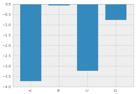
For labeled, non-time series data, you may wish to produce a bar plot:
In [39]: plt.figure();
In [39]: df.ix[5].plot(kind='bar'); plt.axhline(0, color='k')
<matplotlib.lines.Line2D at 0xc46aed0>
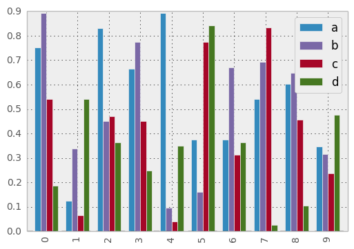
Calling a DataFrame’s plot method with kind='bar' produces a multiple bar plot:
In [40]: df2 = DataFrame(rand(10, 4), columns=['a', 'b', 'c', 'd'])

In [41]: df2.plot(kind='bar');
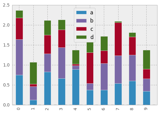
To produce a stacked bar plot, pass stacked=True:
In [41]: df2.plot(kind='bar', stacked=True);
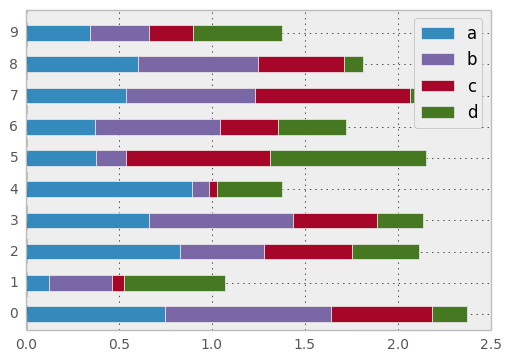
To get horizontal bar plots, pass kind='barh':
In [41]: df2.plot(kind='barh', stacked=True);
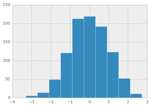
Histograms
In [41]: plt.figure();
In [41]: df['A'].diff().hist()
<matplotlib.axes.AxesSubplot at 0xd02fd50>
For a DataFrame, hist plots the histograms of the columns on multiple subplots:
In [42]: plt.figure()
<matplotlib.figure.Figure at 0xd438350>

In [43]: df.diff().hist(color='k', alpha=0.5, bins=50)

array([[<matplotlib.axes.AxesSubplot object at 0x8a29990>,
        <matplotlib.axes.AxesSubplot object at 0xd45a2d0>],
       [<matplotlib.axes.AxesSubplot object at 0xd805850>,
        <matplotlib.axes.AxesSubplot object at 0xd81ad10>]], dtype=object)
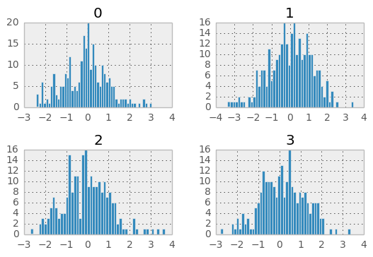
New since 0.10.0, the by keyword can be specified to plot grouped histograms:
In [44]: data = Series(randn(1000))

In [45]: data.hist(by=randint(0, 4, 1000), figsize=(6, 4))

array([[<matplotlib.axes.AxesSubplot object at 0xe1df790>,
        <matplotlib.axes.AxesSubplot object at 0xe0058d0>],
       [<matplotlib.axes.AxesSubplot object at 0xe01fbd0>,
        <matplotlib.axes.AxesSubplot object at 0xe5b6910>]], dtype=object)
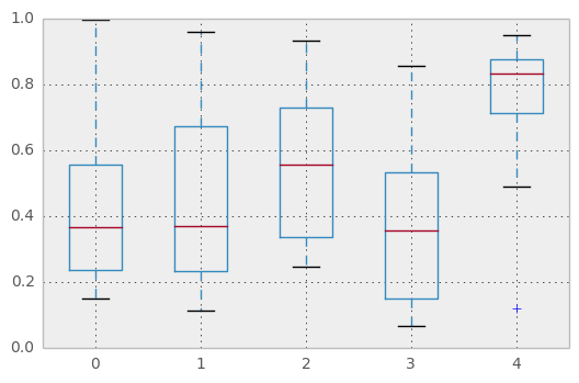
Box-Plotting
DataFrame has a boxplot method which allows you to visualize the distribution of values within each column.
For instance, here is a boxplot representing five trials of 10 observations of a uniform random variable on [0,1).
In [46]: df = DataFrame(rand(10,5))

In [47]: plt.figure();
In [47]: bp = df.boxplot()
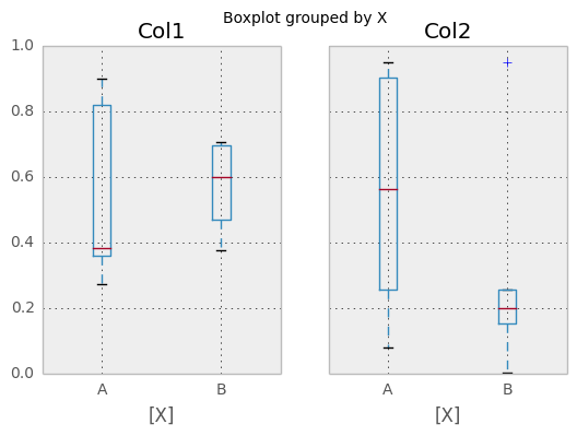
You can create a stratified boxplot using the by keyword argument to create groupings. For instance,
In [48]: df = DataFrame(rand(10,2), columns=['Col1', 'Col2'] )

In [49]: df['X'] = Series(['A','A','A','A','A','B','B','B','B','B'])

In [50]: plt.figure();
In [50]: bp = df.boxplot(by='X')
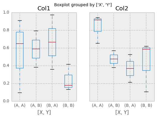
You can also pass a subset of columns to plot, as well as group by multiple columns:
In [51]: df = DataFrame(rand(10,3), columns=['Col1', 'Col2', 'Col3'])

In [52]: df['X'] = Series(['A','A','A','A','A','B','B','B','B','B'])

In [53]: df['Y'] = Series(['A','B','A','B','A','B','A','B','A','B'])

In [54]: plt.figure();
In [54]: bp = df.boxplot(column=['Col1','Col2'], by=['X','Y'])
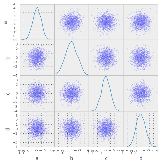
Scatter plot matrix
- New in 0.7.3. You can create a scatter plot matrix using the
- scatter_matrix method in pandas.tools.plotting:
In [55]: from pandas.tools.plotting import scatter_matrix

In [56]: df = DataFrame(randn(1000, 4), columns=['a', 'b', 'c', 'd'])

In [57]: scatter_matrix(df, alpha=0.2, figsize=(6, 6), diagonal='kde')

array([[<matplotlib.axes.AxesSubplot object at 0xfc5dfd0>,
        <matplotlib.axes.AxesSubplot object at 0xfbd9050>,
        <matplotlib.axes.AxesSubplot object at 0xfbfe5d0>,
        <matplotlib.axes.AxesSubplot object at 0xff2c4d0>],
       [<matplotlib.axes.AxesSubplot object at 0xff4edd0>,
        <matplotlib.axes.AxesSubplot object at 0x100a1910>,
        <matplotlib.axes.AxesSubplot object at 0x100d3610>,
        <matplotlib.axes.AxesSubplot object at 0x1022cbd0>],
       [<matplotlib.axes.AxesSubplot object at 0x10240f90>,
        <matplotlib.axes.AxesSubplot object at 0x103b78d0>,
        <matplotlib.axes.AxesSubplot object at 0x10519050>,
        <matplotlib.axes.AxesSubplot object at 0x10532d50>],
       [<matplotlib.axes.AxesSubplot object at 0x1069a910>,
        <matplotlib.axes.AxesSubplot object at 0x10543090>,
        <matplotlib.axes.AxesSubplot object at 0x10824310>,
        <matplotlib.axes.AxesSubplot object at 0x1084b7d0>]], dtype=object)
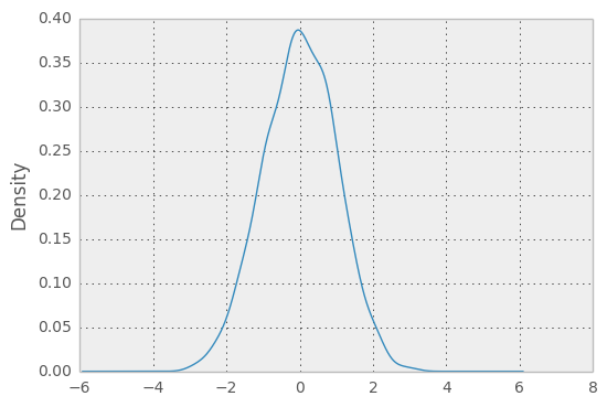
New in 0.8.0 You can create density plots using the Series/DataFrame.plot and setting kind=’kde’:
In [58]: ser = Series(randn(1000))

In [59]: ser.plot(kind='kde')
<matplotlib.axes.AxesSubplot at 0x10b1eb50>
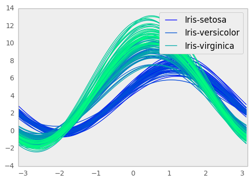
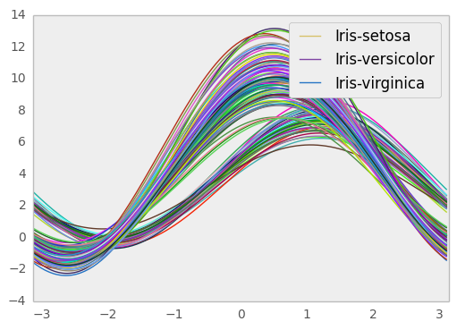
Andrews Curves
Andrews curves allow one to plot multivariate data as a large number of curves that are created using the attributes of samples as coefficients for Fourier series. By coloring these curves differently for each class it is possible to visualize data clustering. Curves belonging to samples of the same class will usually be closer together and form larger structures.
Note: The “Iris” dataset is available here.
In [60]: from pandas import read_csv

In [61]: from pandas.tools.plotting import andrews_curves

In [62]: data = read_csv('data/iris.data')

In [63]: plt.figure()
<matplotlib.figure.Figure at 0x9f6a090>

In [64]: andrews_curves(data, 'Name')
<matplotlib.axes.AxesSubplot at 0x9f6a690>
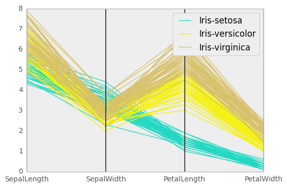
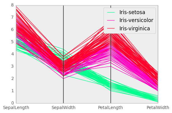
Parallel Coordinates
Parallel coordinates is a plotting technique for plotting multivariate data. It allows one to see clusters in data and to estimate other statistics visually. Using parallel coordinates points are represented as connected line segments. Each vertical line represents one attribute. One set of connected line segments represents one data point. Points that tend to cluster will appear closer together.
In [65]: from pandas import read_csv

In [66]: from pandas.tools.plotting import parallel_coordinates

In [67]: data = read_csv('data/iris.data')

In [68]: plt.figure()
<matplotlib.figure.Figure at 0x11b2e290>

In [69]: parallel_coordinates(data, 'Name')
<matplotlib.axes.AxesSubplot at 0x11b2ecd0>
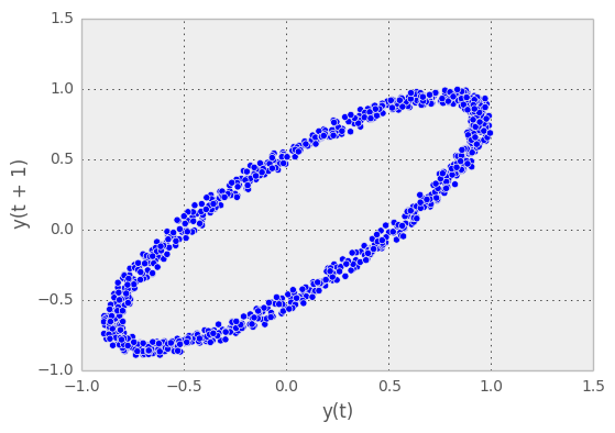
Lag Plot
Lag plots are used to check if a data set or time series is random. Random data should not exhibit any structure in the lag plot. Non-random structure implies that the underlying data are not random.
In [70]: from pandas.tools.plotting import lag_plot

In [71]: plt.figure()
<matplotlib.figure.Figure at 0x9f6ae10>

In [72]: data = Series(0.1 * rand(1000) +
   ....:    0.9 * np.sin(np.linspace(-99 * np.pi, 99 * np.pi, num=1000)))
   ....:

In [73]: lag_plot(data)
<matplotlib.axes.AxesSubplot at 0x123378d0>
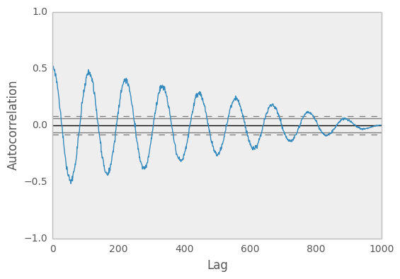
Autocorrelation Plot
Autocorrelation plots are often used for checking randomness in time series. This is done by computing autocorrelations for data values at varying time lags. If time series is random, such autocorrelations should be near zero for any and all time-lag separations. If time series is non-random then one or more of the autocorrelations will be significantly non-zero. The horizontal lines displayed in the plot correspond to 95% and 99% confidence bands. The dashed line is 99% confidence band.
In [74]: from pandas.tools.plotting import autocorrelation_plot

In [75]: plt.figure()
<matplotlib.figure.Figure at 0x1235e8d0>

In [76]: data = Series(0.7 * rand(1000) +
   ....:    0.3 * np.sin(np.linspace(-9 * np.pi, 9 * np.pi, num=1000)))
   ....:

In [77]: autocorrelation_plot(data)
<matplotlib.axes.AxesSubplot at 0x1235e6d0>
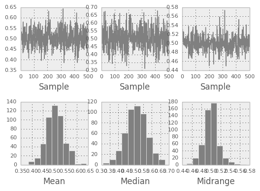
Bootstrap Plot
Bootstrap plots are used to visually assess the uncertainty of a statistic, such as mean, median, midrange, etc. A random subset of a specified size is selected from a data set, the statistic in question is computed for this subset and the process is repeated a specified number of times. Resulting plots and histograms are what constitutes the bootstrap plot.
In [78]: from pandas.tools.plotting import bootstrap_plot

In [79]: data = Series(rand(1000))

In [80]: bootstrap_plot(data, size=50, samples=500, color='grey')
<matplotlib.figure.Figure at 0x11a5bf90>
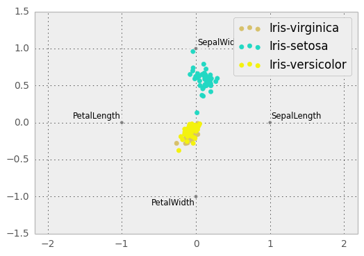
RadViz
RadViz is a way of visualizing multi-variate data. It is based on a simple spring tension minimization algorithm. Basically you set up a bunch of points in a plane. In our case they are equally spaced on a unit circle. Each point represents a single attribute. You then pretend that each sample in the data set is attached to each of these points by a spring, the stiffness of which is proportional to the numerical value of that attribute (they are normalized to unit interval). The point in the plane, where our sample settles to (where the forces acting on our sample are at an equilibrium) is where a dot representing our sample will be drawn. Depending on which class that sample belongs it will be colored differently.
Note: The “Iris” dataset is available here.
In [81]: from pandas import read_csv

In [82]: from pandas.tools.plotting import radviz

In [83]: data = read_csv('data/iris.data')

In [84]: plt.figure()
<matplotlib.figure.Figure at 0x12bf3cd0>

In [85]: radviz(data, 'Name')
<matplotlib.axes.AxesSubplot at 0x1233d350>
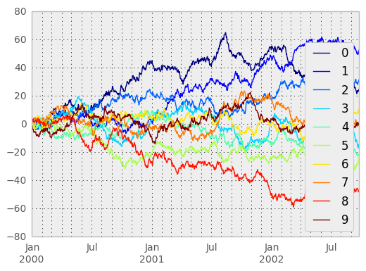
Colormaps
A potential issue when plotting a large number of columns is that it can be difficult to distinguish some series due to repetition in the default colors. To remedy this, DataFrame plotting supports the use of the colormap= argument, which accepts either a Matplotlib colormap or a string that is a name of a colormap registered with Matplotlib. A visualization of the default matplotlib colormaps is available here.
As matplotlib does not directly support colormaps for line-based plots, the colors are selected based on an even spacing determined by the number of columns in the DataFrame. There is no consideration made for background color, so some colormaps will produce lines that are not easily visible.
To use the jet colormap, we can simply pass 'jet' to colormap=
In [86]: df = DataFrame(randn(1000, 10), index=ts.index)

In [87]: df = df.cumsum()

In [88]: plt.figure()
<matplotlib.figure.Figure at 0x130f32d0>

In [89]: df.plot(colormap='jet')
<matplotlib.axes.AxesSubplot at 0x13107950>

or we can pass the colormap itself
In [90]: from matplotlib import cm

In [91]: plt.figure()
<matplotlib.figure.Figure at 0x130ff910>

In [92]: df.plot(colormap=cm.jet)
<matplotlib.axes.AxesSubplot at 0x13ae9950>
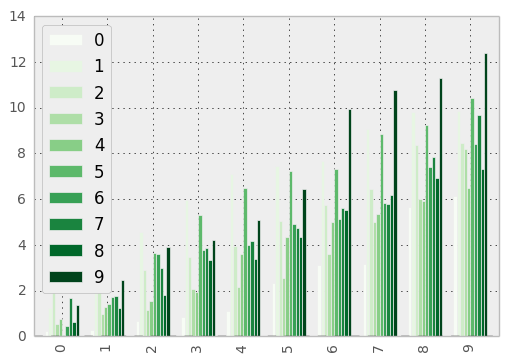
Colormaps can also be used other plot types, like bar charts:
In [93]: dd = DataFrame(randn(10, 10)).applymap(abs)

In [94]: dd = dd.cumsum()

In [95]: plt.figure()
<matplotlib.figure.Figure at 0x130f3510>

In [96]: dd.plot(kind='bar', colormap='Greens')
<matplotlib.axes.AxesSubplot at 0x14009fd0>
Parallel coordinates charts:
In [97]: plt.figure()
<matplotlib.figure.Figure at 0x1400f910>

In [98]: parallel_coordinates(data, 'Name', colormap='gist_rainbow')
<matplotlib.axes.AxesSubplot at 0x13e0b690>
Andrews curves charts:
In [99]: plt.figure()
<matplotlib.figure.Figure at 0x14aa5610>

In [100]: andrews_curves(data, 'Name', colormap='winter')
<matplotlib.axes.AxesSubplot at 0x136825d0>