Plotting
We use the standard convention for referencing the matplotlib API:
In [1]: import matplotlib.pyplot as plt
New in version 0.11.0.
The display.mpl_style produces more appealing plots. When set, matplotlib’s rcParams are changed (globally!) to nicer-looking settings. All the plots in the documentation are rendered with this option set to the ‘default’ style.
In [2]: pd.options.display.mpl_style = 'default'
We provide the basics in pandas to easily create decent looking plots. See the ecosystem section for visualization libraries that go beyond the basics documented here.
Note
All calls to np.random are seeded with 123456.
Basic Plotting: plot
See the cookbook for some advanced strategies
The plot method on Series and DataFrame is just a simple wrapper around plt.plot():
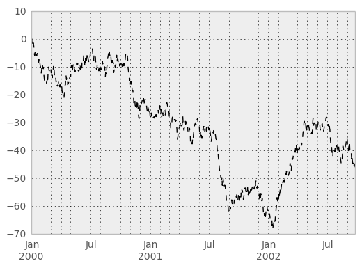
In [3]: ts = Series(randn(1000), index=date_range('1/1/2000', periods=1000))

In [4]: ts = ts.cumsum()

In [5]: ts.plot()
Out[5]: <matplotlib.axes.AxesSubplot at 0xa1133f6c>
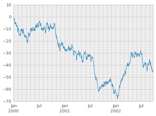
If the index consists of dates, it calls gcf().autofmt_xdate() to try to format the x-axis nicely as per above.
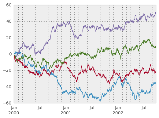
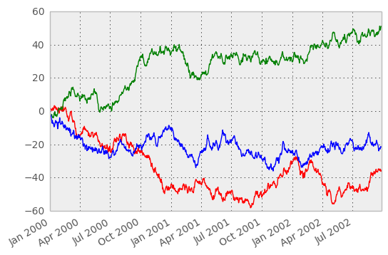
On DataFrame, plot() is a convenience to plot all of the columns with labels:
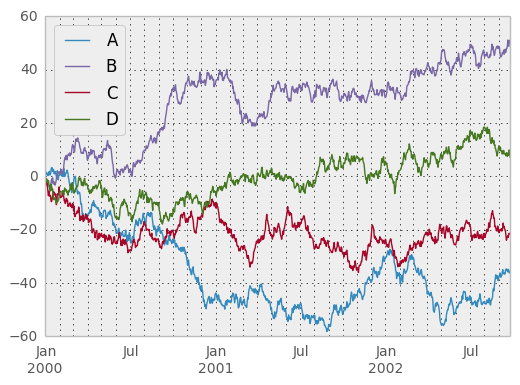
In [6]: df = DataFrame(randn(1000, 4), index=ts.index, columns=list('ABCD'))

In [7]: df = df.cumsum()

In [8]: plt.figure(); df.plot();
You can plot one column versus another using the x and y keywords in plot():
In [9]: df3 = DataFrame(randn(1000, 2), columns=['B', 'C']).cumsum()

In [10]: df3['A'] = Series(list(range(len(df))))

In [11]: df3.plot(x='A', y='B')
Out[11]: <matplotlib.axes.AxesSubplot at 0xa1b14d8c>
Note
For more formatting and sytling options, see below.
Other Plots
The kind keyword argument of plot() accepts a handful of values for plots other than the default Line plot. These include:
- ‘bar’ or ‘barh’ for bar plots
- ‘kde’ or 'density' for density plots
- ‘area’ for area plots
- ‘scatter’ for scatter plots
- ‘hexbin’ for hexagonal bin plots
- ‘pie’ for pie plots
In addition to these kind s, there are the DataFrame.hist(), and DataFrame.boxplot() methods, which use a separate interface.
Finally, there are several plotting functions in pandas.tools.plotting that take a Series or DataFrame as an argument. These include
- Scatter Matrix
- Andrews Curves
- Parallel Coordinates
- Lag Plot
- Autocorrelation Plot
- Bootstrap Plot
- RadViz
Plots may also be adorned with errorbars or tables.
Bar plots
For labeled, non-time series data, you may wish to produce a bar plot:
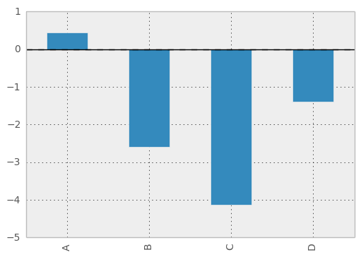
In [12]: plt.figure();

In [13]: df.ix[5].plot(kind='bar'); plt.axhline(0, color='k')
Out[13]: <matplotlib.lines.Line2D at 0xa6f54d8c>
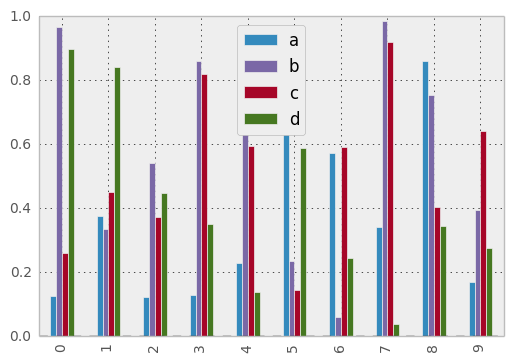
Calling a DataFrame’s plot() method with kind='bar' produces a multiple bar plot:
In [14]: df2 = DataFrame(rand(10, 4), columns=['a', 'b', 'c', 'd'])

In [15]: df2.plot(kind='bar');
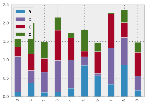
To produce a stacked bar plot, pass stacked=True:
In [16]: df2.plot(kind='bar', stacked=True);
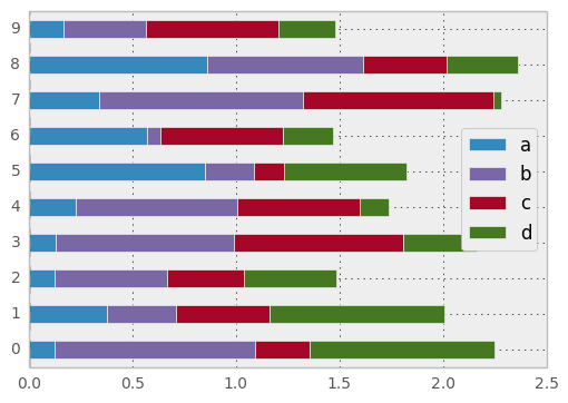
To get horizontal bar plots, pass kind='barh':
In [17]: df2.plot(kind='barh', stacked=True);
Histograms
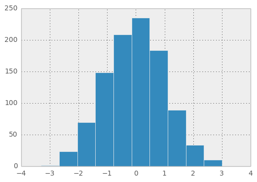
In [18]: plt.figure();

In [19]: df['A'].diff().hist()
Out[19]: <matplotlib.axes.AxesSubplot at 0xa15c758c>
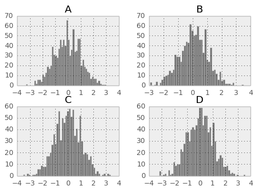
DataFrame.hist() plots the histograms of the columns on multiple subplots:
In [20]: plt.figure()
Out[20]: <matplotlib.figure.Figure at 0xa11255cc>

In [21]: df.diff().hist(color='k', alpha=0.5, bins=50)
Out[21]:
array([[<matplotlib.axes.AxesSubplot object at 0xa5e58b4c>,
        <matplotlib.axes.AxesSubplot object at 0xa15ae30c>],
       [<matplotlib.axes.AxesSubplot object at 0xa5d0ef0c>,
        <matplotlib.axes.AxesSubplot object at 0xa159c30c>]], dtype=object)
New in version 0.10.0.
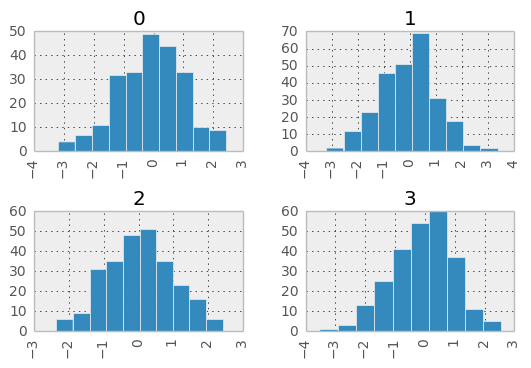
The by keyword can be specified to plot grouped histograms:
In [22]: data = Series(randn(1000))

In [23]: data.hist(by=randint(0, 4, 1000), figsize=(6, 4))
Out[23]:
array([[<matplotlib.axes.AxesSubplot object at 0xa0f6d48c>,
        <matplotlib.axes.AxesSubplot object at 0xa0aab48c>],
       [<matplotlib.axes.AxesSubplot object at 0xa5cd11cc>,
        <matplotlib.axes.AxesSubplot object at 0xa15b5aec>]], dtype=object)
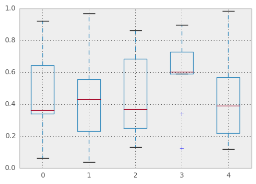
Box Plots
DataFrame has a boxplot() method that allows you to visualize the distribution of values within each column.
For instance, here is a boxplot representing five trials of 10 observations of a uniform random variable on [0,1).
In [24]: df = DataFrame(rand(10,5))

In [25]: plt.figure();

In [26]: bp = df.boxplot()
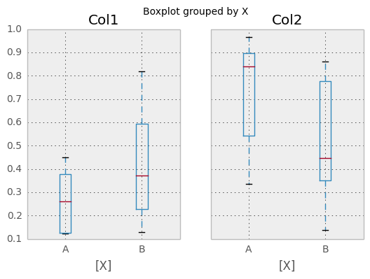
You can create a stratified boxplot using the by keyword argument to create groupings. For instance,
In [27]: df = DataFrame(rand(10,2), columns=['Col1', 'Col2'] )

In [28]: df['X'] = Series(['A','A','A','A','A','B','B','B','B','B'])

In [29]: plt.figure();

In [30]: bp = df.boxplot(by='X')
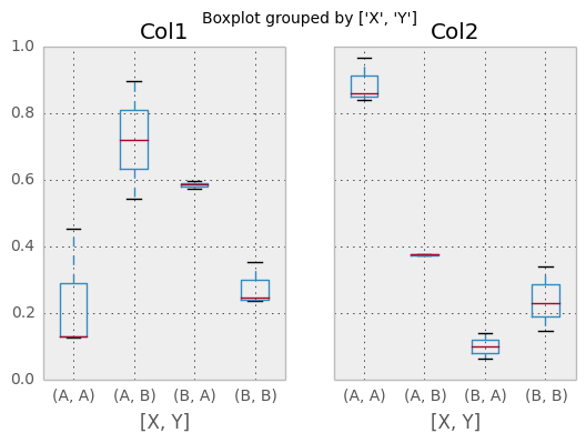
You can also pass a subset of columns to plot, as well as group by multiple columns:
In [31]: df = DataFrame(rand(10,3), columns=['Col1', 'Col2', 'Col3'])

In [32]: df['X'] = Series(['A','A','A','A','A','B','B','B','B','B'])

In [33]: df['Y'] = Series(['A','B','A','B','A','B','A','B','A','B'])

In [34]: plt.figure();

In [35]: bp = df.boxplot(column=['Col1','Col2'], by=['X','Y'])
The return type of boxplot depends on two keyword arguments: by and return_type. When by is None:
- if return_type is 'dict', a dictionary containing the matplotlib Lines is returned. The keys are “boxes”, “caps”, “fliers”, “medians”, and “whiskers”.
This is the deafult.
if return_type is 'axes', a matplotlib Axes containing the boxplot is returned.
- if return_type is 'both' a namedtuple containging the matplotlib Axes
and matplotlib Lines is returned
When by is some column of the DataFrame, a dict of return_type is returned, where the keys are the columns of the DataFrame. The plot has a facet for each column of the DataFrame, with a separate box for each value of by.
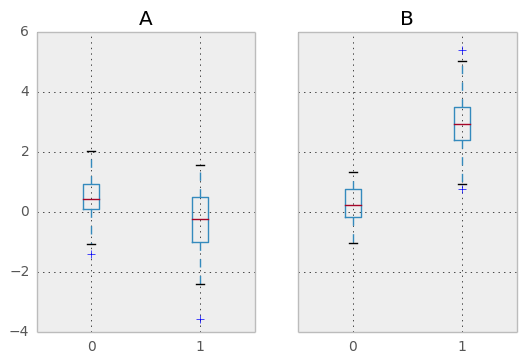
Finally, when calling boxplot on a Groupby object, a dict of return_type is returned, where the keys are the same as the Groupby object. The plot has a facet for each key, with each facet containing a box for each column of the DataFrame.
In [36]: np.random.seed(1234)

In [37]: df_box = DataFrame(np.random.randn(50, 2))

In [38]: df_box['g'] = np.random.choice(['A', 'B'], size=50)

In [39]: df_box.loc[df_box['g'] == 'B', 1] += 3

In [40]: bp = df_box.boxplot(by='g')
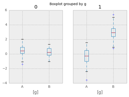
Compare to:
In [41]: bp = df_box.groupby('g').boxplot()
Area Plot
New in version 0.14.
You can create area plots with Series.plot and DataFrame.plot by passing kind='area'. Area plots are stacked by default. To produce stacked area plot, each column must be either all positive or all negative values.
When input data contains NaN, it will be automatically filled by 0. If you want to drop or fill by different values, use dataframe.dropna() or dataframe.fillna() before calling plot.
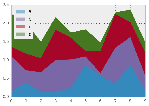
In [42]: df = DataFrame(rand(10, 4), columns=['a', 'b', 'c', 'd'])

In [43]: df.plot(kind='area');
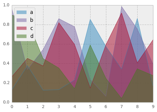
To produce an unstacked plot, pass stacked=False. Alpha value is set to 0.5 unless otherwise specified:
In [44]: df.plot(kind='area', stacked=False);
Hexagonal Bin Plot
New in version 0.14.
You can create hexagonal bin plots with DataFrame.plot() and kind='hexbin'. Hexbin plots can be a useful alternative to scatter plots if your data are too dense to plot each point individually.
In [45]: df = DataFrame(randn(1000, 2), columns=['a', 'b'])

In [46]: df['b'] = df['b'] + np.arange(1000)

In [47]: df.plot(kind='hexbin', x='a', y='b', gridsize=25)
Out[47]: <matplotlib.axes.AxesSubplot at 0xa0a9890c>
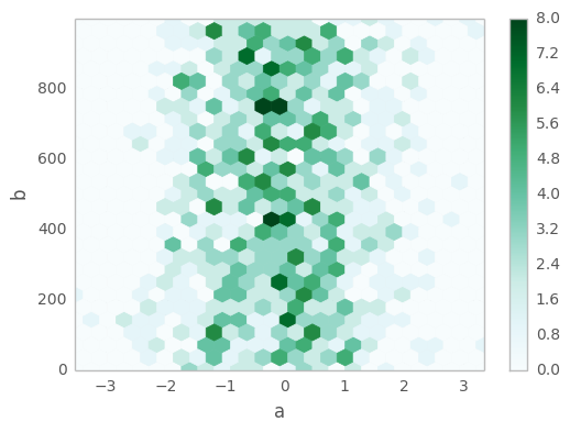
A useful keyword argument is gridsize; it controls the number of hexagons in the x-direction, and defaults to 100. A larger gridsize means more, smaller bins.
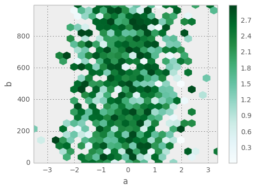
By default, a histogram of the counts around each (x, y) point is computed. You can specify alternative aggregations by passing values to the C and reduce_C_function arguments. C specifies the value at each (x, y) point and reduce_C_function is a function of one argument that reduces all the values in a bin to a single number (e.g. mean, max, sum, std). In this example the positions are given by columns a and b, while the value is given by column z. The bins are aggregated with numpy’s max function.
In [48]: df = DataFrame(randn(1000, 2), columns=['a', 'b'])

In [49]: df['b'] = df['b'] = df['b'] + np.arange(1000)

In [50]: df['z'] = np.random.uniform(0, 3, 1000)

In [51]: df.plot(kind='hexbin', x='a', y='b', C='z', reduce_C_function=np.max,
   ....:         gridsize=25)
   ....:
Out[51]: <matplotlib.axes.AxesSubplot at 0xa0973f8c>
See the hexbin method and the matplotlib hexbin documenation for more.
Pie plot
New in version 0.14.
You can create a pie plot with DataFrame.plot() or Series.plot() with kind='pie'. If your data includes any NaN, they will be automatically filled with 0. A ValueError will be raised if there are any negative values in your data.
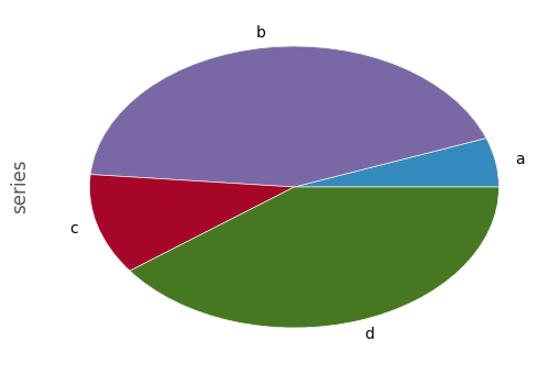
In [52]: series = Series(3 * rand(4), index=['a', 'b', 'c', 'd'], name='series')

In [53]: series.plot(kind='pie')
Out[53]: <matplotlib.axes.AxesSubplot at 0xa07610ec>
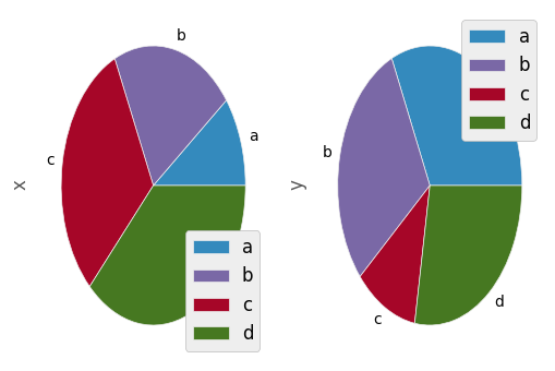
Note that pie plot with DataFrame requires that you either specify a target column by the y argument or subplots=True. When y is specified, pie plot of selected column will be drawn. If subplots=True is specified, pie plots for each column are drawn as subplots. A legend will be drawn in each pie plots by default; specify legend=False to hide it.
In [54]: df = DataFrame(3 * rand(4, 2), index=['a', 'b', 'c', 'd'], columns=['x', 'y'])

In [55]: df.plot(kind='pie', subplots=True)
Out[55]:
array([<matplotlib.axes.AxesSubplot object at 0xa07329ac>,
       <matplotlib.axes.AxesSubplot object at 0xa058ae6c>], dtype=object)
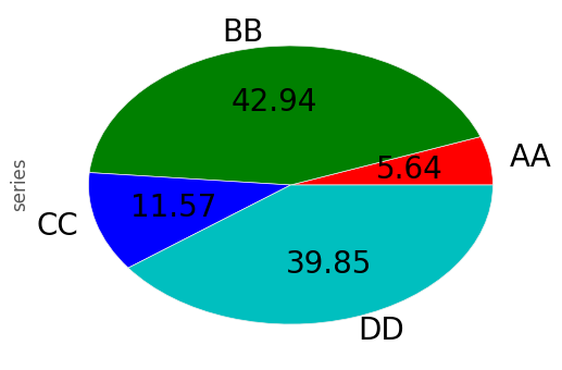
You can use the labels and colors keywords to specify the labels and colors of each wedge.
Warning
Most pandas plots use the the label and color arguments (not the lack of “s” on those). To be consistent with matplotlib.pyplot.pie() you must use labels and colors.
If you want to hide wedge labels, specify labels=None. If fontsize is specified, the value will be applied to wedge labels. Also, other keywords supported by matplotlib.pyplot.pie() can be used.
In [56]: series.plot(kind='pie', labels=['AA', 'BB', 'CC', 'DD'], colors=['r', 'g', 'b', 'c'],
   ....:             autopct='%.2f', fontsize=20)
   ....:
Out[56]: <matplotlib.axes.AxesSubplot at 0xa050e86c>
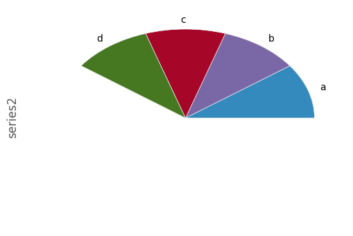
If you pass values whose sum total is less than 1.0, matplotlib draws a semicircle.
In [57]: series = Series([0.1] * 4, index=['a', 'b', 'c', 'd'], name='series2')

In [58]: series.plot(kind='pie')
Out[58]: <matplotlib.axes.AxesSubplot at 0x9fff230c>
See the matplotlib pie documenation for more.
Plotting Tools
These functions can be imported from pandas.tools.plotting and take a Series or DataFrame as an argument.
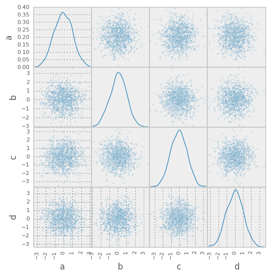
Scatter Matrix Plot
New in version 0.7.3.
- You can create a scatter plot matrix using the
- scatter_matrix method in pandas.tools.plotting:
In [59]: from pandas.tools.plotting import scatter_matrix

In [60]: df = DataFrame(randn(1000, 4), columns=['a', 'b', 'c', 'd'])

In [61]: scatter_matrix(df, alpha=0.2, figsize=(6, 6), diagonal='kde')
Out[61]:
array([[<matplotlib.axes.AxesSubplot object at 0xa0ea8a2c>,
        <matplotlib.axes.AxesSubplot object at 0xaa22f5cc>,
        <matplotlib.axes.AxesSubplot object at 0xa2a8dbac>,
        <matplotlib.axes.AxesSubplot object at 0xa6e64a4c>],
       [<matplotlib.axes.AxesSubplot object at 0xa0bee7ac>,
        <matplotlib.axes.AxesSubplot object at 0xa0b736ac>,
        <matplotlib.axes.AxesSubplot object at 0xa06b168c>,
        <matplotlib.axes.AxesSubplot object at 0xa064836c>],
       [<matplotlib.axes.AxesSubplot object at 0xa09178ec>,
        <matplotlib.axes.AxesSubplot object at 0xa06de28c>,
        <matplotlib.axes.AxesSubplot object at 0xa066f0ac>,
        <matplotlib.axes.AxesSubplot object at 0xa0bf3aec>],
       [<matplotlib.axes.AxesSubplot object at 0xa06db1ac>,
        <matplotlib.axes.AxesSubplot object at 0x9ff63c0c>,
        <matplotlib.axes.AxesSubplot object at 0xa06920ec>,
        <matplotlib.axes.AxesSubplot object at 0xa175c08c>]], dtype=object)
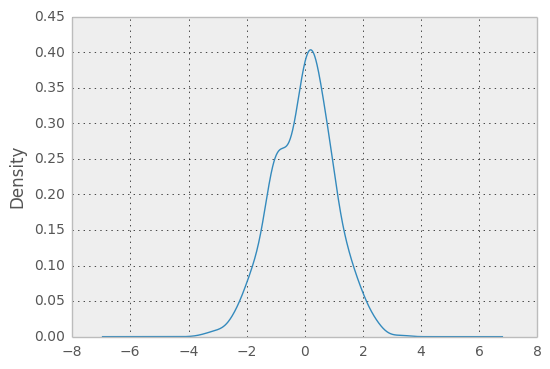
Density Plot
New in version 0.8.0.
You can create density plots using the Series/DataFrame.plot and setting kind='kde':
In [62]: ser = Series(randn(1000))

In [63]: ser.plot(kind='kde')
Out[63]: <matplotlib.axes.AxesSubplot at 0xa045888c>
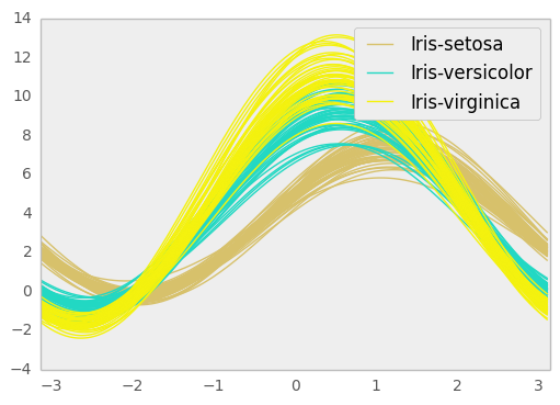
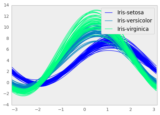
Andrews Curves
Andrews curves allow one to plot multivariate data as a large number of curves that are created using the attributes of samples as coefficients for Fourier series. By coloring these curves differently for each class it is possible to visualize data clustering. Curves belonging to samples of the same class will usually be closer together and form larger structures.
Note: The “Iris” dataset is available here.
In [64]: from pandas import read_csv

In [65]: from pandas.tools.plotting import andrews_curves

In [66]: data = read_csv('data/iris.data')

In [67]: plt.figure()
Out[67]: <matplotlib.figure.Figure at 0xa03759cc>

In [68]: andrews_curves(data, 'Name')
Out[68]: <matplotlib.axes.AxesSubplot at 0xa0375dec>
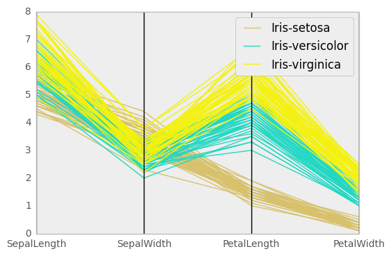
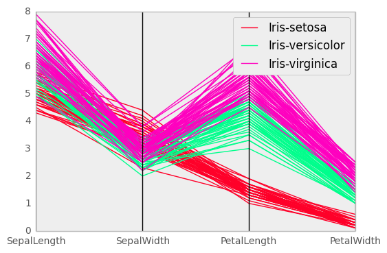
Parallel Coordinates
Parallel coordinates is a plotting technique for plotting multivariate data. It allows one to see clusters in data and to estimate other statistics visually. Using parallel coordinates points are represented as connected line segments. Each vertical line represents one attribute. One set of connected line segments represents one data point. Points that tend to cluster will appear closer together.
In [69]: from pandas import read_csv

In [70]: from pandas.tools.plotting import parallel_coordinates

In [71]: data = read_csv('data/iris.data')

In [72]: plt.figure()
Out[72]: <matplotlib.figure.Figure at 0x9fdc0dac>

In [73]: parallel_coordinates(data, 'Name')
Out[73]: <matplotlib.axes.AxesSubplot at 0x9fdc07cc>
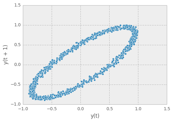
Lag Plot
Lag plots are used to check if a data set or time series is random. Random data should not exhibit any structure in the lag plot. Non-random structure implies that the underlying data are not random.
In [74]: from pandas.tools.plotting import lag_plot

In [75]: plt.figure()
Out[75]: <matplotlib.figure.Figure at 0x9f67fecc>

In [76]: data = Series(0.1 * rand(1000) +
   ....:    0.9 * np.sin(np.linspace(-99 * np.pi, 99 * np.pi, num=1000)))
   ....:

In [77]: lag_plot(data)
Out[77]: <matplotlib.axes.AxesSubplot at 0x9f84486c>
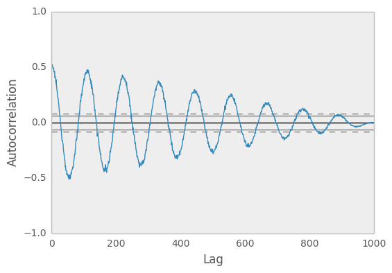
Autocorrelation Plot
Autocorrelation plots are often used for checking randomness in time series. This is done by computing autocorrelations for data values at varying time lags. If time series is random, such autocorrelations should be near zero for any and all time-lag separations. If time series is non-random then one or more of the autocorrelations will be significantly non-zero. The horizontal lines displayed in the plot correspond to 95% and 99% confidence bands. The dashed line is 99% confidence band.
In [78]: from pandas.tools.plotting import autocorrelation_plot

In [79]: plt.figure()
Out[79]: <matplotlib.figure.Figure at 0x9f636fcc>

In [80]: data = Series(0.7 * rand(1000) +
   ....:    0.3 * np.sin(np.linspace(-9 * np.pi, 9 * np.pi, num=1000)))
   ....:

In [81]: autocorrelation_plot(data)
Out[81]: <matplotlib.axes.AxesSubplot at 0x9f636c6c>
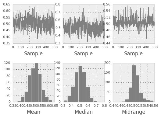
Bootstrap Plot
Bootstrap plots are used to visually assess the uncertainty of a statistic, such as mean, median, midrange, etc. A random subset of a specified size is selected from a data set, the statistic in question is computed for this subset and the process is repeated a specified number of times. Resulting plots and histograms are what constitutes the bootstrap plot.
In [82]: from pandas.tools.plotting import bootstrap_plot

In [83]: data = Series(rand(1000))

In [84]: bootstrap_plot(data, size=50, samples=500, color='grey')
Out[84]: <matplotlib.figure.Figure at 0x9f772dac>
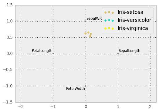
RadViz
RadViz is a way of visualizing multi-variate data. It is based on a simple spring tension minimization algorithm. Basically you set up a bunch of points in a plane. In our case they are equally spaced on a unit circle. Each point represents a single attribute. You then pretend that each sample in the data set is attached to each of these points by a spring, the stiffness of which is proportional to the numerical value of that attribute (they are normalized to unit interval). The point in the plane, where our sample settles to (where the forces acting on our sample are at an equilibrium) is where a dot representing our sample will be drawn. Depending on which class that sample belongs it will be colored differently.
Note: The “Iris” dataset is available here.
In [85]: from pandas import read_csv

In [86]: from pandas.tools.plotting import radviz

In [87]: data = read_csv('data/iris.data')

In [88]: plt.figure()
Out[88]: <matplotlib.figure.Figure at 0x9fe5ed0c>

In [89]: radviz(data, 'Name')
Out[89]: <matplotlib.axes.AxesSubplot at 0x9fafc90c>
Plot Formatting
Most plotting methods have a set of keyword arguments that control the layout and formatting of the returned plot:
In [90]: plt.figure(); ts.plot(style='k--', label='Series');
For each kind of plot (e.g. line, bar, scatter) any additional arguments keywords are passed alogn to the corresponding matplotlib function (ax.plot(), ax.bar(), ax.scatter()). These can be used to control additional styling, beyond what pandas provides.
Controlling the Legend
You may set the legend argument to False to hide the legend, which is shown by default.
In [91]: df = DataFrame(randn(1000, 4), index=ts.index, columns=list('ABCD'))

In [92]: df = df.cumsum()

In [93]: df.plot(legend=False)
Out[93]: <matplotlib.axes.AxesSubplot at 0x9f628bcc>
Scales
You may pass logy to get a log-scale Y axis.
In [94]: ts = Series(randn(1000), index=date_range('1/1/2000', periods=1000))

In [95]: ts = np.exp(ts.cumsum())

In [96]: ts.plot(logy=True)
Out[96]: <matplotlib.axes.AxesSubplot at 0x9f024c0c>
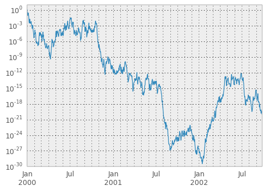
See also the logx and loglog keyword arguments.
Plotting on a Secondary Y-axis
To plot data on a secondary y-axis, use the secondary_y keyword:
In [97]: df.A.plot()
Out[97]: <matplotlib.axes.AxesSubplot at 0x9ee55bac>

In [98]: df.B.plot(secondary_y=True, style='g')
Out[98]: <matplotlib.axes.AxesSubplot at 0x9f44428c>
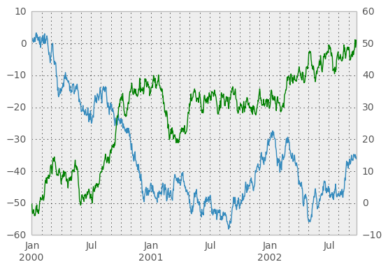
To plot some columns in a DataFrame, give the column names to the secondary_y keyword:
In [99]: plt.figure()
Out[99]: <matplotlib.figure.Figure at 0x9ec6dacc>

In [100]: ax = df.plot(secondary_y=['A', 'B'])

In [101]: ax.set_ylabel('CD scale')
Out[101]: <matplotlib.text.Text at 0x9ee64cec>

In [102]: ax.right_ax.set_ylabel('AB scale')
Out[102]: <matplotlib.text.Text at 0x9ec84e8c>
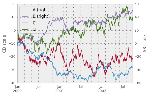
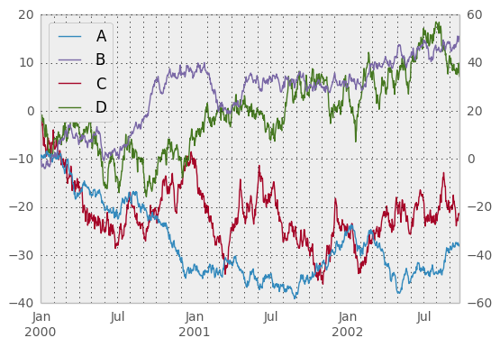
Note that the columns plotted on the secondary y-axis is automatically marked with “(right)” in the legend. To turn off the automatic marking, use the mark_right=False keyword:
In [103]: plt.figure()
Out[103]: <matplotlib.figure.Figure at 0x9f3df4ec>

In [104]: df.plot(secondary_y=['A', 'B'], mark_right=False)
Out[104]: <matplotlib.axes.AxesSubplot at 0x9ec328ac>
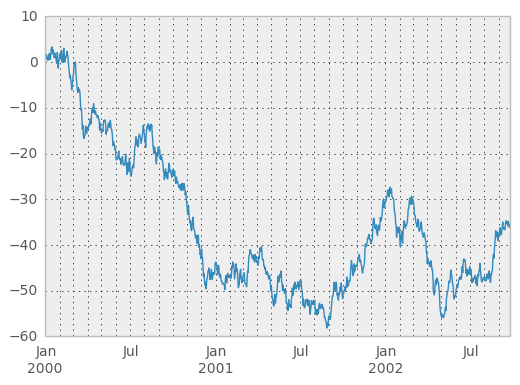
Suppressing Tick Resolution Adjustment
pandas includes automatically tick resolution adjustment for regular frequency time-series data. For limited cases where pandas cannot infer the frequency information (e.g., in an externally created twinx), you can choose to suppress this behavior for alignment purposes.
Here is the default behavior, notice how the x-axis tick labelling is performed:
In [105]: plt.figure()
Out[105]: <matplotlib.figure.Figure at 0x9ed2f64c>

In [106]: df.A.plot()
Out[106]: <matplotlib.axes.AxesSubplot at 0x9ed0c60c>
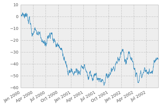
Using the x_compat parameter, you can suppress this behavior:
In [107]: plt.figure()
Out[107]: <matplotlib.figure.Figure at 0x9ed3a40c>

In [108]: df.A.plot(x_compat=True)
Out[108]: <matplotlib.axes.AxesSubplot at 0x9ecbaeec>
If you have more than one plot that needs to be suppressed, the use method in pandas.plot_params can be used in a with statement:
In [109]: import pandas as pd

In [110]: plt.figure()
Out[110]: <matplotlib.figure.Figure at 0x9ecf12cc>

In [111]: with pd.plot_params.use('x_compat', True):
   .....:     df.A.plot(color='r')
   .....:     df.B.plot(color='g')
   .....:     df.C.plot(color='b')
   .....:
Subplots
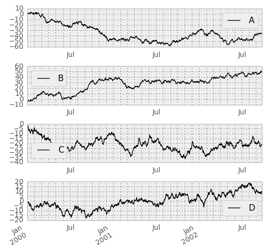
Each Series in a DataFrame can be plotted on a different axis with the subplots keyword:
In [112]: df.plot(subplots=True, figsize=(6, 6));
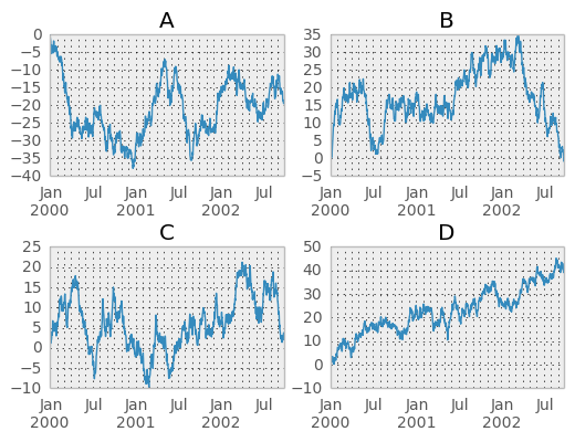
Targeting Different Subplots
You can pass an ax argument to Series.plot() to plot on a particular axis:
In [113]: fig, axes = plt.subplots(nrows=2, ncols=2)

In [114]: df['A'].plot(ax=axes[0,0]); axes[0,0].set_title('A')
Out[114]: <matplotlib.text.Text at 0x9e27098c>

In [115]: df['B'].plot(ax=axes[0,1]); axes[0,1].set_title('B')
Out[115]: <matplotlib.text.Text at 0x9e5c44ac>

In [116]: df['C'].plot(ax=axes[1,0]); axes[1,0].set_title('C')
Out[116]: <matplotlib.text.Text at 0x9e1cc10c>

In [117]: df['D'].plot(ax=axes[1,1]); axes[1,1].set_title('D')
Out[117]: <matplotlib.text.Text at 0x9e57d54c>
Plotting With Error Bars
New in version 0.14.
Plotting with error bars is now supported in the DataFrame.plot() and Series.plot()
Horizontal and vertical errorbars can be supplied to the xerr and yerr keyword arguments to plot(). The error values can be specified using a variety of formats.
- As a DataFrame or dict of errors with column names matching the columns attribute of the plotting DataFrame or matching the name attribute of the Series
- As a str indicating which of the columns of plotting DataFrame contain the error values
- As raw values (list, tuple, or np.ndarray). Must be the same length as the plotting DataFrame/Series
Asymmetrical error bars are also supported, however raw error values must be provided in this case. For a M length Series, a Mx2 array should be provided indicating lower and upper (or left and right) errors. For a MxN DataFrame, asymmetrical errors should be in a Mx2xN array.
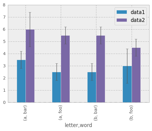
Here is an example of one way to easily plot group means with standard deviations from the raw data.
# Generate the data
In [118]: ix3 = pd.MultiIndex.from_arrays([['a', 'a', 'a', 'a', 'b', 'b', 'b', 'b'], ['foo', 'foo', 'bar', 'bar', 'foo', 'foo', 'bar', 'bar']], names=['letter', 'word'])

In [119]: df3 = pd.DataFrame({'data1': [3, 2, 4, 3, 2, 4, 3, 2], 'data2': [6, 5, 7, 5, 4, 5, 6, 5]}, index=ix3)

# Group by index labels and take the means and standard deviations for each group
In [120]: gp3 = df3.groupby(level=('letter', 'word'))

In [121]: means = gp3.mean()

In [122]: errors = gp3.std()

In [123]: means
Out[123]:
             data1  data2
letter word
a      bar     3.5    6.0
       foo     2.5    5.5
b      bar     2.5    5.5
       foo     3.0    4.5

In [124]: errors
Out[124]:
                data1     data2
letter word
a      bar   0.707107  1.414214
       foo   0.707107  0.707107
b      bar   0.707107  0.707107
       foo   1.414214  0.707107

# Plot
In [125]: fig, ax = plt.subplots()

In [126]: means.plot(yerr=errors, ax=ax, kind='bar')
Out[126]: <matplotlib.axes.AxesSubplot at 0x9e275a0c>
Plotting Tables
New in version 0.14.
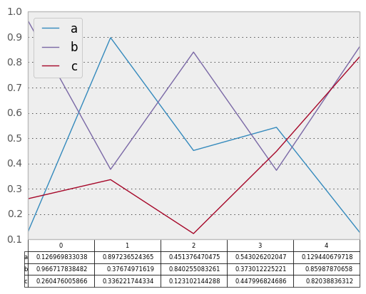
Plotting with matplotlib table is now supported in DataFrame.plot() and Series.plot() with a table keyword. The table keyword can accept bool, DataFrame or Series. The simple way to draw a table is to specify table=True. Data will be transposed to meet matplotlib’s default layout.
In [127]: fig, ax = plt.subplots(1, 1)

In [128]: df = DataFrame(rand(5, 3), columns=['a', 'b', 'c'])

In [129]: ax.get_xaxis().set_visible(False)   # Hide Ticks

In [130]: df.plot(table=True, ax=ax)
Out[130]: <matplotlib.axes.AxesSubplot at 0x9e9a492c>
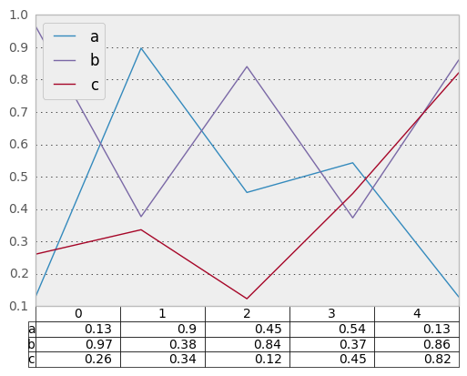
Also, you can pass different DataFrame or Series for table keyword. The data will be drawn as displayed in print method (not transposed automatically). If required, it should be transposed manually as below example.
In [131]: fig, ax = plt.subplots(1, 1)

In [132]: ax.get_xaxis().set_visible(False)   # Hide Ticks

In [133]: df.plot(table=np.round(df.T, 2), ax=ax)
Out[133]: <matplotlib.axes.AxesSubplot at 0x9e6f768c>
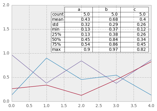
Finally, there is a helper function pandas.tools.plotting.table to create a table from DataFrame and Series, and add it to an matplotlib.Axes. This function can accept keywords which matplotlib table has.
In [134]: from pandas.tools.plotting import table

In [135]: fig, ax = plt.subplots(1, 1)

In [136]: table(ax, np.round(df.describe(), 2),
   .....:       loc='upper right', colWidths=[0.2, 0.2, 0.2])
   .....:
Out[136]: <matplotlib.table.Table at 0x9ed06a0c>

In [137]: df.plot(ax=ax, ylim=(0, 2), legend=None)
Out[137]: <matplotlib.axes.AxesSubplot at 0x9ece86cc>
Note: You can get table instances on the axes using axes.tables property for further decorations. See the matplotlib table documenation for more.
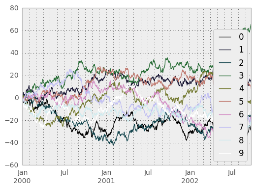
Colormaps
A potential issue when plotting a large number of columns is that it can be difficult to distinguish some series due to repetition in the default colors. To remedy this, DataFrame plotting supports the use of the colormap= argument, which accepts either a Matplotlib colormap or a string that is a name of a colormap registered with Matplotlib. A visualization of the default matplotlib colormaps is available here.
As matplotlib does not directly support colormaps for line-based plots, the colors are selected based on an even spacing determined by the number of columns in the DataFrame. There is no consideration made for background color, so some colormaps will produce lines that are not easily visible.
To use the cubhelix colormap, we can simply pass 'cubehelix' to colormap=
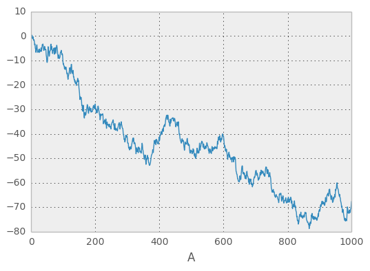
In [138]: df = DataFrame(randn(1000, 10), index=ts.index)

In [139]: df = df.cumsum()

In [140]: plt.figure()
Out[140]: <matplotlib.figure.Figure at 0x9e92d12c>

In [141]: df.plot(colormap='cubehelix')
Out[141]: <matplotlib.axes.AxesSubplot at 0x9f456bcc>
or we can pass the colormap itself
In [142]: from matplotlib import cm

In [143]: plt.figure()
Out[143]: <matplotlib.figure.Figure at 0xa02f7a6c>

In [144]: df.plot(colormap=cm.cubehelix)
Out[144]: <matplotlib.axes.AxesSubplot at 0x9f6689ac>

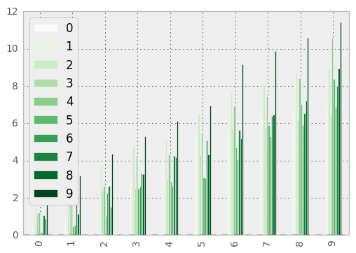
Colormaps can also be used other plot types, like bar charts:
In [145]: dd = DataFrame(randn(10, 10)).applymap(abs)

In [146]: dd = dd.cumsum()

In [147]: plt.figure()
Out[147]: <matplotlib.figure.Figure at 0x9ec2deec>

In [148]: dd.plot(kind='bar', colormap='Greens')
Out[148]: <matplotlib.axes.AxesSubplot at 0xa02891cc>
Parallel coordinates charts:
In [149]: plt.figure()
Out[149]: <matplotlib.figure.Figure at 0x9eea5b4c>

In [150]: parallel_coordinates(data, 'Name', colormap='gist_rainbow')
Out[150]: <matplotlib.axes.AxesSubplot at 0x9de33c4c>
Andrews curves charts:
In [151]: plt.figure()
Out[151]: <matplotlib.figure.Figure at 0x9e42586c>

In [152]: andrews_curves(data, 'Name', colormap='winter')
Out[152]: <matplotlib.axes.AxesSubplot at 0x9e42d60c>
Plotting directly with matplotlib
In some situations it may still be preferable or necessary to prepare plots directly with matplotlib, for instance when a certain type of plot or customization is not (yet) supported by pandas. Series and DataFrame objects behave like arrays and can therefore be passed directly to matplotlib functions without explicit casts.
pandas also automatically registers formatters and locators that recognize date indices, thereby extending date and time support to practically all plot types available in matplotlib. Although this formatting does not provide the same level of refinement you would get when plotting via pandas, it can be faster when plotting a large number of points.
Note
The speed up for large data sets only applies to pandas 0.14.0 and later.
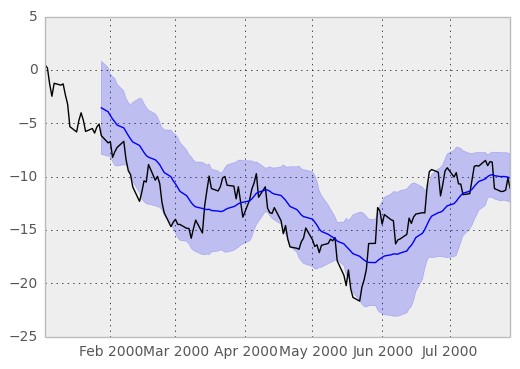
In [153]: price = Series(randn(150).cumsum(),
   .....:                index=date_range('2000-1-1', periods=150, freq='B'))
   .....:

In [154]: ma = pd.rolling_mean(price, 20)

In [155]: mstd = pd.rolling_std(price, 20)

In [156]: plt.figure()
Out[156]: <matplotlib.figure.Figure at 0x9d76a96c>

In [157]: plt.plot(price.index, price, 'k')
Out[157]: [<matplotlib.lines.Line2D at 0x9da83acc>]

In [158]: plt.plot(ma.index, ma, 'b')
Out[158]: [<matplotlib.lines.Line2D at 0xa02c692c>]

In [159]: plt.fill_between(mstd.index, ma-2*mstd, ma+2*mstd, color='b', alpha=0.2)
Out[159]: <matplotlib.collections.PolyCollection at 0x9e40858c>