Plotting with matplotlib
Note
We intend to build more plotting integration with matplotlib as time goes on.
We use the standard convention for referencing the matplotlib API:
In [1186]: import matplotlib.pyplot as plt
Basic plotting: plot
The plot method on Series and DataFrame is just a simple wrapper around plt.plot:
In [1187]: ts = Series(randn(1000), index=date_range('1/1/2000', periods=1000))

In [1188]: ts = ts.cumsum()

In [1189]: ts.plot()
Out[1189]: <matplotlib.axes.AxesSubplot at 0x117b67c50>
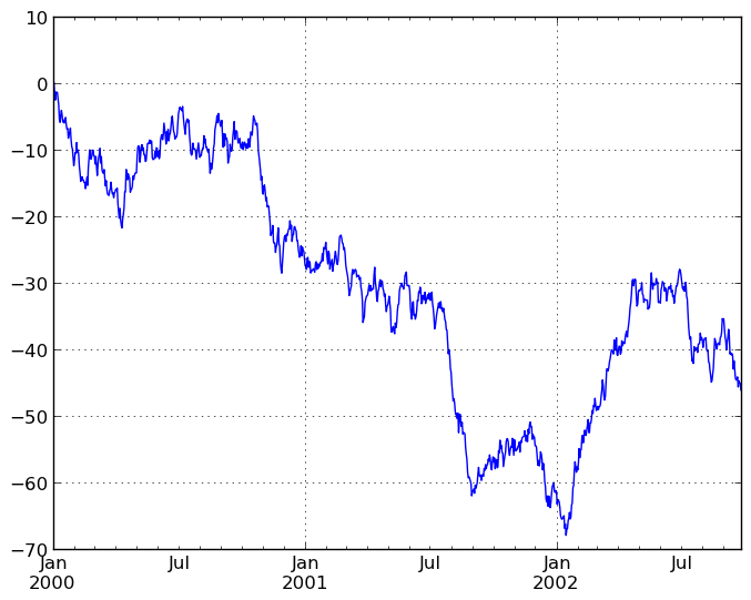
If the index consists of dates, it calls gcf().autofmt_xdate() to try to format the x-axis nicely as per above. The method takes a number of arguments for controlling the look of the plot:
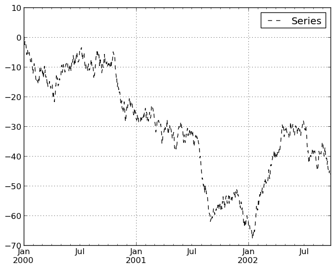
In [1190]: plt.figure(); ts.plot(style='k--', label='Series'); plt.legend()
Out[1190]: <matplotlib.legend.Legend at 0x11af0b9d0>
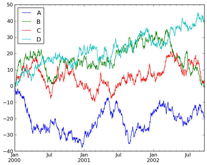
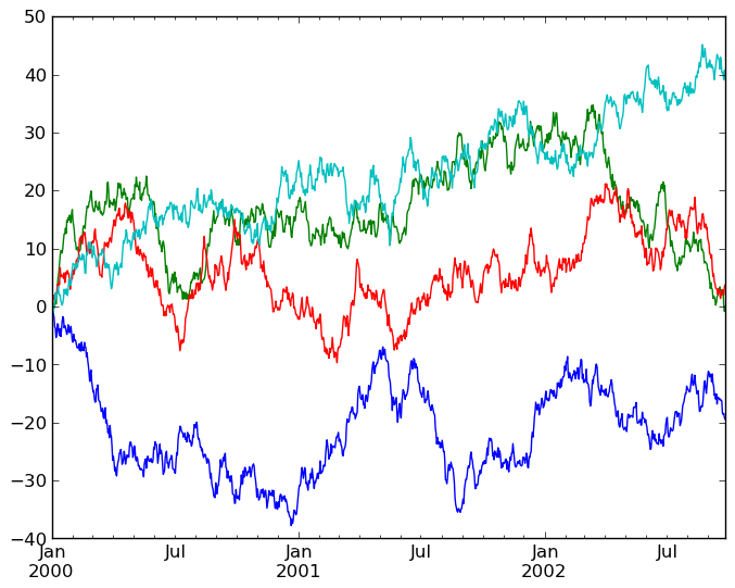
On DataFrame, plot is a convenience to plot all of the columns with labels:
In [1191]: df = DataFrame(randn(1000, 4), index=ts.index,
   ......:                columns=['A', 'B', 'C', 'D'])
   ......:

In [1192]: df = df.cumsum()

In [1193]: plt.figure(); df.plot(); plt.legend(loc='best')
Out[1193]: <matplotlib.legend.Legend at 0x11afaa410>
You may set the legend argument to False to hide the legend, which is shown by default.
In [1194]: df.plot(legend=False)
Out[1194]: <matplotlib.axes.AxesSubplot at 0x11ce41990>
Some other options are available, like plotting each Series on a different axis:
In [1195]: df.plot(subplots=True, figsize=(8, 8)); plt.legend(loc='best')
Out[1195]: <matplotlib.legend.Legend at 0x11cc813d0>
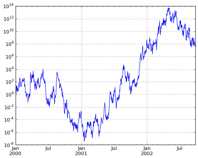
You may pass logy to get a log-scale Y axis.
In [1196]: plt.figure();
In [1196]: ts = Series(randn(1000), index=date_range('1/1/2000', periods=1000))

In [1197]: ts = np.exp(ts.cumsum())

In [1198]: ts.plot(logy=True)
Out[1198]: <matplotlib.axes.AxesSubplot at 0x11d4733d0>
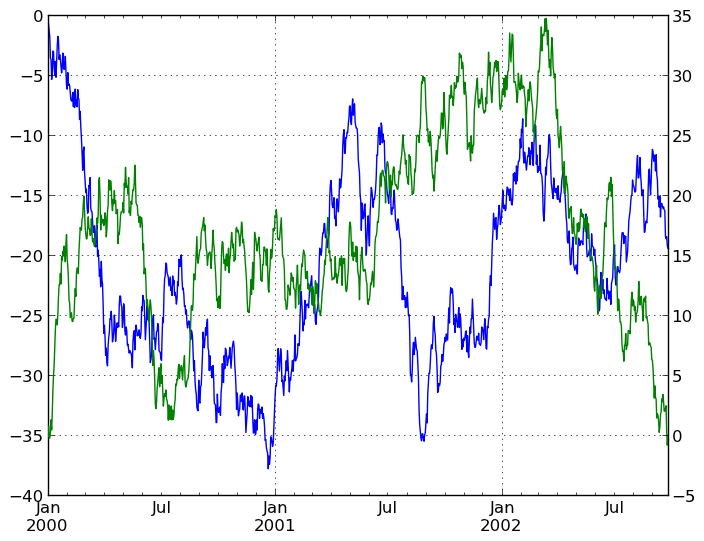
Plotting on a Secondary Y-axis
To plot data on a secondary y-axis, use the secondary_y keyword:
In [1199]: plt.figure()
Out[1199]: <matplotlib.figure.Figure at 0x11d4fef90>

In [1200]: df.A.plot()
Out[1200]: <matplotlib.axes.AxesSubplot at 0x11c81e250>

In [1201]: df.B.plot(secondary_y=True, style='g')
Out[1201]: <matplotlib.axes.Axes at 0x11c813e90>
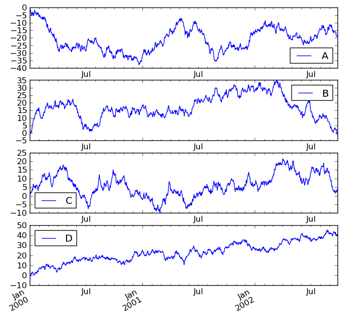
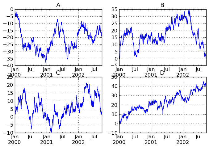
Targeting different subplots
You can pass an ax argument to Series.plot to plot on a particular axis:
In [1202]: fig, axes = plt.subplots(nrows=2, ncols=2, figsize=(8, 5))

In [1203]: df['A'].plot(ax=axes[0,0]); axes[0,0].set_title('A')
Out[1203]: <matplotlib.text.Text at 0x11d56ded0>

In [1204]: df['B'].plot(ax=axes[0,1]); axes[0,1].set_title('B')
Out[1204]: <matplotlib.text.Text at 0x11d87c650>

In [1205]: df['C'].plot(ax=axes[1,0]); axes[1,0].set_title('C')
Out[1205]: <matplotlib.text.Text at 0x11d8a0150>

In [1206]: df['D'].plot(ax=axes[1,1]); axes[1,1].set_title('D')
Out[1206]: <matplotlib.text.Text at 0x11d899fd0>
Other plotting features
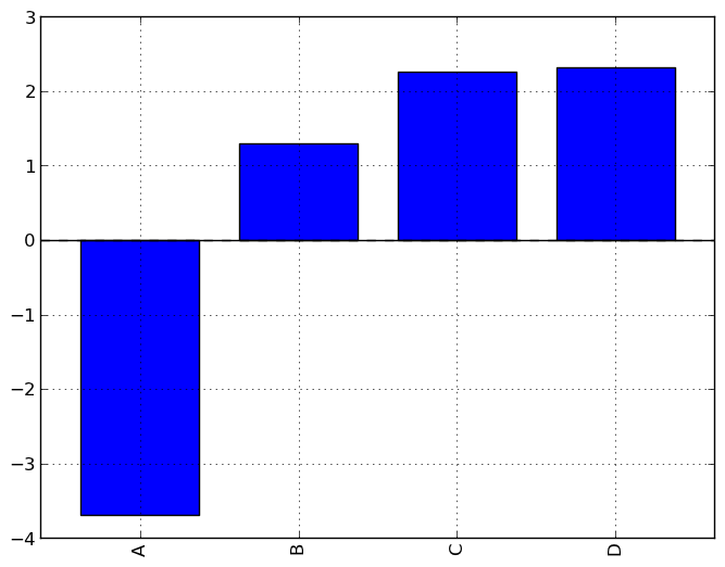
Bar plots
For labeled, non-time series data, you may wish to produce a bar plot:
In [1207]: plt.figure();
In [1207]: df.ix[5].plot(kind='bar'); plt.axhline(0, color='k')
Out[1207]: <matplotlib.lines.Line2D at 0x11e72e150>
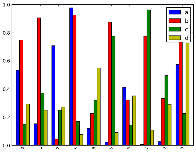
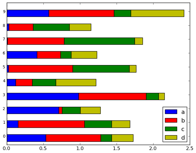
Calling a DataFrame’s plot method with kind='bar' produces a multiple bar plot:
In [1208]: df2 = DataFrame(np.random.rand(10, 4), columns=['a', 'b', 'c', 'd'])

In [1209]: df2.plot(kind='bar');
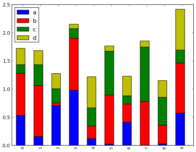
To produce a stacked bar plot, pass stacked=True:
In [1209]: df2.plot(kind='bar', stacked=True);
To get horizontal bar plots, pass kind='barh':
In [1209]: df2.plot(kind='barh', stacked=True);
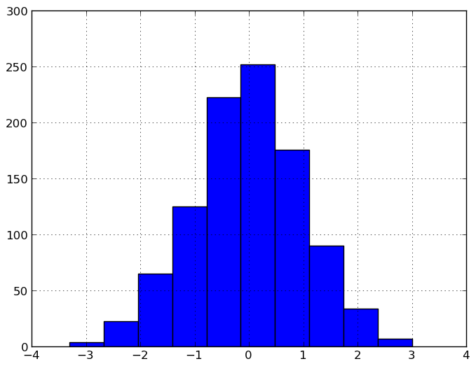
Histograms
In [1209]: plt.figure();
In [1209]: df['A'].diff().hist()
Out[1209]: <matplotlib.axes.AxesSubplot at 0x11e7a7bd0>
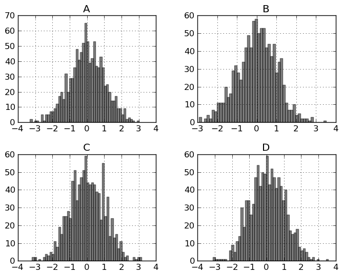
For a DataFrame, hist plots the histograms of the columns on multiple subplots:
In [1210]: plt.figure()
Out[1210]: <matplotlib.figure.Figure at 0x11f279d10>

In [1211]: df.diff().hist(color='k', alpha=0.5, bins=50)
Out[1211]:
array([[Axes(0.125,0.552174;0.336957x0.347826),
        Axes(0.563043,0.552174;0.336957x0.347826)],
       [Axes(0.125,0.1;0.336957x0.347826),
        Axes(0.563043,0.1;0.336957x0.347826)]], dtype=object)
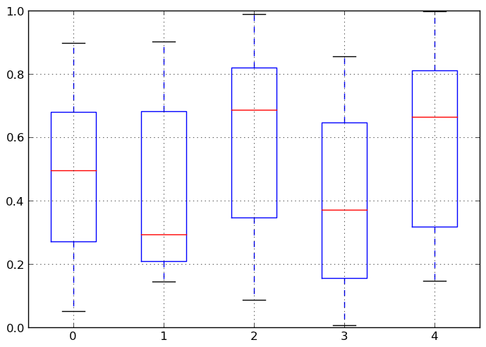
Box-Plotting
DataFrame has a boxplot method which allows you to visualize the distribution of values within each column.
For instance, here is a boxplot representing five trials of 10 observations of a uniform random variable on [0,1).
In [1212]: df = DataFrame(np.random.rand(10,5))

In [1213]: plt.figure();
In [1213]: bp = df.boxplot()
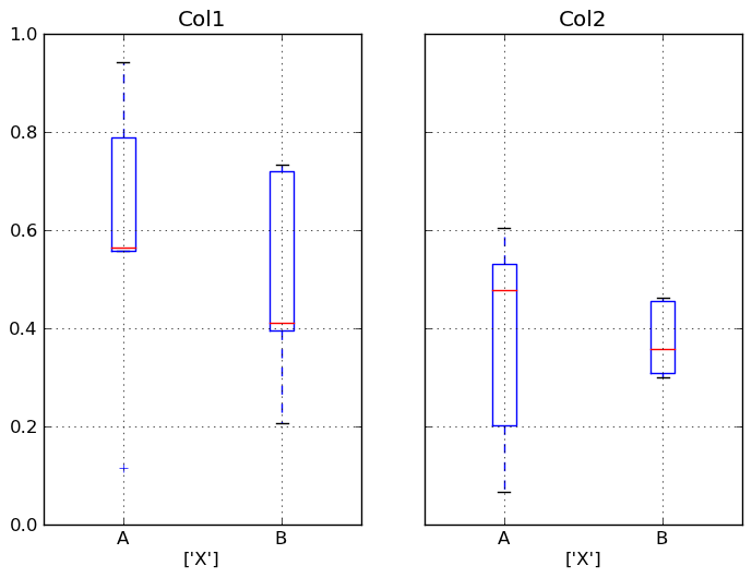
You can create a stratified boxplot using the by keyword argument to create groupings. For instance,
In [1214]: df = DataFrame(np.random.rand(10,2), columns=['Col1', 'Col2'] )

In [1215]: df['X'] = Series(['A','A','A','A','A','B','B','B','B','B'])

In [1216]: plt.figure();
In [1216]: bp = df.boxplot(by='X')
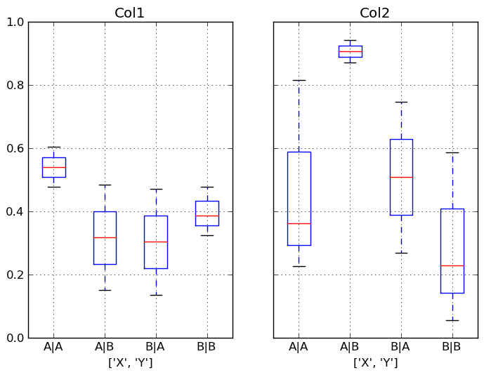
You can also pass a subset of columns to plot, as well as group by multiple columns:
In [1217]: df = DataFrame(np.random.rand(10,3), columns=['Col1', 'Col2', 'Col3'])

In [1218]: df['X'] = Series(['A','A','A','A','A','B','B','B','B','B'])

In [1219]: df['Y'] = Series(['A','B','A','B','A','B','A','B','A','B'])

In [1220]: plt.figure();
In [1220]: bp = df.boxplot(column=['Col1','Col2'], by=['X','Y'])
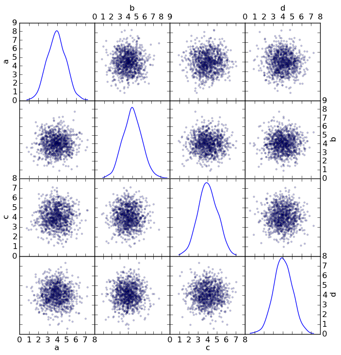
Scatter plot matrix
- New in 0.7.3. You can create a scatter plot matrix using the
- scatter_matrix method in pandas.tools.plotting:
In [1221]: from pandas.tools.plotting import scatter_matrix

In [1222]: df = DataFrame(np.random.randn(1000, 4), columns=['a', 'b', 'c', 'd'])

In [1223]: scatter_matrix(df, alpha=0.2, figsize=(8, 8), diagonal='kde')
Out[1223]:
array([[Axes(0.125,0.7;0.19375x0.2), Axes(0.31875,0.7;0.19375x0.2),
        Axes(0.5125,0.7;0.19375x0.2), Axes(0.70625,0.7;0.19375x0.2)],
       [Axes(0.125,0.5;0.19375x0.2), Axes(0.31875,0.5;0.19375x0.2),
        Axes(0.5125,0.5;0.19375x0.2), Axes(0.70625,0.5;0.19375x0.2)],
       [Axes(0.125,0.3;0.19375x0.2), Axes(0.31875,0.3;0.19375x0.2),
        Axes(0.5125,0.3;0.19375x0.2), Axes(0.70625,0.3;0.19375x0.2)],
       [Axes(0.125,0.1;0.19375x0.2), Axes(0.31875,0.1;0.19375x0.2),
        Axes(0.5125,0.1;0.19375x0.2), Axes(0.70625,0.1;0.19375x0.2)]], dtype=object)
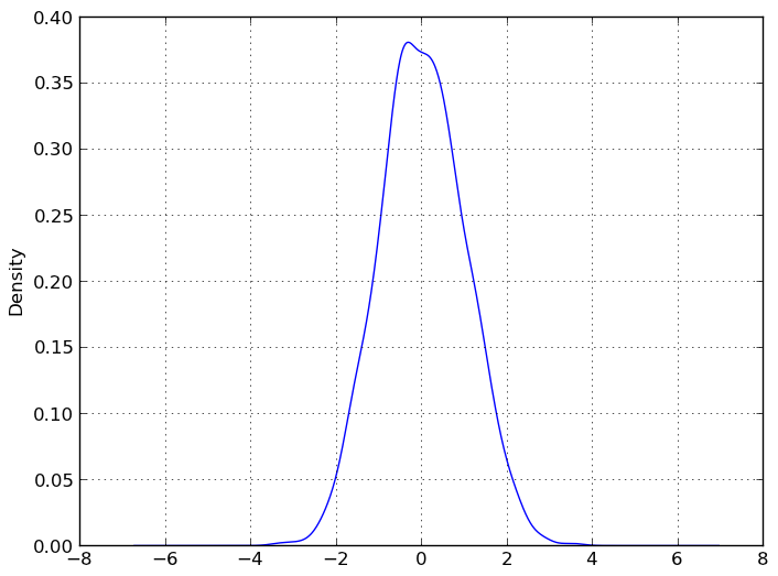
New in 0.8.0 You can create density plots using the Series/DataFrame.plot and setting kind=’kde’:
In [1224]: ser = Series(np.random.randn(1000))

In [1225]: ser.plot(kind='kde')
Out[1225]: <matplotlib.axes.AxesSubplot at 0x121f77450>
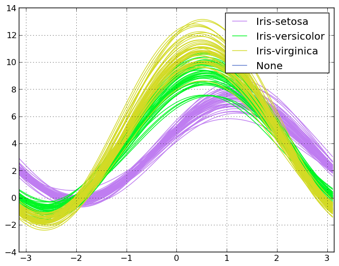
Andrews Curves
Andrews curves allow one to plot multivariate data as a large number of curves that are created using the attributes of samples as coefficients for Fourier series. By coloring these curves differently for each class it is possible to visualize data clustering. Curves belonging to samples of the same class will usually be closer together and form larger structures.
In [1226]: from pandas import read_csv

In [1227]: from pandas.tools.plotting import andrews_curves

In [1228]: data = read_csv('data/iris.data')

In [1229]: plt.figure()
Out[1229]: <matplotlib.figure.Figure at 0x121f73b90>

In [1230]: andrews_curves(data, 'Name')
Out[1230]: <matplotlib.axes.AxesSubplot at 0x11c8a8f10>
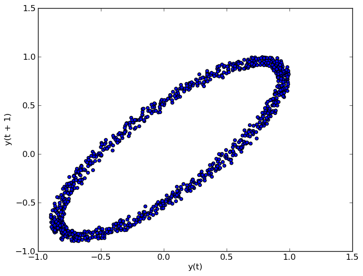
Lag Plot
Lag plots are used to check if a data set or time series is random. Random data should not exhibit any structure in the lag plot. Non-random structure implies that the underlying data are not random.
In [1231]: from pandas.tools.plotting import lag_plot

In [1232]: plt.figure()
Out[1232]: <matplotlib.figure.Figure at 0x11c8a8bd0>

In [1233]: data = Series(0.1 * np.random.random(1000) +
   ......:    0.9 * np.sin(np.linspace(-99 * np.pi, 99 * np.pi, num=1000)))
   ......:

In [1234]: lag_plot(data)
Out[1234]: <matplotlib.axes.AxesSubplot at 0x123aa60d0>
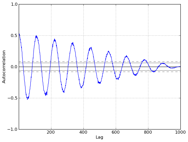
Autocorrelation Plot
Autocorrelation plots are often used for checking randomness in time series. This is done by computing autocorrelations for data values at varying time lags. If time series is random, such autocorrelations should be near zero for any and all time-lag separations. If time series is non-random then one or more of the autocorrelations will be significantly non-zero. The horizontal lines displayed in the plot correspond to 95% and 99% confidence bands. The dashed line is 99% confidence band.
In [1235]: from pandas.tools.plotting import autocorrelation_plot

In [1236]: plt.figure()
Out[1236]: <matplotlib.figure.Figure at 0x123aa6550>

In [1237]: data = Series(0.7 * np.random.random(1000) +
   ......:    0.3 * np.sin(np.linspace(-9 * np.pi, 9 * np.pi, num=1000)))
   ......:

In [1238]: autocorrelation_plot(data)
Out[1238]: <matplotlib.axes.AxesSubplot at 0x123aa6ed0>