Trellis plotting interface
Note
The tips data set can be downloaded here. Once you download it execute
from pandas import read_csv
tips_data = read_csv('tips.csv')
from the directory where you downloaded the file.
We import the rplot API:
In [1]: import pandas.tools.rplot as rplot
Examples
RPlot is a flexible API for producing Trellis plots. These plots allow you to arrange data in a rectangular grid by values of certain attributes.
In [2]: plt.figure()
<matplotlib.figure.Figure at 0xb808cd0>
In [3]: plot = rplot.RPlot(tips_data, x='total_bill', y='tip')
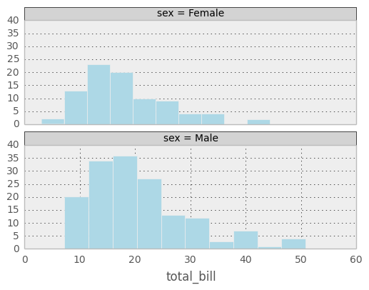
In [4]: plot.add(rplot.TrellisGrid(['sex', 'smoker']))
In [5]: plot.add(rplot.GeomHistogram())
In [6]: plot.render(plt.gcf())
<matplotlib.figure.Figure at 0xb808cd0>
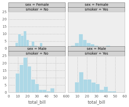
In the example above, data from the tips data set is arranged by the attributes ‘sex’ and ‘smoker’. Since both of those attributes can take on one of two values, the resulting grid has two columns and two rows. A histogram is displayed for each cell of the grid.
In [7]: plt.figure()
<matplotlib.figure.Figure at 0xe64dc90>

In [8]: plot = rplot.RPlot(tips_data, x='total_bill', y='tip')

In [9]: plot.add(rplot.TrellisGrid(['sex', 'smoker']))

In [10]: plot.add(rplot.GeomDensity())

In [11]: plot.render(plt.gcf())
<matplotlib.figure.Figure at 0xe64dc90>
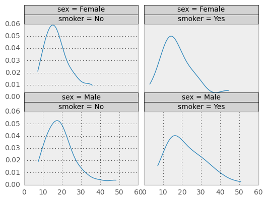
Example above is the same as previous except the plot is set to kernel density estimation. This shows how easy it is to have different plots for the same Trellis structure.
In [12]: plt.figure()
<matplotlib.figure.Figure at 0xbcbdc50>

In [13]: plot = rplot.RPlot(tips_data, x='total_bill', y='tip')

In [14]: plot.add(rplot.TrellisGrid(['sex', 'smoker']))

In [15]: plot.add(rplot.GeomScatter())

In [16]: plot.add(rplot.GeomPolyFit(degree=2))

In [17]: plot.render(plt.gcf())
<matplotlib.figure.Figure at 0xbcbdc50>
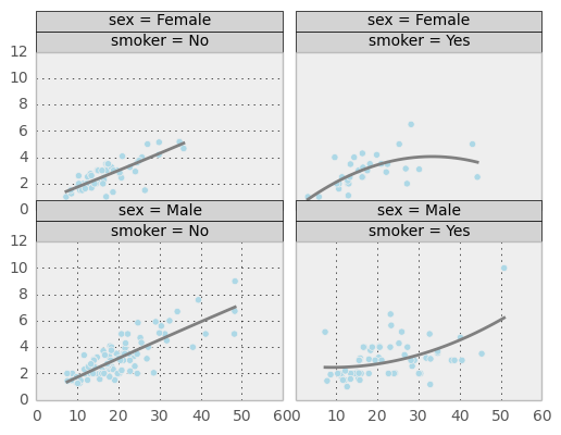
The plot above shows that it is possible to have two or more plots for the same data displayed on the same Trellis grid cell.
In [18]: plt.figure()
<matplotlib.figure.Figure at 0x13535710>

In [19]: plot = rplot.RPlot(tips_data, x='total_bill', y='tip')

In [20]: plot.add(rplot.TrellisGrid(['sex', 'smoker']))

In [21]: plot.add(rplot.GeomScatter())

In [22]: plot.add(rplot.GeomDensity2D())

In [23]: plot.render(plt.gcf())
<matplotlib.figure.Figure at 0x13535710>
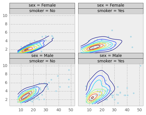
Above is a similar plot but with 2D kernel desnity estimation plot superimposed.
In [24]: plt.figure()
<matplotlib.figure.Figure at 0x1352eb90>
In [25]: plot = rplot.RPlot(tips_data, x='total_bill', y='tip')
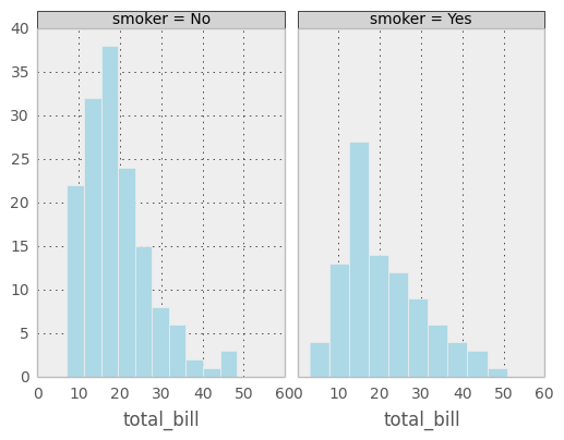
In [26]: plot.add(rplot.TrellisGrid(['sex', '.']))
In [27]: plot.add(rplot.GeomHistogram())
In [28]: plot.render(plt.gcf())
<matplotlib.figure.Figure at 0x1352eb90>
It is possible to only use one attribute for grouping data. The example above only uses ‘sex’ attribute. If the second grouping attribute is not specified, the plots will be arranged in a column.
In [29]: plt.figure()
<matplotlib.figure.Figure at 0x133ca890>

In [30]: plot = rplot.RPlot(tips_data, x='total_bill', y='tip')

In [31]: plot.add(rplot.TrellisGrid(['.', 'smoker']))

In [32]: plot.add(rplot.GeomHistogram())

In [33]: plot.render(plt.gcf())
<matplotlib.figure.Figure at 0x133ca890>
If the first grouping attribute is not specified the plots will be arranged in a row.
In [34]: plt.figure()
<matplotlib.figure.Figure at 0x146ef3d0>

In [35]: plot = rplot.RPlot(tips_data, x='total_bill', y='tip')

In [36]: plot.add(rplot.TrellisGrid(['.', 'smoker']))

In [37]: plot.add(rplot.GeomHistogram())

In [38]: plot = rplot.RPlot(tips_data, x='tip', y='total_bill')

In [39]: plot.add(rplot.TrellisGrid(['sex', 'smoker']))

In [40]: plot.add(rplot.GeomPoint(size=80.0, colour=rplot.ScaleRandomColour('day'), shape=rplot.ScaleShape('size'), alpha=1.0))

In [41]: plot.render(plt.gcf())
<matplotlib.figure.Figure at 0x146ef3d0>
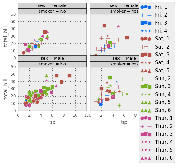
As shown above, scatter plots are also possible. Scatter plots allow you to map various data attributes to graphical properties of the plot. In the example above the colour and shape of the scatter plot graphical objects is mapped to ‘day’ and ‘size’ attributes respectively. You use scale objects to specify these mappings. The list of scale classes is given below with initialization arguments for quick reference.
Scales
ScaleGradient(column, colour1, colour2)
This one allows you to map an attribute (specified by parameter column) value to the colour of a graphical object. The larger the value of the attribute the closer the colour will be to colour2, the smaller the value, the closer it will be to colour1.
ScaleGradient2(column, colour1, colour2, colour3)
The same as ScaleGradient but interpolates linearly between three colours instead of two.
ScaleSize(column, min_size, max_size, transform)
Map attribute value to size of the graphical object. Parameter min_size (default 5.0) is the minimum size of the graphical object, max_size (default 100.0) is the maximum size and transform is a one argument function that will be used to transform the attribute value (defaults to lambda x: x).
ScaleShape(column)
Map the shape of the object to attribute value. The attribute has to be categorical.
ScaleRandomColour(column)
Assign a random colour to a value of categorical attribute specified by column.