pandas.plotting.autocorrelation_plot
-
pandas.plotting.autocorrelation_plot(series, ax=None, **kwargs)[source]¶ Autocorrelation plot for time series.
- Parameters
- seriesTime series
- axMatplotlib axis object, optional
- **kwargs
Options to pass to matplotlib plotting method.
- Returns
- class:matplotlib.axis.Axes
Examples
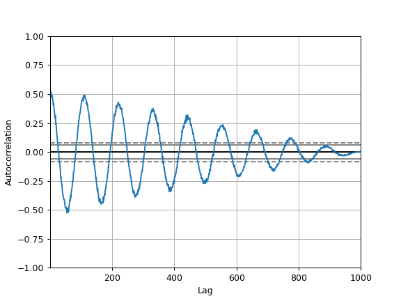
The horizontal lines in the plot correspond to 95% and 99% confidence bands.
The dashed line is 99% confidence band.
>>> spacing = np.linspace(-9 * np.pi, 9 * np.pi, num=1000)
>>> s = pd.Series(0.7 * np.random.rand(1000) + 0.3 * np.sin(spacing))
>>> pd.plotting.autocorrelation_plot(s)