pandas.DataFrame.plot.barh#
- DataFrame.plot.barh(x=None, y=None, color=None, **kwargs)[source]#
Make a horizontal bar plot.
A horizontal bar plot is a plot that presents quantitative data with rectangular bars with lengths proportional to the values that they represent. A bar plot shows comparisons among discrete categories. One axis of the plot shows the specific categories being compared, and the other axis represents a measured value.
- Parameters:
- xlabel or position, optional
Allows plotting of one column versus another. If not specified, the index of the DataFrame is used.
- ylabel or position, optional
Allows plotting of one column versus another. If not specified, all numerical columns are used.
- colorstr, array-like, or dict, optional
The color for each of the DataFrame’s columns. Possible values are:
A single color string referred to by name, RGB or RGBA code, for instance ‘red’ or ‘#a98d19’.
A sequence of color strings referred to by name, RGB or RGBA code, which will be used for each column recursively. For instance [‘green’,’yellow’] each column’s bar will be filled in green or yellow, alternatively. If there is only a single column to be plotted, then only the first color from the color list will be used.
A dict of the form {column name : color}, so that each column will be colored accordingly. For example, if your columns are called a and b, then passing {‘a’: ‘green’, ‘b’: ‘red’} will color bars for column a in green and bars for column b in red.
- **kwargs
Additional keyword arguments are documented in
DataFrame.plot().
- Returns:
- matplotlib.axes.Axes or np.ndarray of them
An ndarray is returned with one
matplotlib.axes.Axesper column whensubplots=True.
See also
DataFrame.plot.barVertical bar plot.
DataFrame.plotMake plots of DataFrame using matplotlib.
matplotlib.axes.Axes.barPlot a vertical bar plot using matplotlib.
Examples
Basic example
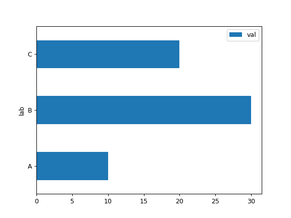
>>> df = pd.DataFrame({"lab": ["A", "B", "C"], "val": [10, 30, 20]})
>>> ax = df.plot.barh(x="lab", y="val")
Plot a whole DataFrame to a horizontal bar plot
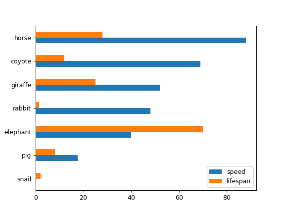
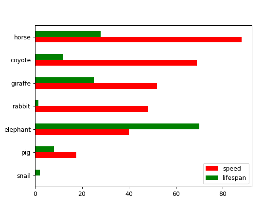
>>> speed = [0.1, 17.5, 40, 48, 52, 69, 88]
>>> lifespan = [2, 8, 70, 1.5, 25, 12, 28]
>>> index = [
...     "snail",
...     "pig",
...     "elephant",
...     "rabbit",
...     "giraffe",
...     "coyote",
...     "horse",
... ]
>>> df = pd.DataFrame({"speed": speed, "lifespan": lifespan}, index=index)
>>> ax = df.plot.barh()
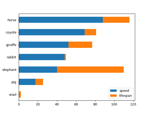
Plot stacked barh charts for the DataFrame
>>> ax = df.plot.barh(stacked=True)
We can specify colors for each column
>>> ax = df.plot.barh(color={"speed": "red", "lifespan": "green"})
Plot a column of the DataFrame to a horizontal bar plot
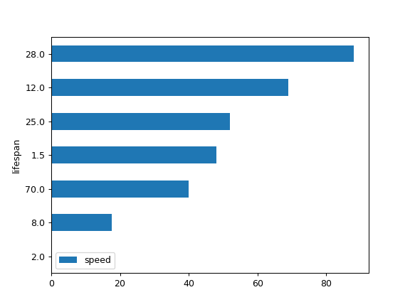
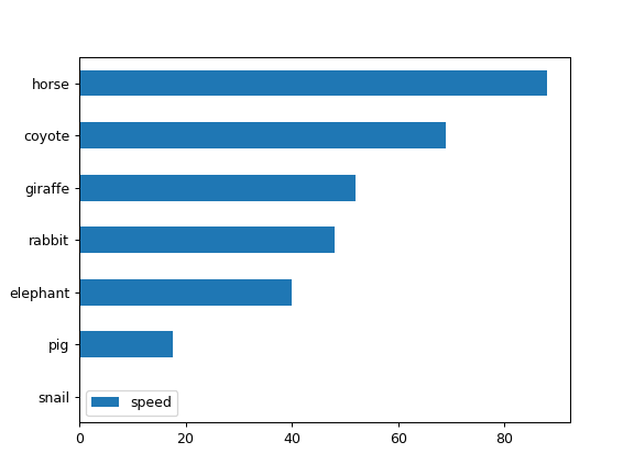
>>> speed = [0.1, 17.5, 40, 48, 52, 69, 88]
>>> lifespan = [2, 8, 70, 1.5, 25, 12, 28]
>>> index = [
...     "snail",
...     "pig",
...     "elephant",
...     "rabbit",
...     "giraffe",
...     "coyote",
...     "horse",
... ]
>>> df = pd.DataFrame({"speed": speed, "lifespan": lifespan}, index=index)
>>> ax = df.plot.barh(y="speed")
Plot DataFrame versus the desired column
>>> speed = [0.1, 17.5, 40, 48, 52, 69, 88]
>>> lifespan = [2, 8, 70, 1.5, 25, 12, 28]
>>> index = [
...     "snail",
...     "pig",
...     "elephant",
...     "rabbit",
...     "giraffe",
...     "coyote",
...     "horse",
... ]
>>> df = pd.DataFrame({"speed": speed, "lifespan": lifespan}, index=index)
>>> ax = df.plot.barh(x="lifespan")