pandas.DataFrame.plot.line#
- DataFrame.plot.line(x=None, y=None, color=None, **kwargs)[source]#
Plot Series or DataFrame as lines.
This function is useful to plot lines using DataFrame’s values as coordinates.
- Parameters:
- xlabel or position, optional
Allows plotting of one column versus another. If not specified, the index of the DataFrame is used.
- ylabel or position, optional
Allows plotting of one column versus another. If not specified, all numerical columns are used.
- colorstr, array-like, or dict, optional
The color for each of the DataFrame’s columns. Possible values are:
A single color string referred to by name, RGB or RGBA code, for instance ‘red’ or ‘#a98d19’.
A sequence of color strings referred to by name, RGB or RGBA code, which will be used for each column recursively. For instance [‘green’,’yellow’] each column’s line will be filled in green or yellow, alternatively. If there is only a single column to be plotted, then only the first color from the color list will be used.
A dict of the form {column name : color}, so that each column will be colored accordingly. For example, if your columns are called a and b, then passing {‘a’: ‘green’, ‘b’: ‘red’} will color lines for column a in green and lines for column b in red.
- **kwargs
Additional keyword arguments are documented in
DataFrame.plot().
- Returns:
- matplotlib.axes.Axes or np.ndarray of them
An ndarray is returned with one
matplotlib.axes.Axesper column whensubplots=True.
See also
matplotlib.pyplot.plotPlot y versus x as lines and/or markers.
Examples
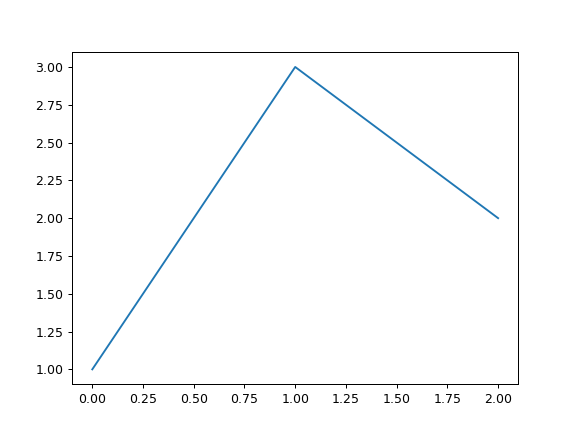
>>> s = pd.Series([1, 3, 2])
>>> s.plot.line()
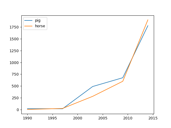
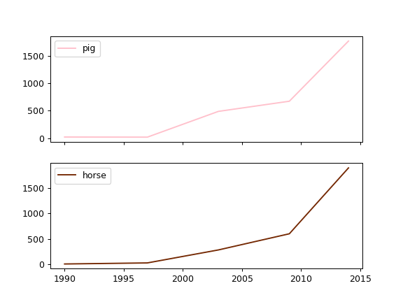
The following example shows the populations for some animals over the years.
>>> df = pd.DataFrame(
...     {
...         "pig": [20, 18, 489, 675, 1776],
...         "horse": [4, 25, 281, 600, 1900],
...     },
...     index=[1990, 1997, 2003, 2009, 2014],
... )
>>> lines = df.plot.line()
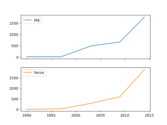
An example with subplots, so an array of axes is returned.
>>> axes = df.plot.line(subplots=True)
>>> type(axes)
<class 'numpy.ndarray'>
Let’s repeat the same example, but specifying colors for each column (in this case, for each animal).
>>> axes = df.plot.line(
...     subplots=True, color={"pig": "pink", "horse": "#742802"}
... )
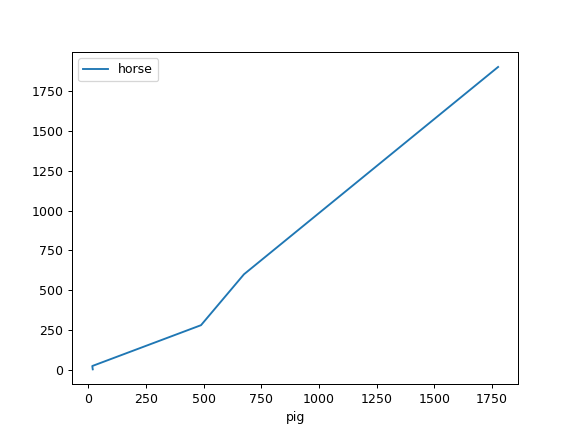
The following example shows the relationship between both populations.
>>> lines = df.plot.line(x="pig", y="horse")